A small tattoo is the easiest way to look effortlessly cool… and also the easiest way to accidentally end up with something that feels like you grabbed it from page one of Pinterest. 😅 The secret isn’t “finding a design no one has.” It’s building a design that has your fingerprints all over it—even if the motif is simple.
Because yes, a tiny moon can be generic… or it can be your moon.
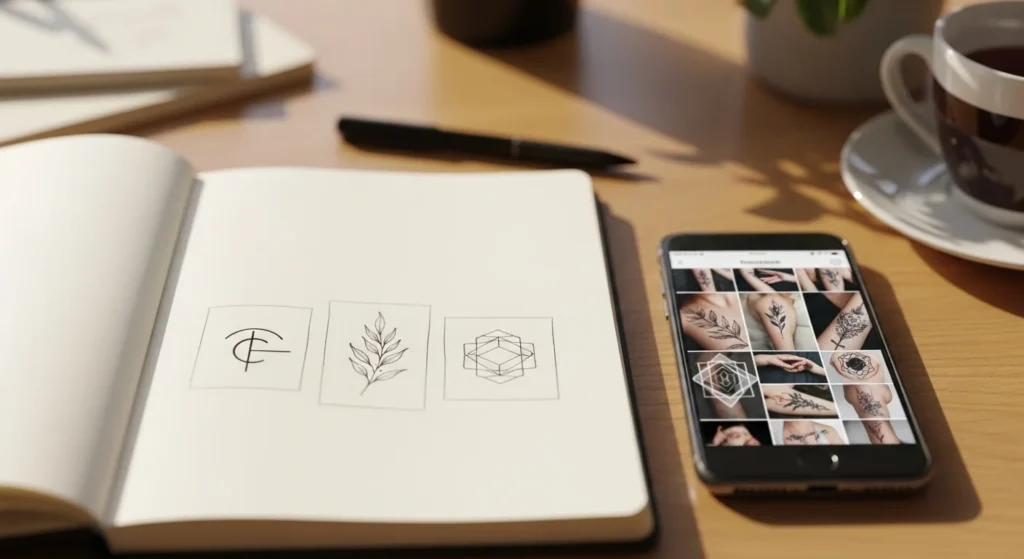
Start With One Strong Element (Small Tattoos Need Clarity)
Small tattoos look custom when they’re clean and intentional, not crowded.
The “one-element” rule
Pick one main subject and commit to it:
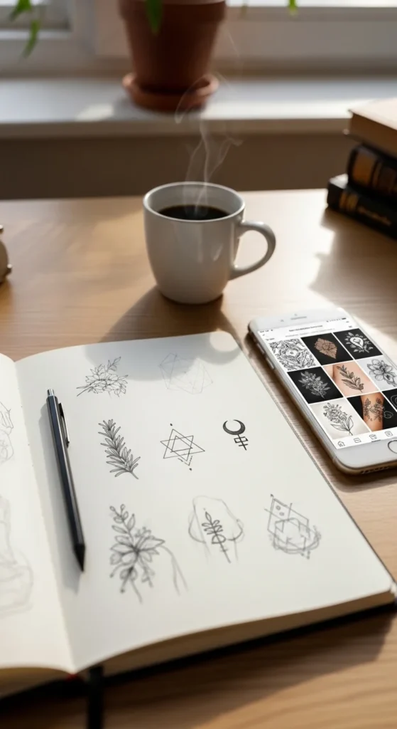
- a single flower sprig (lavender, fern, olive)
- one symbol (arrow, heart, star, wave)
- one geometric shape (triangle, circle, crescent)
- one tiny object (match, book, shell, compass)
Then add micro-accents only if they support the main element.
Crowd-control checklist
If your design has:
- 3+ focal points
- lots of tiny shading
- multiple overlapping symbols
…it will likely read as messy at 1–2 inches. Clean wins.
Make It Personal With a “Story-to-Symbol” Swap
Here’s the easiest custom trick: translate your story into visuals.
Pick one personal anchor:
- a place that changed you
- a goal you achieved
- a person you carry with you
- a hobby that defines you
- a season you survived
Now convert it into a symbol using one of these swaps:
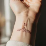
- Place → outline shape (mountain ridge, coastline curve)
- Person → tiny detail (initial hidden in a leaf vein)
- Goal → direction symbol (arrow, compass point, star)
- Moment → nature marker (specific flower, moon phase)
- Value → geometric meaning (circle = unity, triangle = strength)
Why this works: even if the style is trendy, the meaning becomes uniquely yours.
Use Negative Space Like a Designer (Instant “Custom” Look)
Negative space isn’t just “empty skin”—it’s part of the art. It creates shape, contrast, and that modern minimalist feel that looks high-end.
Easy negative-space techniques for small tattoos:
- a tiny gap inside a heart outline
- a crescent moon created by two curved lines (not filled)
- a leaf shape defined by outline + open center
- a geometric symbol with a cut-out center
Rule of thumb: if you want your tattoo to look crisp and not muddy, give it room to breathe.
Dial In Line Weight + Spacing (So It Doesn’t Fade Into Blur)
A custom-looking tattoo isn’t only the idea—it’s the engineering.
Two things that make tiny tattoos age better:
- Balanced line weight (not too thin, not too thick)
- Enough spacing so lines don’t merge as it heals
Quick “tiny tattoo clarity” rules
- Avoid ultra-thin lines if you want maximum longevity
- Leave space between details (tiny tattoos need breathing room)
- Skip overly delicate cursive script at micro sizes (it’s the #1 blur risk)
If you love script, go for:
- simple sans-serif lettering
- short words
- slightly larger size so it stays readable
Do the Print-and-Shrink Test (This Saves So Much Regret)
Before anything touches skin, test the design like a pro.
The “print & shrink” method:
- Print your design at 2 inches
- Print again at 1.5 inches
- Print again at 1 inch
- Tape each version on your chosen spot
- Stand 3–5 feet away and check readability
If you can’t recognize it quickly from a normal distance, simplify it.
This test is gold for preventing “cute on paper, messy on skin.”
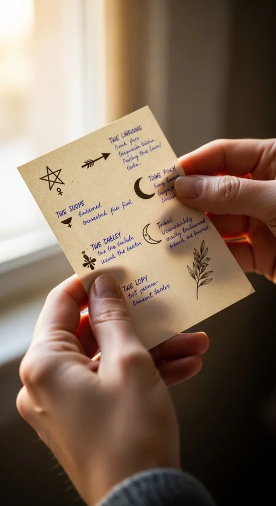
Add a “Signature Detail” (The Custom Stamp)
This is where your tattoo becomes yours even if the base motif is common.
Signature detail ideas (tiny but powerful):
- a hidden initial or number inside the linework
- a specific petal count (2, 3, 5) tied to meaning
- a micro dot constellation near the main symbol
- a tiny break in the line (intentional negative-space cut)
- coordinates or date in ultra-minimal number style (if size allows)
Think of it like a designer logo—but subtle and personal.
Match the Design to Placement (So It Looks Like It Belongs There)
Some designs look clean in one spot and awkward in another.
Simple placement + shape pairings:
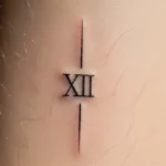
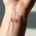
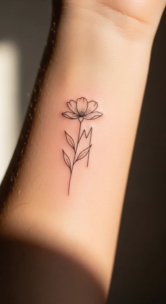
- Wrist: small icons, linework, tiny vertical sprigs
- Inner arm: delicate symbols, fine-line botanicals
- Ankle: round motifs, small stamps, mini florals
- Ribs: micro-realism or slightly larger minimal designs (if you’re brave)
- Forearm: anything clean and readable
If you want a tattoo that looks custom, it should feel like it was designed for that exact spot.
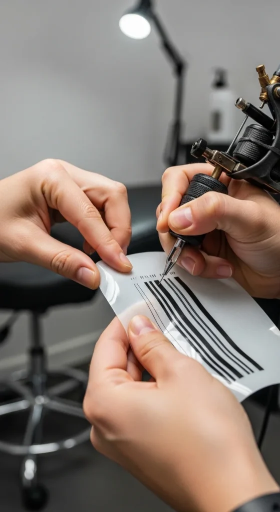
Collaborate With Your Artist (Don’t Hand Them a Screenshot)
Want the fastest path to “custom”? Give your artist a clear brief.
Easy consult brief template
Bring:
- 3 inspiration images (style)
- 1 image for the subject (what it is)
- your placement + size range
- one sentence meaning (“This represents…”)
Then say:
- “I want this vibe, but a unique version.”
A great artist will adjust:
- line weight for your skin
- spacing for longevity
- shape to fit your body
That’s where custom magic happens.
Final Takeaway: Custom Is a Process, Not a Motif
A small tattoo looks custom when it’s:
- simple enough to read
- personal enough to feel yours
- designed with spacing + line weight in mind
- tested at real size
- placed intentionally
If you do these steps, even a tiny heart or moon can feel like a signature.
Save this guide for later—and next time you’re tempted to copy a Pinterest design, build your own version instead.