Finger tattoos look small, but they demand discipline.
They fade faster than most tattoos. They sit on skin that moves constantly. And most designs people choose are too delicate to survive.
Still, when done right, they stand out instantly. Clean. Personal. Sharp.
This list focuses on designs that actually hold up—and won’t turn into a blur after a few months.
1. Tiny Outline Heart on Ring Finger
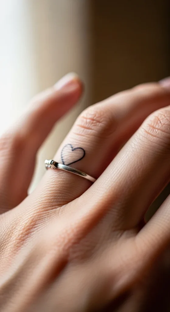
This design works because it’s simple and recognizable. A tiny heart on the ring finger feels personal without being loud. People notice it naturally since the ring finger already draws attention. But here’s the reality—fine-line hearts fade quickly on fingers. If you go too thin, it won’t hold. Go slightly thicker than your first instinct. Avoid placing it on the inner side of the finger where friction is constant. A smart move is to test it first using a pen or temporary tattoo for a few days. If it already annoys you, don’t commit permanently. Keep the size small but not microscopic. Also, expect a touch-up within months. If you’re not willing to maintain it, skip this design completely. Done right, though, it stays clean and gets compliments without trying too hard.
2. Crescent Moon with Micro Stars
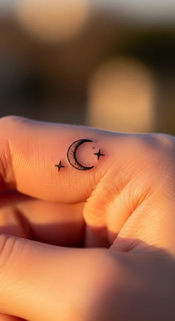
A crescent moon works because it’s clean and symbolic without being complicated. The trick is restraint. Most people ruin this by adding too many stars or details. Stick to one crescent and two or three tiny stars. That’s enough. Placement matters more than design here. On top of the finger, it stands out. On the side, it stays subtle and easier to hide. Avoid adding shading inside the moon. That fades unevenly and looks messy over time. Slightly thicker lines will age better than ultra-fine ones. If you’re on a budget, get the moon and stars done in one session to avoid extra minimum charges. This design works long-term because it relies on basic shapes, not intricate details that break down quickly. Keep it simple, or don’t do it at all.
3. Minimal Star Cluster
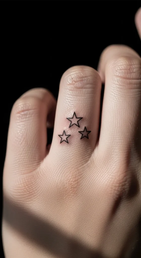
A star cluster looks better than a single star because it creates balance. But spacing is everything. Keep the stars close together. Spread-out stars look disorganized fast, especially as they fade. Use two to four stars max. More than that starts to look crowded on such a small area. Slight size variation helps make it feel natural. Avoid filled or shaded stars—they blur quicker on fingers. This design is practical because even if one line softens over time, the overall cluster still reads clearly. Before getting it, draw three dots on your finger and live with it for a few days. If it already feels cluttered, your tattoo will too. This is one of the safer fine-line designs if you don’t overcomplicate it.
4. Side Finger Daisy
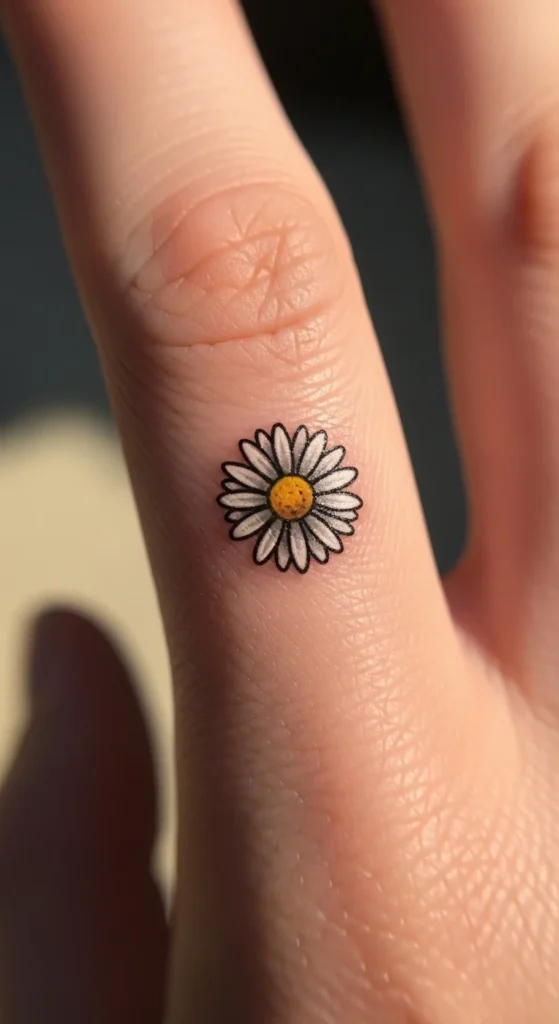
Side finger tattoos give you control. You can hide them easily or show them when you want. A daisy works well because of its simple structure—a circle and short petals. But side placement fades faster due to constant friction. That’s the trade-off. If you choose this, avoid ultra-thin petals. Ask your artist for slightly thicker lines so the shape holds. Skip color if you’re trying to save money. Black ink lasts longer and needs fewer touch-ups. Also, don’t over-detail the center of the flower. Keep it clean and minimal. This design works best for people who want something subtle without committing to a visible top placement. Just accept that maintenance is part of the deal.
5. Honey Bee Mini Tattoo
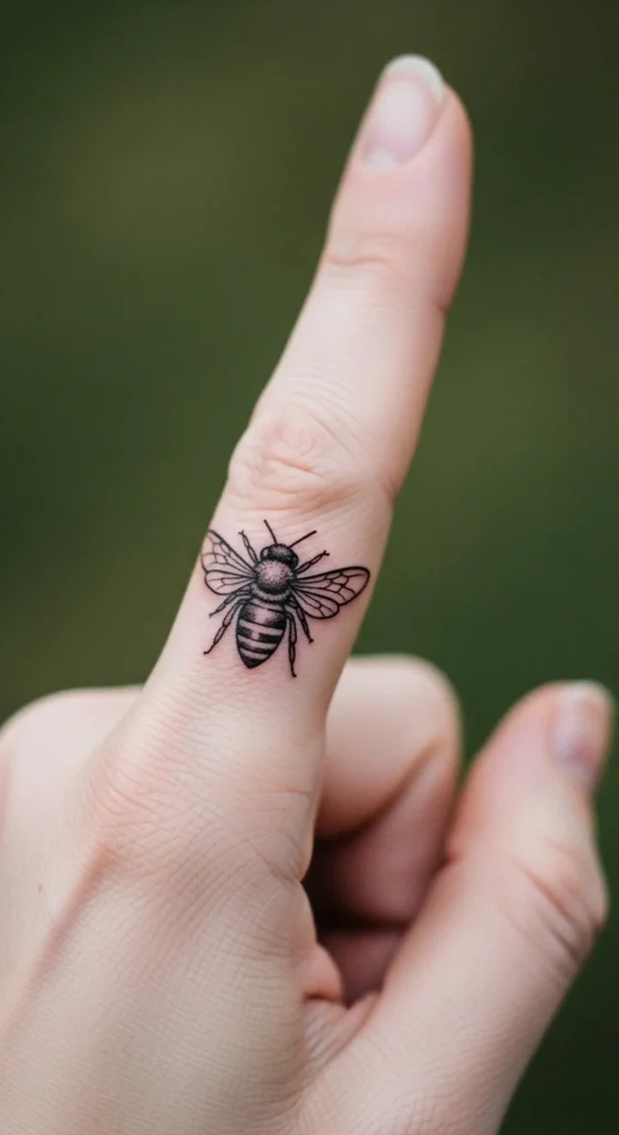
Bees look great until they’re overdesigned. Most people add too much detail in the wings, and that’s where it fades first. Keep it simple. Solid body. Minimal wing lines. No micro shading. The goal is recognizability, not realism. A simplified bee will still look like a bee even after some fading. A detailed one turns into a blur. This design works because it’s symbolic and compact. It fits the finger space without forcing complexity. If you’re on a budget, ask your artist for a minimal version. It takes less time and costs less while aging better. Don’t get pulled into “more detail equals better.” On fingers, it’s the opposite.
6. Heartbeat Line Wrap
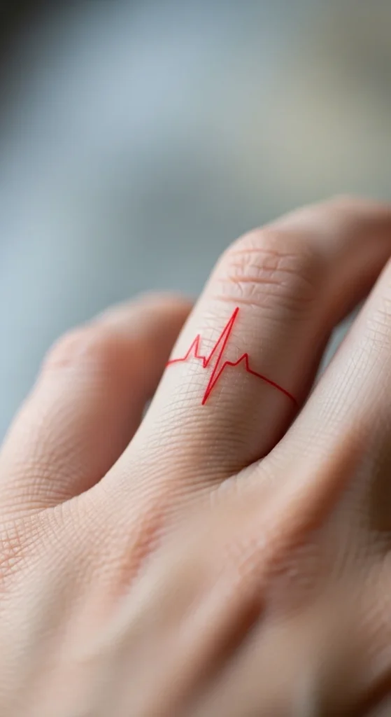
This design looks cool in concept but fails often in execution. Thin zig-zag lines fade fast on fingers. If you still want it, keep the line slightly thicker than expected. Avoid wrapping it fully around the finger—that area gets too much friction. A short segment on top works better. Keep the pattern simple. Don’t stretch it across the entire finger. This is one of those designs where less is actually smarter. If you overextend it, it loses clarity quickly. Only go for this if you’re okay with maintenance. Otherwise, it won’t hold up long-term.
7. Love Knot Symbol

A love knot works because it’s structured. Unlike script or names, it doesn’t rely on fine lettering that blurs. Keep the lines bold enough to maintain shape. Avoid tight overlaps or tiny loops—they merge over time. Placement should be on top or slightly to the side, not the inner finger. If you’re doing this as a couple tattoo, don’t obsess over making both identical. Minor differences happen naturally on fingers. A smart approach is to test it with henna first. It gives you a realistic preview without commitment. This design holds better than most symbolic tattoos if you keep it simple.
8. Tiny Elephant Silhouette
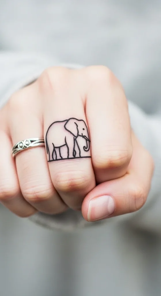
Silhouettes solve a lot of problems. A tiny elephant works because it reduces detail into a clear shape. No shading. No inner lines. Just outline. That’s what helps it age better. Avoid realistic elephants at all costs. They won’t hold up on such a small surface. Slightly thicker lines help preserve the shape over time. This design is budget-friendly since it takes less time to complete. It’s also easier to touch up if needed. If you want something meaningful without risking blur, this is a safe option.
9. Angel Wings Side Tattoo
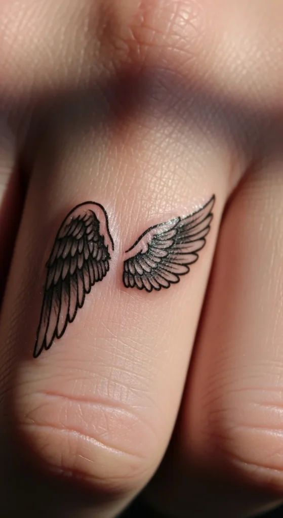
Angel wings look elegant, but most versions fail because they’re over-detailed. Tiny feather lines blur fast on fingers. Keep the wings simplified. Focus on the outer shape instead of stuffing in feather texture. Two clean wing shapes are enough for the eye to recognize it. Place it on the side of the finger if you want control over visibility. That also keeps it from being exposed constantly. Avoid ultra-thin lines. Go slightly thicker so the wings don’t disappear over time. This design works best when it stays minimal and balanced. If your artist shows you a highly detailed stencil, push back. That detail won’t survive. Keep expectations realistic. You’ll likely need a touch-up. But if done right, it still holds its form longer than most decorative designs.
10. Shooting Star Design
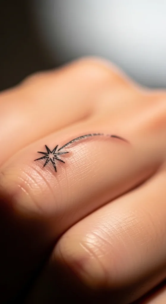
A shooting star works because it’s dynamic but still simple. The mistake people make is adding long trails or multiple stars. That turns messy fast. Keep one small star and a short tail. That’s it. The shorter the trail, the better it holds. Long thin lines fade unevenly. Placement on the top of the finger works best for visibility. Side placement makes it more subtle. This design is budget-friendly since it’s quick to do. It also ages better than complex celestial designs because it relies on clean lines. If you want to combine it with other elements, keep spacing tight and controlled. Don’t let it stretch across the entire finger. Simplicity is what makes this one work long-term.
11. Single Dot Minimal Tattoo
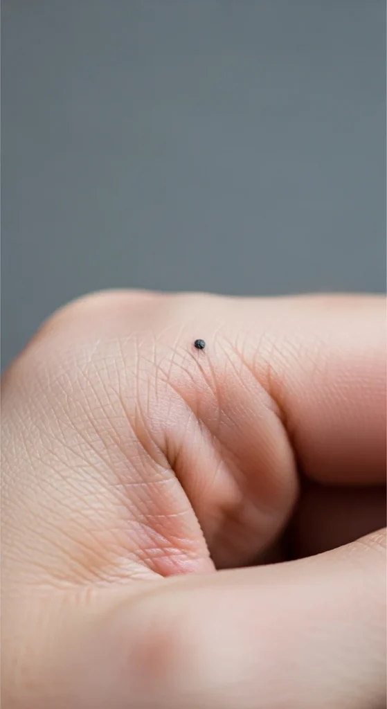
This sounds too simple, but it’s one of the smartest choices. A single dot holds better than most fine-line designs. There’s nothing to blur except the edge. It’s also the cheapest option and takes almost no time to complete. This works well if you’re unsure about finger tattoos. It lets you test how your skin heals without committing to something complex. You can always build on it later. Add more dots or connect them into a pattern. Placement is flexible—top, side, or near the knuckle. Just avoid going too small. A slightly larger dot ages better than a pin-sized one. If you want low risk, this is it.
12. Mini Infinity Symbol
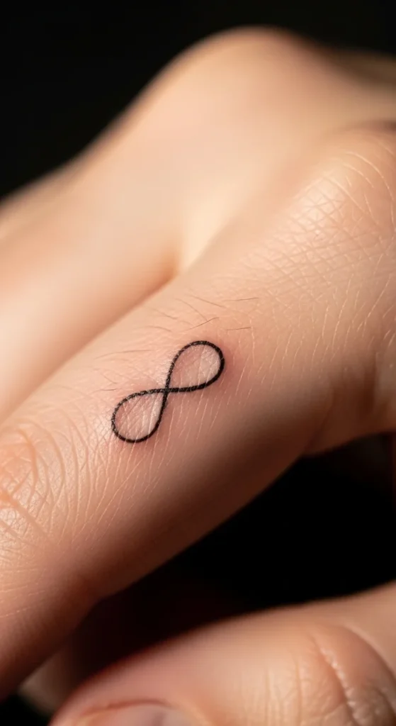
The infinity symbol is everywhere, but it still works when done right. The key is line weight. Too thin, and it fades into nothing. Too thick, and it loses its shape. Aim for balance. Keep it small but readable. Avoid adding names or script into it. That ruins the simplicity and ages badly. Place it on top of the finger for better visibility. This design is easy to touch up, which makes it practical long-term. It’s also quick, so you won’t spend much. If you want something safe and recognizable, this is a solid choice—just don’t overcomplicate it.
13. Tiny Cross Outline
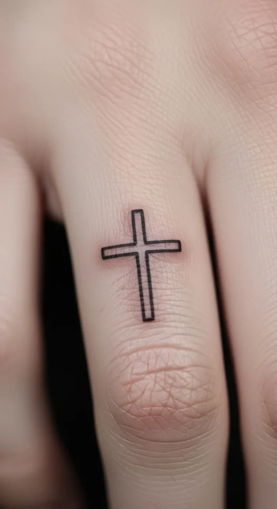
A cross works because it’s built from straight lines. Straight lines age better than curves on fingers. Keep it clean. No shading. No decorative edges. Just a simple outline. Placement on the top of the finger keeps it visible and reduces friction compared to the sides. Go slightly thicker than ultra-fine designs. That helps maintain structure over time. This is one of the more durable minimalist tattoos you can get on fingers. It’s also budget-friendly and quick to complete. If you want something meaningful without risking blur, this is a safe option.
14. Micro Lightning Bolt
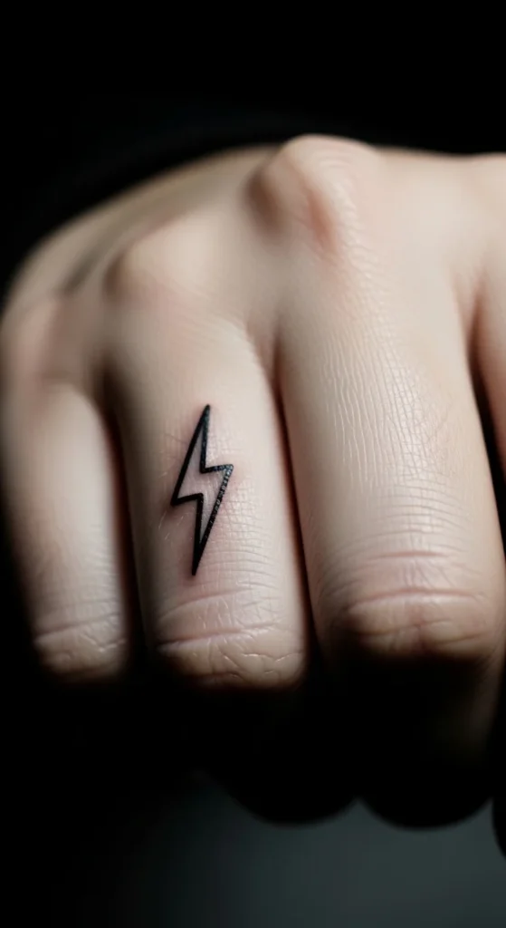
Sharp angles hold up better than soft curves. That’s why lightning bolts work well. Keep the shape clean and simple. Avoid gradients or shading. Those fade unevenly. A solid outline is enough to keep it recognizable. Placement on the top of the finger gives it more visibility and less wear. This design is quick to tattoo and easy to maintain. If it fades slightly, the shape still reads clearly. That’s what you want. Don’t overdesign it. The simpler it is, the better it survives.
15. Minimal Wave Line
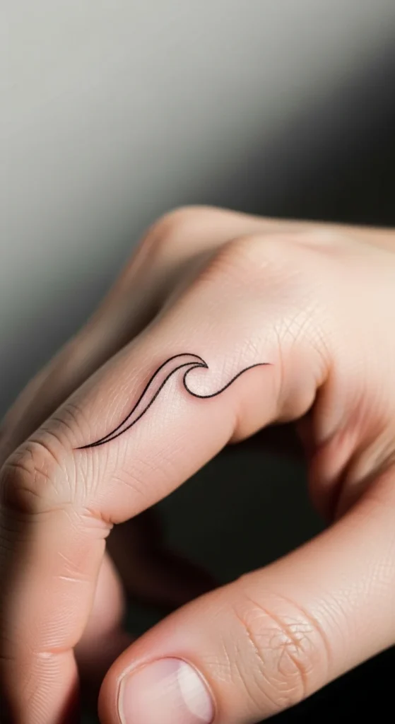
A wave line looks effortless, but thin curves fade fast. Make it slightly thicker than you expect. Keep the curve smooth and continuous. Avoid breaks or sharp points. Those weaken the design. Placement on the top of the finger works best for longevity. Side placement fades faster due to friction. This design is popular because it’s simple and flexible. It fits almost any finger without looking forced. It’s also easy to redo if needed. Just don’t go too thin. That’s where most people mess up.
16. Tiny Initial Letter
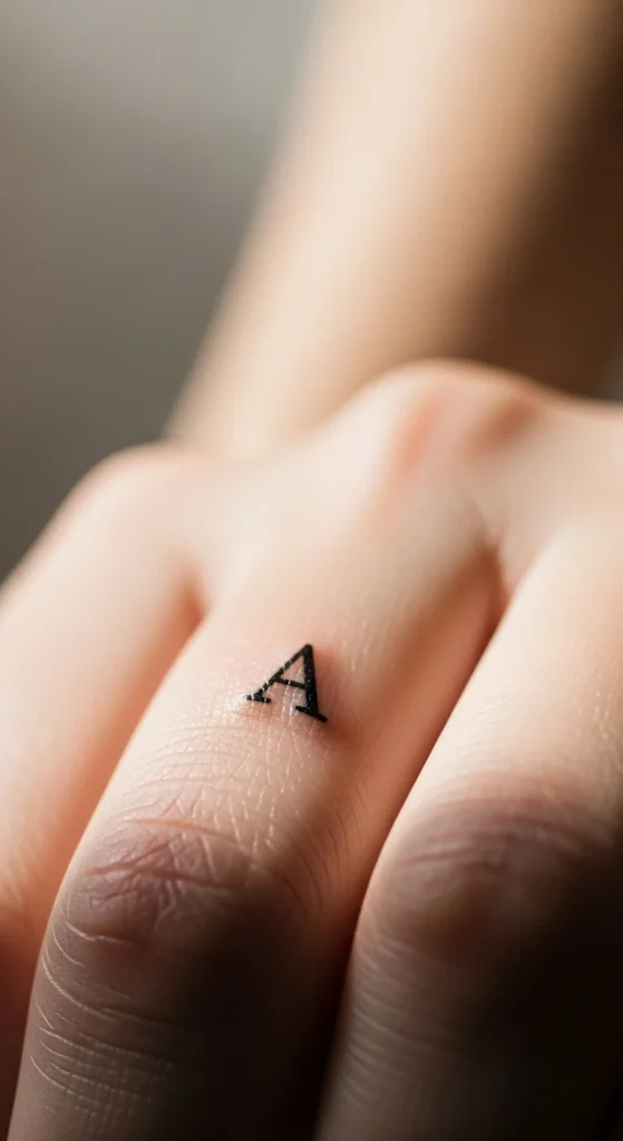
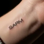
Letter tattoos are risky on fingers. Most fonts don’t age well. If you choose this, go with a simple, clean font. Avoid script or cursive styles. They blur quickly. Keep the letter slightly bold so it stays readable. Placement matters—top of the finger works better than the side. Keep it small but not microscopic. This design is personal, but it needs discipline. If you try to make it fancy, it won’t last. Keep it basic, or skip it entirely.
17. Small Roman Numerals
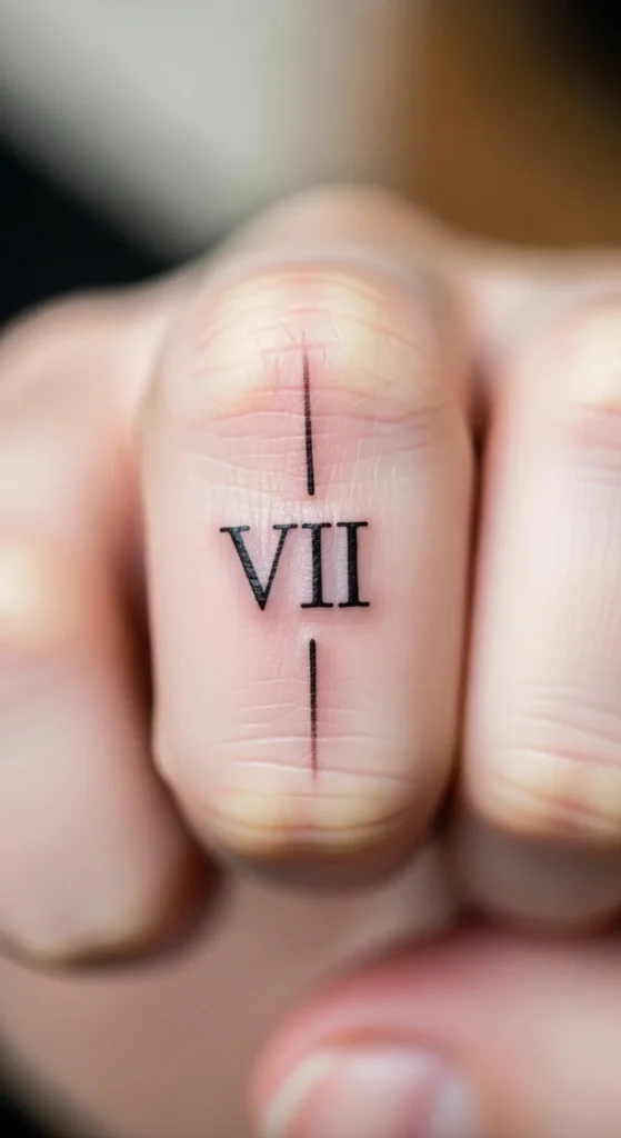
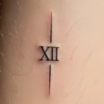
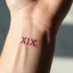
Roman numerals work better than regular numbers because they’re structured. Straight lines and spacing help them hold up longer. Keep the spacing tight so the design doesn’t look scattered. Avoid going too small. Tiny numerals blur into each other over time. Stick to a short sequence, not long dates. This keeps the design readable. Placement on the top of the finger gives better longevity. If you want something meaningful but clean, this is a better option than script dates.
18. Mini Arrow Symbol
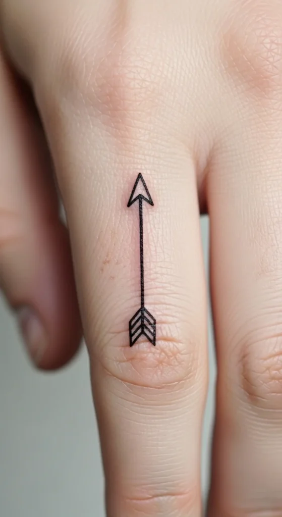
Arrows work because they’re linear and simple. A straight line with a pointed end holds shape better than detailed designs. Avoid feather detailing on the tail. That fades quickly. Keep it solid and minimal. Placement along the length of the finger works best. It follows the natural shape of the finger and looks intentional. This design is quick, cheap, and easy to maintain. If you want something that lasts longer with minimal effort, this is a practical choice.
19. Tiny Butterfly Outline

Butterflies are tricky. Most are too detailed for finger tattoos. Keep it as a simple outline. No inner wing patterns. No shading. Just the basic shape. That’s what helps it last. Slightly thicker lines help preserve the wings. Placement on the top of the finger gives better visibility and durability. This design works if you resist the urge to add detail. Keep it basic, and it stays recognizable longer.
20. Simple Anchor Tattoo
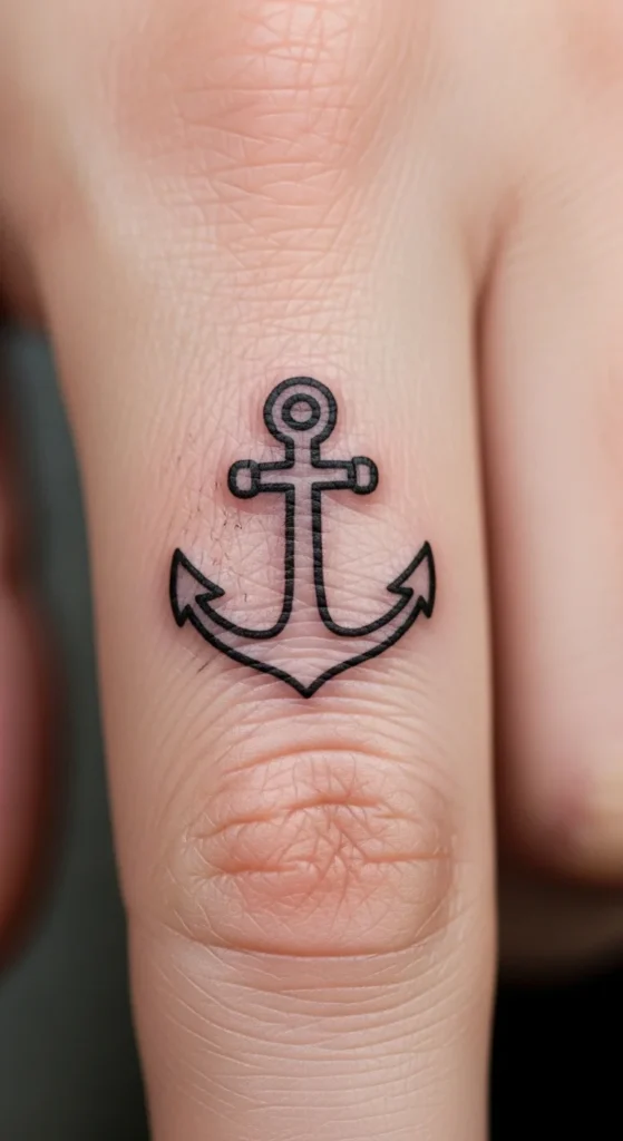
Anchors hold up well because of their structure. Thick lines and simple shapes make them durable. Avoid adding rope details or shading. Those don’t age well. Keep the anchor clean and bold. Placement on the top or side of the finger works fine. This design is reliable. It doesn’t rely on fine detail, so it survives fading better than most. If you want something stable and low-risk, this is a solid pick.
21. Mini Skull Outline
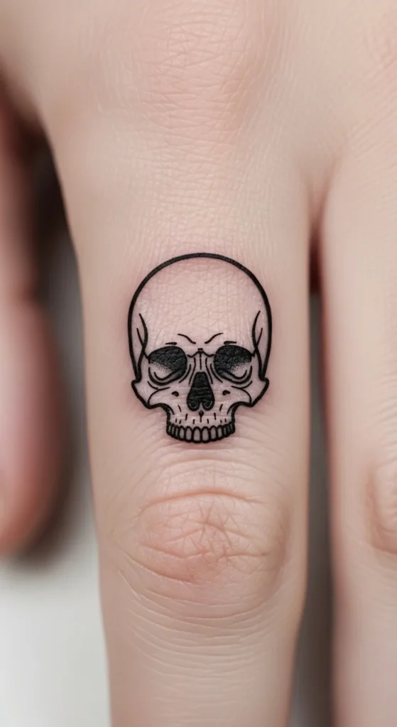
Skulls work if simplified. Most people ruin them with too much detail. Skip cracks, shading, and tiny features. Stick to a clean outline with basic eye and nose shapes. That keeps it readable over time. Slightly thicker lines help maintain structure. Placement on the top of the finger works best. This design can look sharp if you keep it minimal. Overdo it, and it turns into a blur quickly.
22. Tiny Crown Symbol
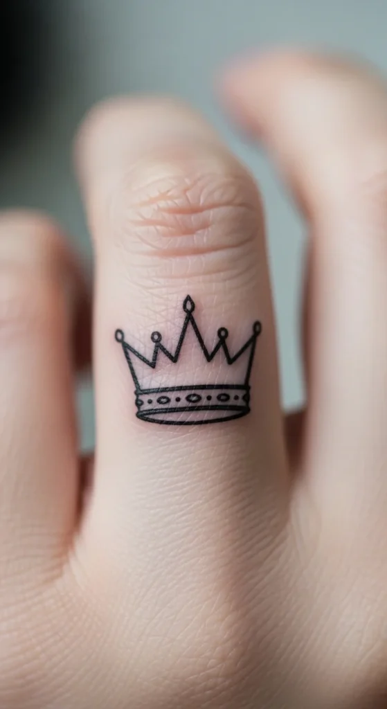
Crowns need restraint. Three points and a base line are enough. Don’t add jewels or decorations. Those details won’t hold. Keep the lines slightly bold so the shape stays intact. Placement on top of the finger gives better visibility. This design works because it’s symbolic and simple. If you keep it clean, it ages well. If you overdesign it, it won’t.
23. Small Sun Outline
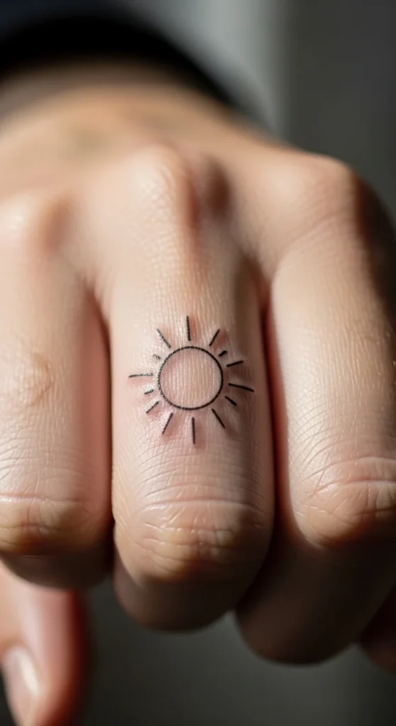
A sun works when it’s simple. A circle with short rays is enough. Keep the rays thick enough so they don’t fade unevenly. Avoid long thin rays. Those disappear fast. Placement on the top of the finger helps maintain visibility. This design is easy to execute and easy to maintain. It’s also flexible—you can keep it minimal or expand it later. Just don’t overcomplicate it.
24. Mini Cat Silhouette
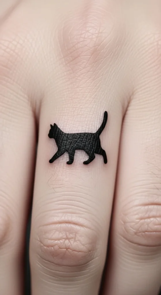
Silhouettes are your best friend on fingers. A cat shape is instantly recognizable without detail. Keep it as a clean outline. No facial features. No shading. Slightly thicker lines help it last longer. Placement on the side or top works depending on how visible you want it. This design is simple, affordable, and durable. That’s exactly what you want for finger tattoos.
25. Tiny Feather Line
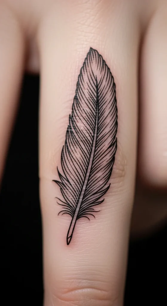
Feathers often fail because they’re too detailed. Keep it minimal. One central line with a few angled strokes is enough. Skip micro strands and shading. Those blur quickly. Make the lines slightly thicker so the feather shape holds. Placement on the top of the finger works best. This design only works if you simplify it. If it looks delicate on paper, it won’t last on skin.
26. Matching Couple Dots or Lines
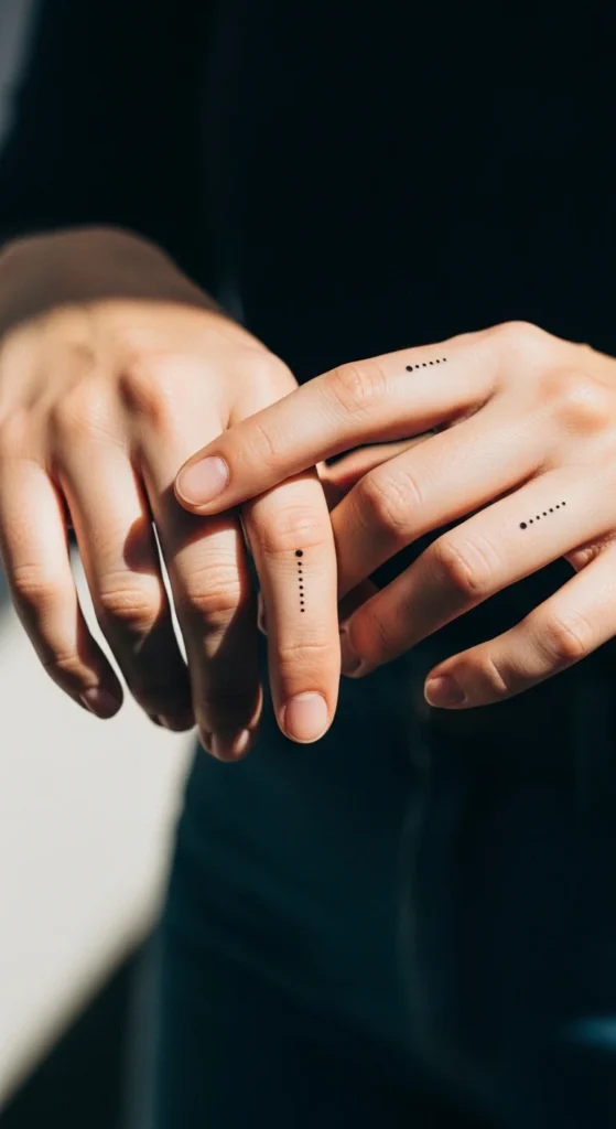
Matching tattoos usually age badly. Names and scripts fade unevenly. Dots or lines solve that problem. They’re simple, durable, and easy to maintain. A single dot or short line on each finger creates a connection without complexity. It’s also cheap and quick to do. If it fades, it’s easy to fix. This is the smartest option for couples who want something meaningful without long-term regret.
27. Multi-Finger Celestial Set
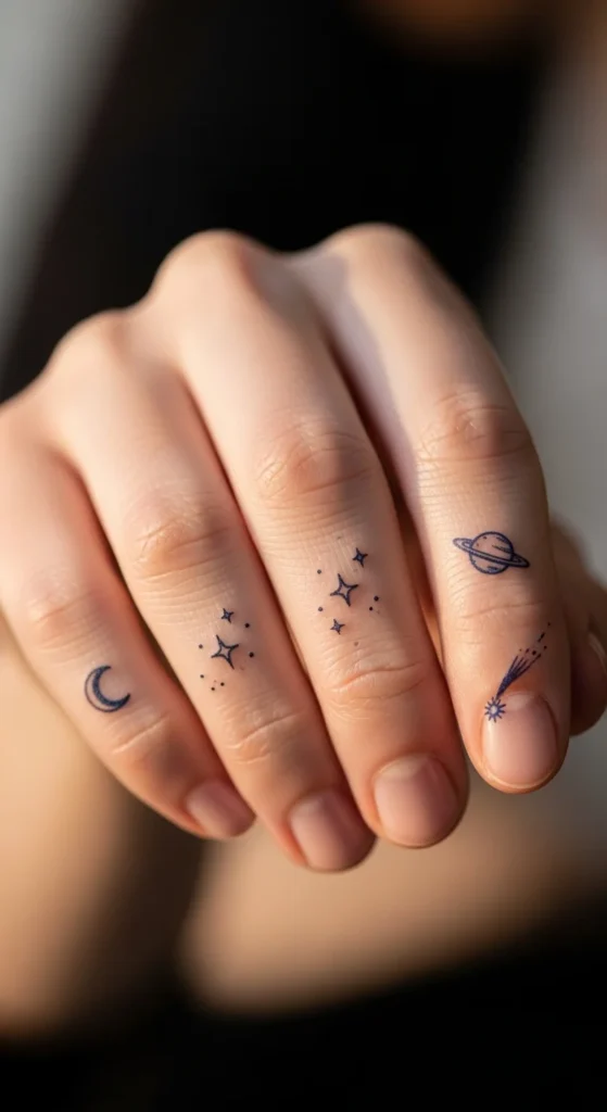
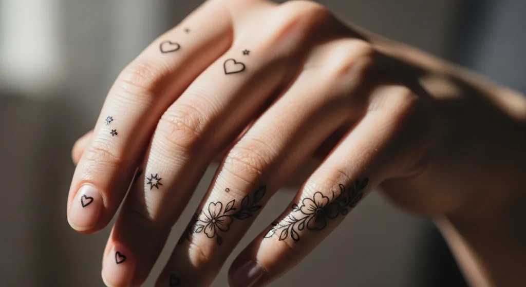
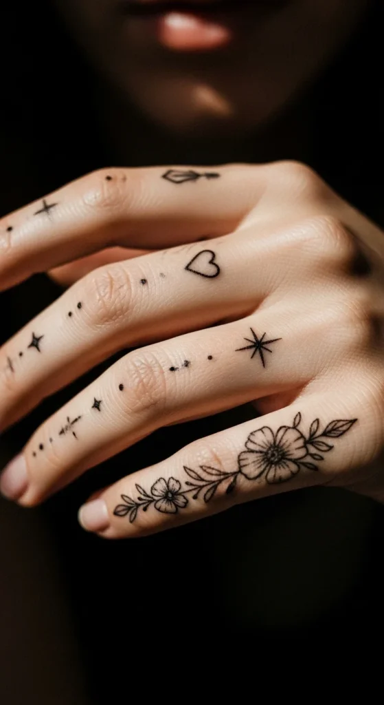
This is where most people get carried away. A multi-finger set looks good only if it’s controlled. Keep each finger minimal. One small symbol per finger. Don’t overcrowd. Stars, moons, and tiny dots work well together because they share a theme without competing. The mistake people make is adding too much detail across all fingers. That turns into visual noise fast. Space everything properly. Let each design breathe. If you’re working with a limited budget, build the set gradually instead of doing everything at once. That also lets you adjust based on how your skin heals. This approach looks intentional when done right, not chaotic.
Conclusion
Finger tattoos aren’t low-maintenance. That’s the part people ignore.
They fade faster. Need touch-ups. Punish bad design choices.
If you go too detailed or too thin, you’ll regret it. Simple designs with slightly bold lines last longer and look cleaner over time.
Test designs before committing. Keep expectations realistic. Budget for maintenance.
Do that, and your tattoo won’t just look good on day one—it’ll still look good months later.