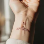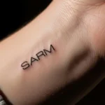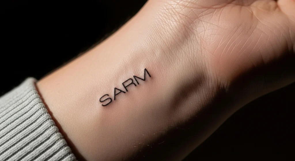
Tiny name tattoos seem simple—until you realize most of them end up looking exactly the same. A thin cursive name slapped on a wrist? That’s not meaningful, it’s predictable. If you’re going to permanently mark your skin, it should feel intentional, not like you picked it in five minutes off Pinterest.
The difference between a forgettable tattoo and one that actually works comes down to design decisions most people ignore.
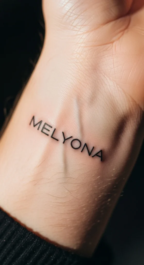
Start With Brutal Honesty: Is the Name Worth It?
Before fonts, placements, or trends—this is where most people mess up.
Name tattoos carry risk. Not stylistic risk—life risk.
Ask yourself:
- Will this name still matter in 5–10 years?
- Is this emotional or impulsive?
- Would you still get it if you couldn’t hide it?
If you hesitate, that’s your answer. People regret names, not designs.
Safer bets:
- Family (parents, kids)
- Yourself (your own name or initials)
- Deep, long-term bonds
Risky territory:
- Romantic partners (yes, even “forever” ones)
- Trends disguised as meaning
If you’re not 100% certain, use alternatives:
- Initials
- Morse code
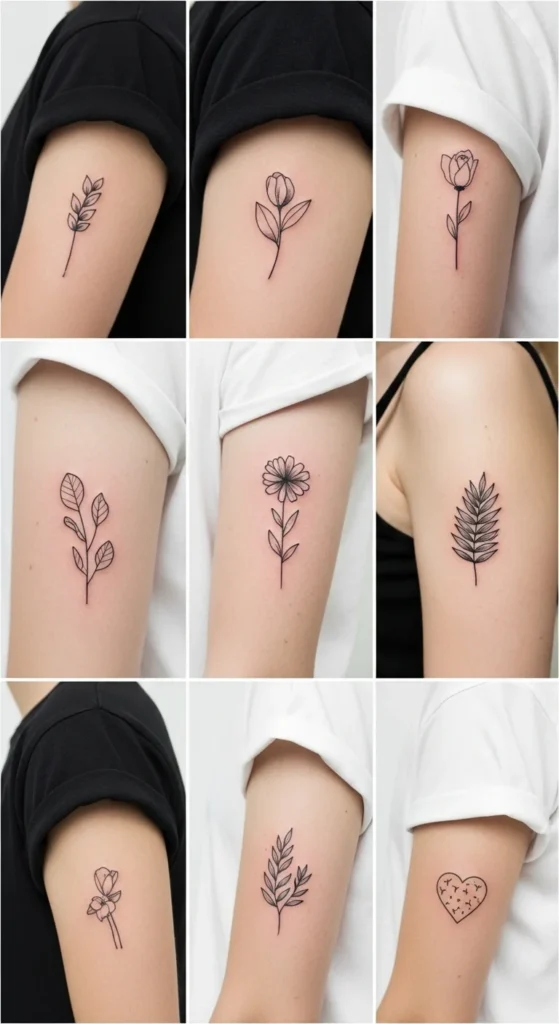
- Symbolic representation (flower, animal, object)
Choose a Font That Ages Well (Not Just Looks Good Today)
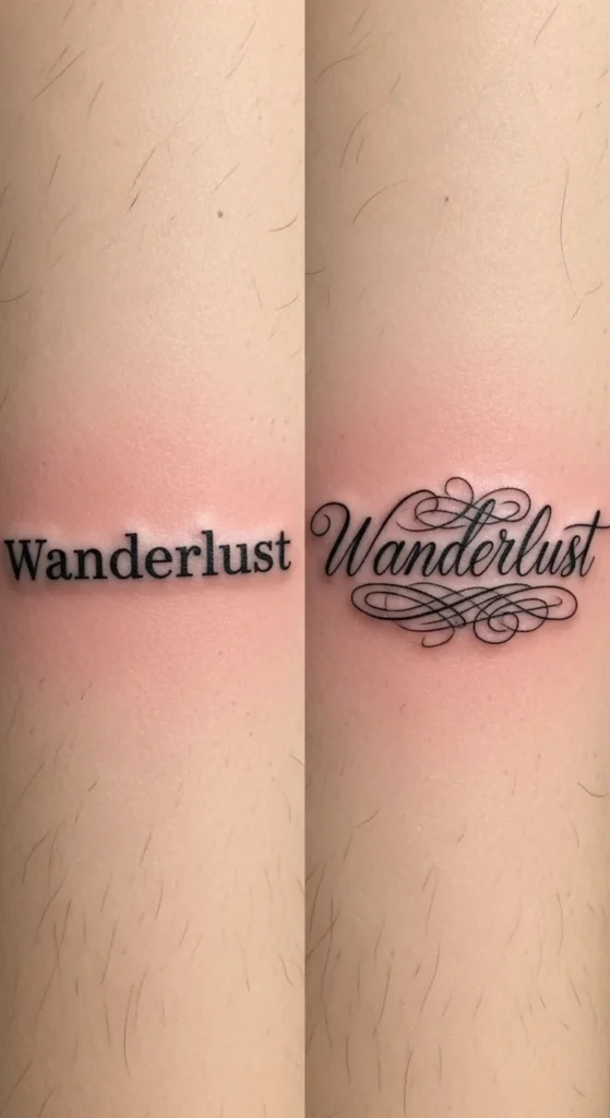
Most “bad” small tattoos fail because of poor font choice. Thin, overly decorative scripts blur into a mess over time.
You don’t want pretty—you want legible after 5 years.
Best options:
- Clean sans-serif (like Helvetica-style)
- Simple fine-line script (minimal swirls)
- Hybrid fonts (slight personality without complexity)
Avoid:
- Ultra-thin cursive with loops
- Tight letter spacing
- Fonts designed for print, not skin
Think of your skin like paper that stretches and fades. If the letters are already tight and delicate, they won’t survive.
Size Matters More Than You Think
Everyone wants “tiny.” That’s where things go wrong.
Ink spreads. Skin changes. What looks sharp today can turn into a blur in a few years.
Reality check:
- Anything under ~1 inch risks losing clarity
- Letters need breathing room
- Fine lines thicken over time
Smart move:
- Increase size by ~20% from what you think you want
- Slightly widen spacing between letters
You won’t regret going a bit bigger. You will regret unreadable ink.
Placement: Stop Picking Based on Trends
Wrist tattoos are popular—but popularity isn’t strategy.
Placement should match:
- Your lifestyle (can you show it daily?)
- Skin movement (flat vs stretchy areas)
- Long-term aging
Best placements for small name tattoos:
- Inner forearm (balanced visibility + stability)
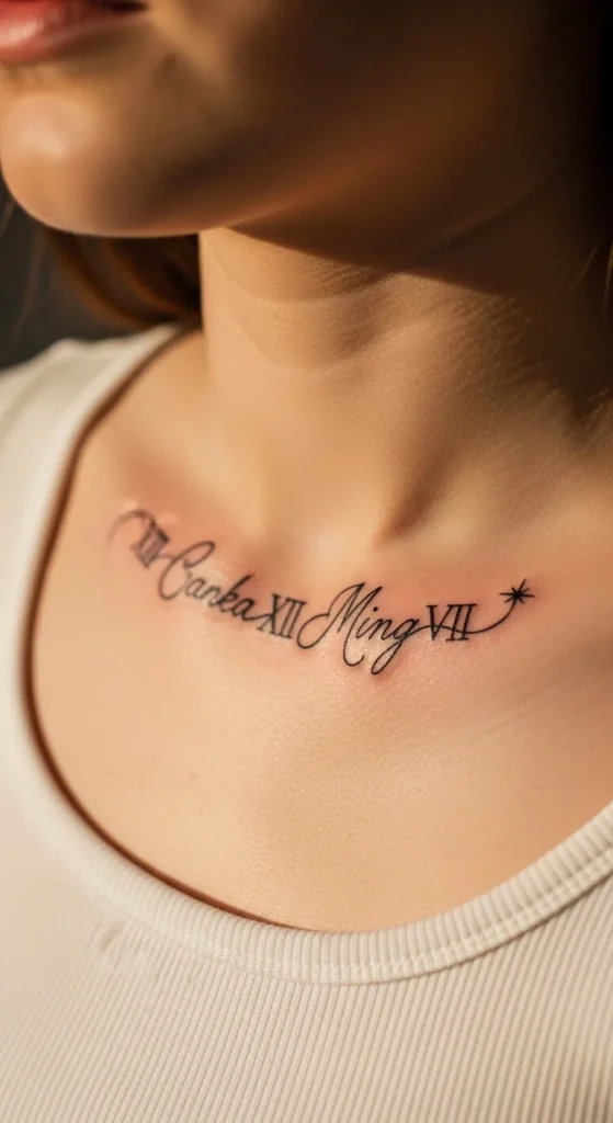
- Collarbone (clean, elegant flow)
- Upper arm (low distortion)
Good for discretion:
- Behind the ear
- Ankle/foot (but fades faster)
Avoid:
- Fingers and joints (they blur and fade fast)
- Highly stretched areas (like sides of fingers or elbows)
Add Depth Without Making It Complicated
A name alone can look… basic. The trick isn’t adding more—it’s adding meaning strategically.
Simple upgrades that work:
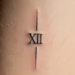
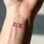
- Pair with Roman numerals (birthdate)
- Add a tiny symbol (star, heart, leaf)
- Use vertical or stacked layout for multiple names
- Incorporate spacing or alignment for design balance
Smarter alternatives:
- Morse code version of the name
- Initials with symbolic element
- Nickname represented visually (e.g., olive branch for Olivia)
You don’t need to decorate heavily. You need to design intentionally.
Test Before You Commit (Most People Skip This)
If you’re not previewing your tattoo beforehand, you’re guessing—and that’s careless.
Use:
- Font preview tools
- Temporary tattoo prints
- Digital mockups on your actual skin photo
Look at it for a few days. Not minutes.
Ask yourself:
- Does it still feel right after a week?
- Is it readable at a distance?
- Does it match your personal style?
If you’re rushing this step, you’re not thinking—you’re reacting.
Your Artist Matters More Than Your Idea
A great concept with a mediocre artist turns into a mediocre tattoo.
Micro lettering is precision work. Not every artist can do it well.
What to check:
- Clean, crisp healed lettering (not fresh tattoos only)
- Consistent line weight
- No ink blowouts or shaky lines
If their portfolio doesn’t show strong small lettering work, don’t gamble.
Also—don’t go cheap. A low-budget tattoo is usually a long-term mistake.
Keep It Simple, But Not Lazy
Minimalist doesn’t mean thoughtless.
A strong small name tattoo:
- Has intentional font choice
- Uses appropriate size and spacing
- Fits the body naturally
- Holds meaning beyond impulse
Most “basic” tattoos fail because they’re rushed, copied, or emotionally reactive.
Yours doesn’t have to be.
Final Takeaway
If you’re serious about getting a small name tattoo, stop chasing trends and start making deliberate choices. The goal isn’t just something that looks good today—it’s something that still makes sense years from now.
Design it like it matters. Because it does.
Save this guide before you book your appointment—you’ll need it when you’re tempted to rush the decision.