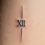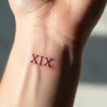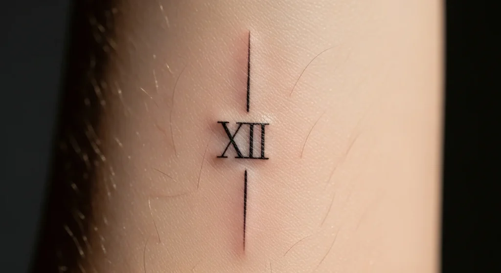
There’s a fine line between a Roman numeral tattoo that looks timeless… and one that turns into an unreadable blur in five years. Most people don’t realize this until it’s too late. The truth? Clean-looking micro tattoos aren’t about taste—they’re about precision, planning, and brutal honesty about what will actually age well.
If you’re thinking of getting one, stop romanticizing it for a second. Design choices matter more than meaning.
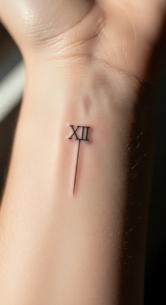
Start With the Right Date Format (Most People Get This Wrong)
Here’s where people mess up immediately: they convert the date casually or inconsistently.
You need to lock the structure first—not later.
Best approach:
- Use MM.DD.YYYY if you want clarity and balance
- Keep spacing consistent (dots or small gaps)
- Avoid mixing formats (like DD/MM/YYYY vs MM/DD/YYYY confusion)
Example:
- July 4, 1990 → VII.IV.MCMXC
What kills clean design:
- Overly long numerals crammed into tiny space
- Inconsistent spacing between sections
- Trying to “stylize” before getting the base right
If the structure looks messy on paper, it will look worse on skin.
Choose Size Based on Longevity, Not Aesthetic Ego
You might want something tiny. Your skin doesn’t care.
Fine-line tattoos spread over time. If your numerals are too small, they’ll merge into a blob.
Non-negotiable rules:
- Minimum 1–1.5 cm height per numeral
- Increase size by at least 20% from your initial idea
- Leave breathing space between characters
Reality check:
That ultra-micro tattoo you saw online? It either:
- Was freshly done, or
- Will age badly
No exceptions.
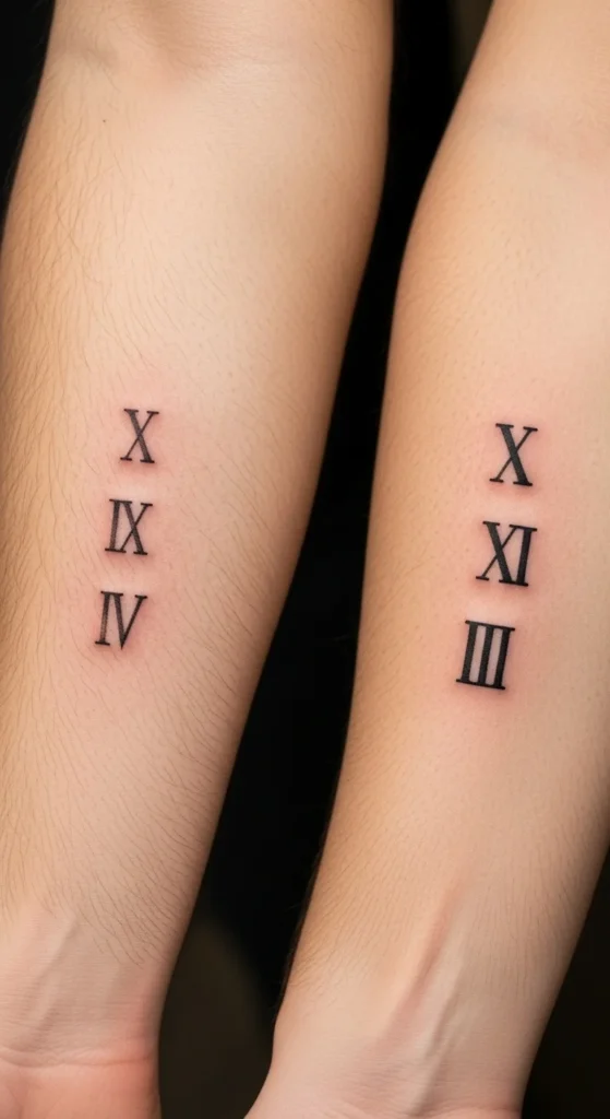
Pick Placement That Works With Your Body (Not Against It)
Placement is where most “clean” designs fail.
Skin moves. Some areas distort more than others. If you ignore that, your tattoo won’t stay sharp.
Best placements for clean numerals:
- Inner wrist (follows natural curve)
- Forearm (stable, low distortion)
- Collarbone (subtle and structured)
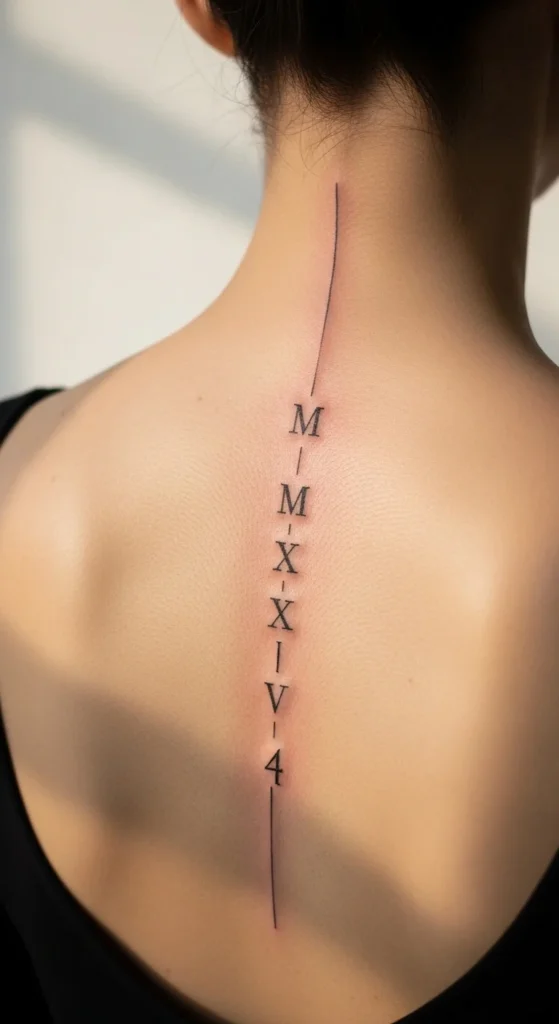
- Spine/ribs (great for vertical layouts)
Avoid:
- Fingers and knuckles (high stretch, fast fading)
- Joints (constant motion = blur)
- Areas with frequent friction
Blunt truth:
If you choose placement for aesthetics only, expect compromised results.
Decide Between Horizontal vs Vertical Layout
This is where style meets anatomy.
Horizontal (classic, readable)
- Best for wrist and forearm
- Easy to read at a glance
- Works well for longer dates
Vertical (modern, trending)
- Ideal for spine or ribs
- Looks more elegant and elongated
- Requires precise spacing to avoid clutter
Don’t guess—test both layouts first.
Typography Matters More Than You Think
Not all Roman numerals are equal. Font choice determines whether your tattoo looks refined or amateur.
Two main directions:
Fine-line minimalist
- Clean, thin strokes
- Modern look
- Needs a skilled artist to avoid fading
Serif (classic Roman style)
- Small decorative edges
- Slightly heavier weight
- Ages better if done right
Smart move:
Combine subtle serif with fine-line technique for balance.
Bad move:
- Overly thin lines with no structure
- Heavy bold fonts that bleed together over time
Keep It Black Ink—No Experiments
This isn’t the place to get creative with color.
Why black works:
- Highest contrast across all skin tones
- Ages predictably
- Maintains sharpness longer
Color fades unevenly. Roman numerals rely on precision. That combination doesn’t work.
Simple rule:
If it’s not black, it won’t stay clean.
Test Your Design Before You Commit
If you’re skipping this step, you’re being careless.
Use a digital preview or even draw it on your skin.
Check for:
- Spacing between numerals
- Readability from a distance
- Flow with your body line
Even better:
- Print it out at actual size
- Place it on your skin
- Live with it for a few days
Most people rush here—and regret it later.
Choose the Right Artist (This Is Where You Either Win or Lose)
A “good tattoo artist” isn’t enough.
You need someone who specializes in:
- Fine-line work
- Micro lettering
- Precision detail
Red flags:
- No healed tattoo examples
- Only bold or large designs in portfolio
- Inconsistent line thickness
What to look for:
- Crisp, straight lines
- Even spacing
- Healed work that still looks clean
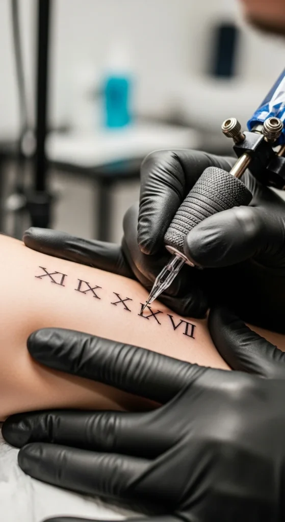
Think Beyond the Numerals (Optional but Powerful)
If you want something slightly more personal without ruining the minimalism:
Subtle additions:
- Small coordinates beside the date
- Tiny symbol (heart, star, cross)
- Light floral framing
Don’t overdo it.
The moment it gets busy, it stops looking clean.
Minimalism isn’t about adding less—it’s about knowing when to stop.
Final Thought: Clean Tattoos Are Ruthless by Design
A small Roman numeral tattoo looks effortless—but it’s not forgiving.
Every flaw shows:
- Bad spacing
- Poor placement
- Weak line work
If you cut corners, it will show permanently.
If you do it right, though?
You get something subtle, personal, and timeless.
Your move:
Don’t rush it. Test it. Challenge your design decisions. Then commit.
Save this guide before you make a decision—you’ll need it.