Mixing tattoo styles can look bold, artistic, and deeply personal—or completely chaotic if it’s not done thoughtfully. The difference comes down to balance, intention, and flow. Whether you already have tattoos in different styles or you’re planning your next piece, learning how to mix styles the right way helps everything feel cohesive instead of random. This guide breaks it down in a simple, stress-free way.
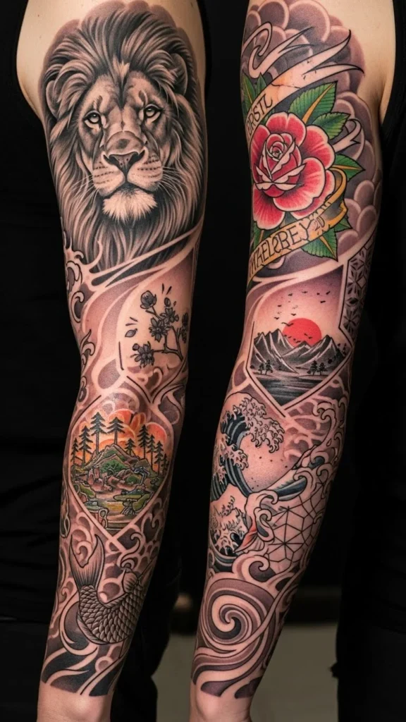
Start With One Dominant Style
The easiest way to mix tattoo styles is to choose one main style as your anchor.
Your dominant style:
- Appears most often
- Covers larger areas
- Sets the overall mood
Examples:
- Black and grey realism as the base, with small fine-line accents
- Traditional tattoos as the core, with minimal filler pieces
- Ornamental patterns supported by soft illustrative elements
When one style leads, others can support it without fighting for attention.
Keep Line Weight Consistent
Line weight is one of the biggest reasons mixed styles clash.
What to watch for:
- Super thin lines next to thick, bold outlines
- Heavy traditional linework beside ultra-delicate fine-line pieces
- Inconsistent edge sharpness
How to fix it:
- Ask artists to slightly adjust line thickness
- Use medium-weight lines as a middle ground
- Separate extreme styles with spacing or connectors
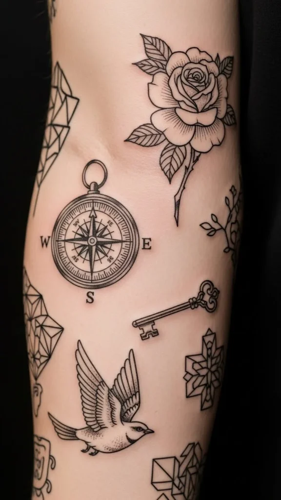
Consistent line weight acts like visual glue.
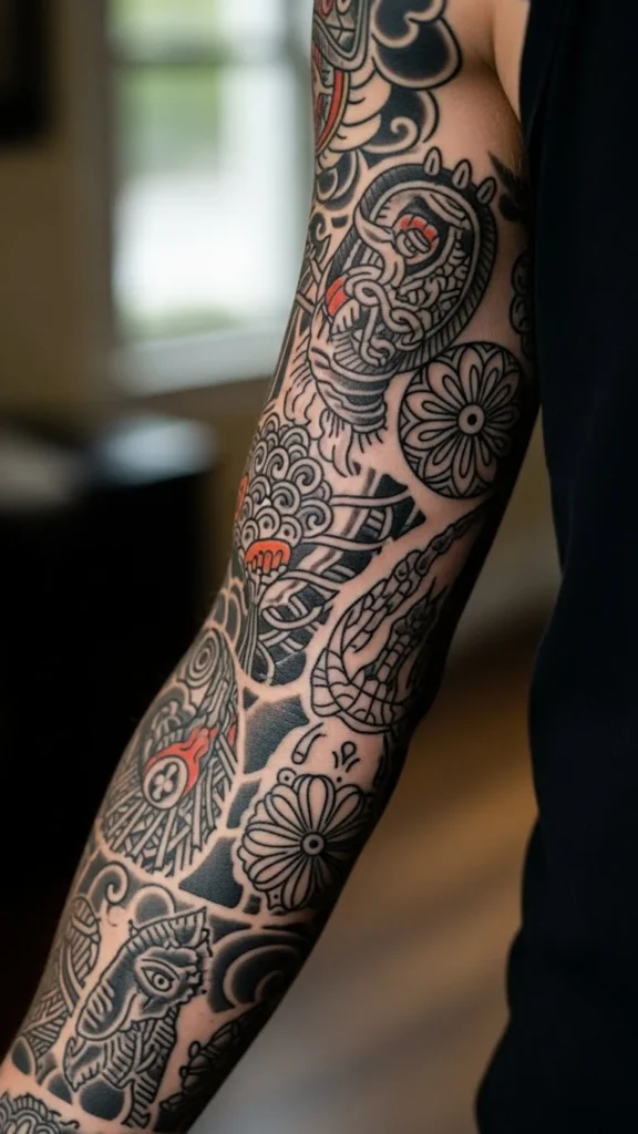
Use Color (or Lack of It) as a Unifier
Color choices can make or break mixed styles.
Ways to keep things cohesive:
- Stick to black and grey across all styles
- Limit color to a shared palette
- Use color sparingly as accent pieces
For example:
- Blackwork tattoos paired with small red highlights
- Color realism mixed with traditional using the same hues
Random color placement is one of the fastest ways to create visual chaos.
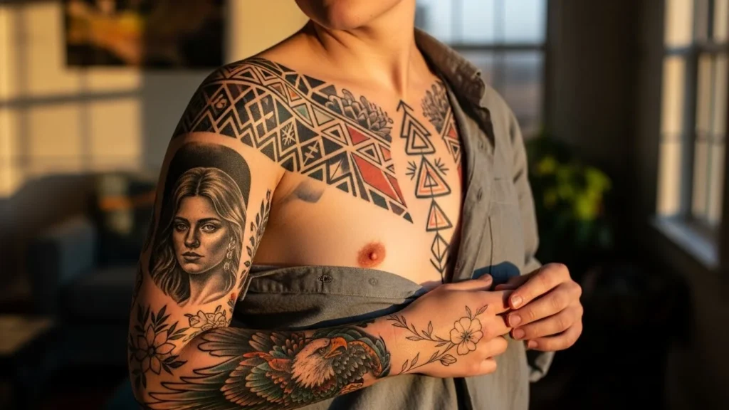
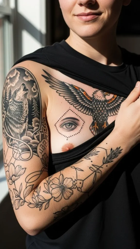
Separate Styles With Intentional Placement
Where tattoos sit on the body matters as much as how they look.
Smart placement ideas:
- One style per limb or section
- Heavier styles on larger areas (chest, back, thighs)
- Lighter styles on arms, ribs, or calves
Avoid stacking very different styles directly next to each other with no transition.
Spacing gives the eye time to adjust.
Use Connectors to Blend Styles Smoothly
Connectors help bridge the gap between different aesthetics.
Popular connector options:
- Soft shading or dotwork
- Florals or vines
- Smoke, clouds, or abstract lines
- Simple geometric patterns
These elements don’t belong to one specific style—which is exactly why they work.
Think of connectors as transitions, not main features.
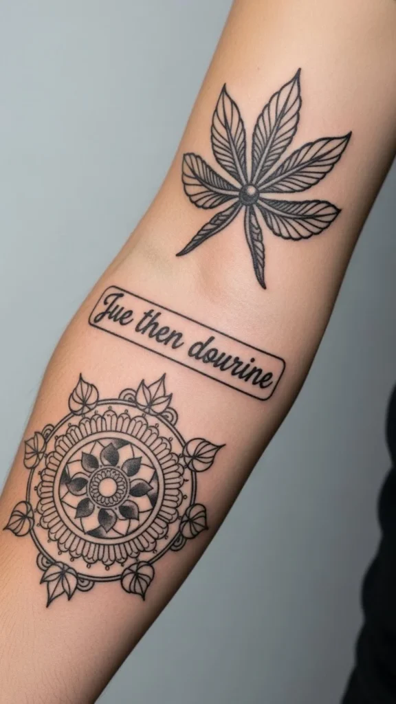
Match Detail Levels (This Is Huge)
Even if styles differ, detail levels should feel balanced.
Watch out for:
- Hyper-realistic tattoos next to very simple cartoons
- Highly detailed pieces beside empty, flat designs
Better pairings:
- Detailed realism + detailed illustrative work
- Minimal fine-line + minimal symbols
- Bold traditional + bold graphic designs
If one tattoo is shouting and the other is whispering, they’ll clash.
Stick to a Consistent Mood
Mood is more important than matching styles.
Questions to ask:
- Do these tattoos feel dark, soft, playful, or serious?
- Do they tell similar emotional stories?
- Would they look strange together in one photo?
A spooky blackwork tattoo next to a cute cartoon can work—but only if that contrast is intentional.
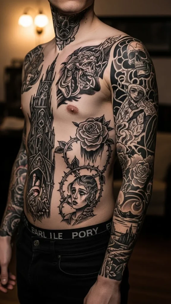
Intentional contrast feels artistic. Accidental contrast feels messy.
Communicate With Your Artist (Every Time)
Never assume an artist will “just know” your plan.
Tell them:
- You’re mixing styles intentionally
- What styles you already have
- What you want the final look to feel like
Great artists will:
- Adjust designs for cohesion
- Suggest placement changes
- Warn you if something might clash
An artist who cares about the big picture is gold.
Take Your Time (Mixing Styles Is a Long Game)
Mixing tattoo styles isn’t about instant perfection.
Helpful mindset:
- Build slowly
- Leave space between pieces
- Re-evaluate after each tattoo
Rushing to fill space often leads to regret.
Final Takeaway
Mixing tattoo styles without clashing comes down to intention, consistency, and smart spacing. Choose a dominant style, keep line weight and mood aligned, and use connectors to tie everything together. When done right, mixed styles don’t compete—they complement.