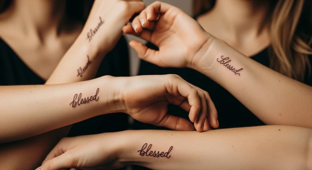
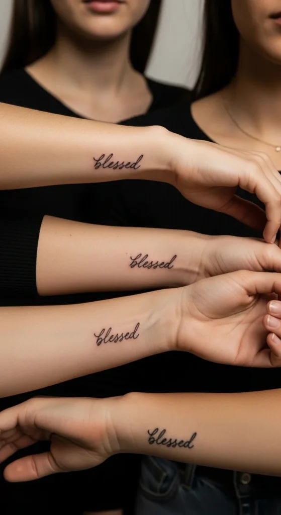
Cursive “blessed” tattoos keep showing up for a reason. They’re simple, personal, and easy to style in a way that actually fits your body instead of fighting it. But here’s the problem—most people copy the same generic script and regret it later. The difference between a tattoo that feels meaningful and one that feels basic comes down to placement, flow, and personalization. This list cuts through the repetition and gives you ideas that actually work in real life, not just on Pinterest boards.
1. Elegant Forearm Flow Script
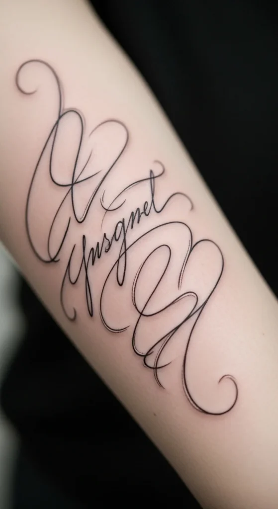
A forearm script works because it follows your body’s natural shape. That’s what makes it look clean instead of forced.
Go with a slight diagonal flow, not straight across. Straight text looks stiff on a curved surface.
Keep the line weight balanced. Too thin fades. Too thick loses elegance.
Budget tip: don’t chase “designer fonts.” Ask your artist to tweak a simple script. That costs less and looks better.
DIY move: write the word yourself. Even if it’s rough, it gives your artist something real to refine.
Limit flourishes. One tail or curve is enough. Anything more starts looking decorative instead of meaningful.
2. Minimal Wrist Fine-Line Script
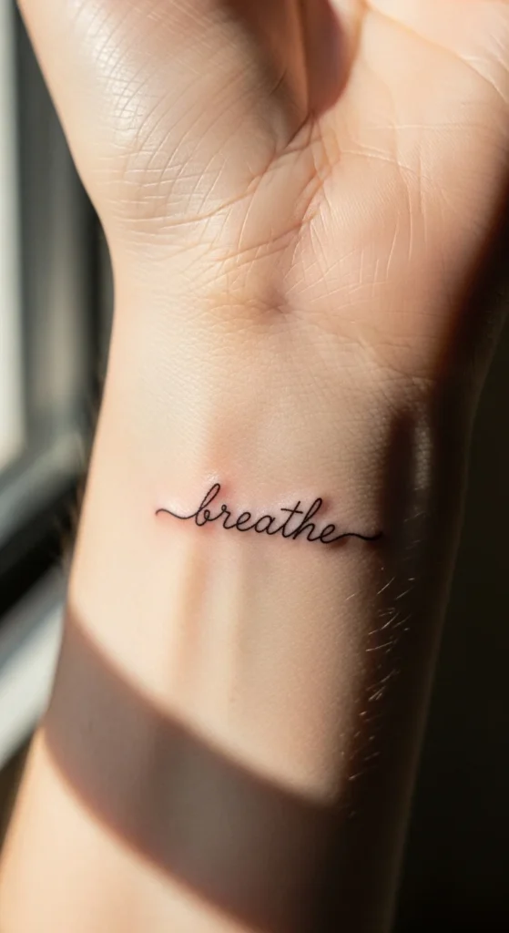
Wrist tattoos look delicate, but they age faster than most placements.
Keep it small and simple. No extra swirls. No stacked words.
Place it slightly above the wrist crease. That area holds ink better.
Budget tip: small tattoos still have a minimum charge. Don’t expect it to be cheap just because it’s tiny.
DIY test: draw it with a pen and live with it for a few days. If it smudges visually, it’s too detailed.
Pick a font that stays readable even when it fades.
3. Vertical Neck Script
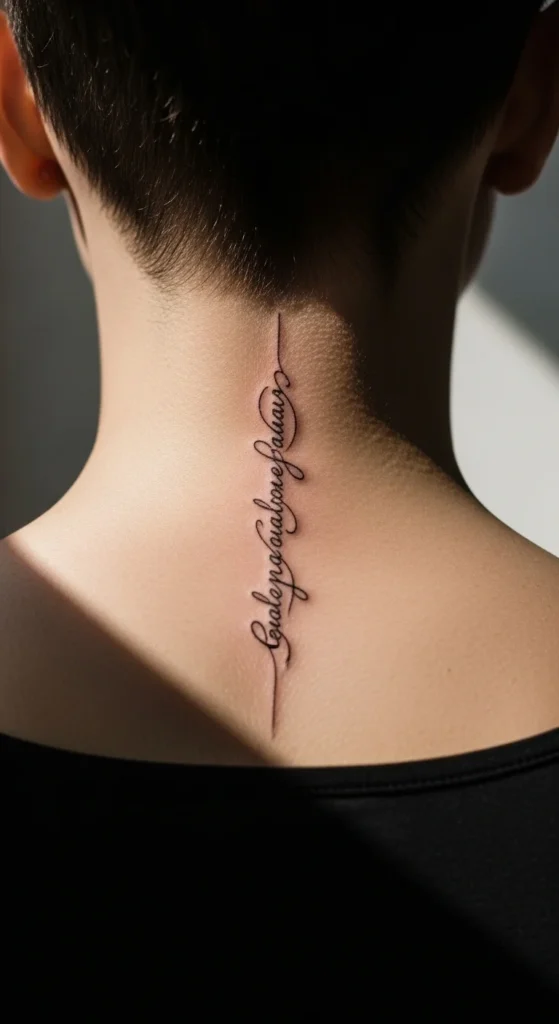
This placement gets attention whether you want it or not.
A vertical layout works because it matches your spine line. That’s why it looks intentional.
Space letters slightly wider than usual. Tight cursive turns into a blur later.
Budget tip: don’t cut corners here. Fixing neck tattoos is expensive and difficult.
Try a temporary version first. See how it feels in daily life.
4. Handwritten Personal Script
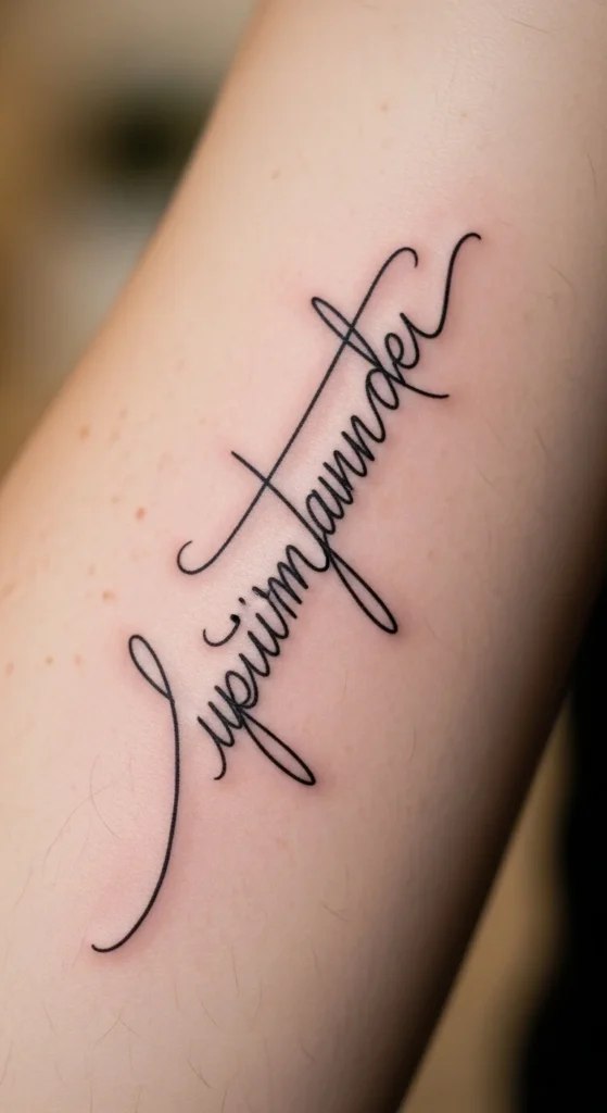
Most people copy fonts. That’s why their tattoo looks generic.
Write it yourself. That alone makes it different.
Your artist can clean spacing and balance without removing your style.
Budget tip: skip buying templates online. Your handwriting costs nothing.
Test it on paper and on skin. Adjust until it feels right.
5. Cursive with Subtle Flourishes
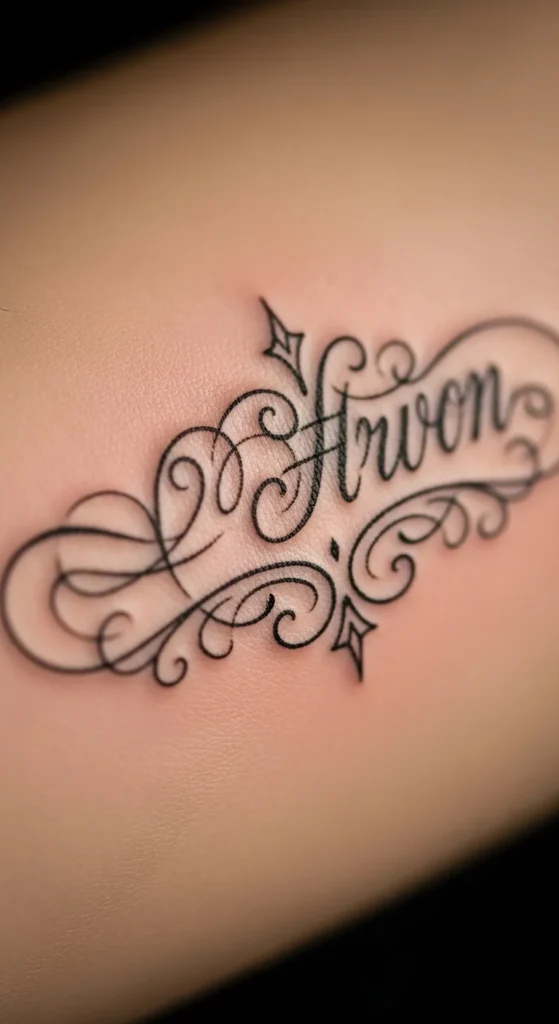
Flourishes can look refined or messy. Most people overdo them.
Stick to one accent. Either at the start or end.
Think of it like a signature, not decoration.
Budget tip: more detail means more time. Simpler designs cost less.
Always review the stencil carefully before committing.
6. Collarbone Curve Script
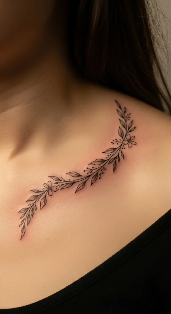
This placement works because it follows a natural line.
Don’t center it perfectly. Shift it slightly for a more natural feel.
Stretch the letters a bit wider. It helps prevent distortion.
Budget tip: avoid going too small. Tiny designs here can look cramped.
Wear loose clothing during healing to protect the area.
7. “Blessed & Grateful” Phrase Extension
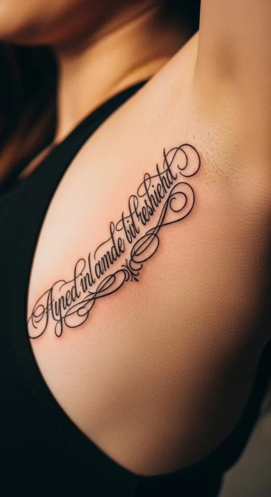
Adding words sounds easy, but spacing becomes critical.
Keep “blessed” slightly more dominant. Let the second word sit lighter.
Avoid stacking too tightly. It creates visual clutter later.
Budget tip: longer phrases increase cost. Trim unnecessary words.
Best placement is ribs or forearm for enough space.
8. Tiny Behind-the-Ear Script
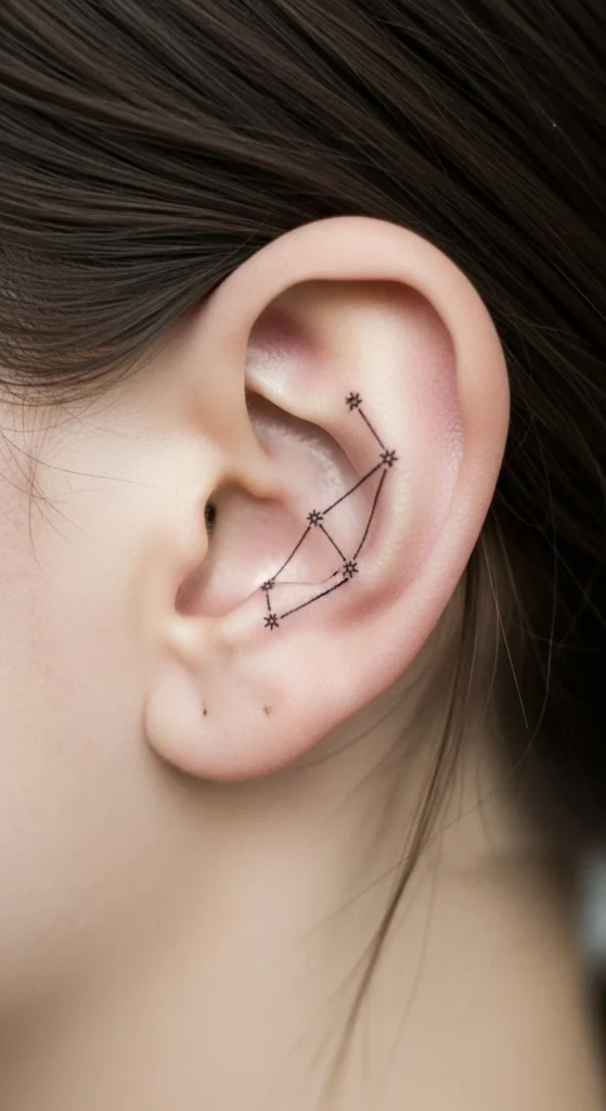
This is about subtle placement.
Keep it extremely simple. No extra styling.
Expect faster fading in this area.
Budget tip: plan for touch-ups. This spot needs maintenance.
Works best if you want something private and minimal.
9. Ribcage Vertical Stack Script
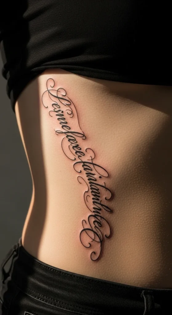
Vertical stacking uses space efficiently.
It also creates a clean, elongated look.
Keep spacing consistent between letters.
Budget tip: ribs are more painful. Short sessions help manage cost and comfort.
Test placement with a temporary design first.
10. Fine-Line Collarbone Minimal Script
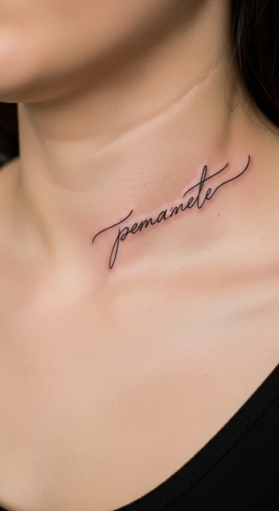
Minimal designs look clean but require precision.
Use slightly thicker lines than trending ultra-thin styles.
Keep the design short.
Budget tip: fewer details reduce time and cost.
Avoid adding extra symbols unless necessary.
11. Inner Arm Soft Script
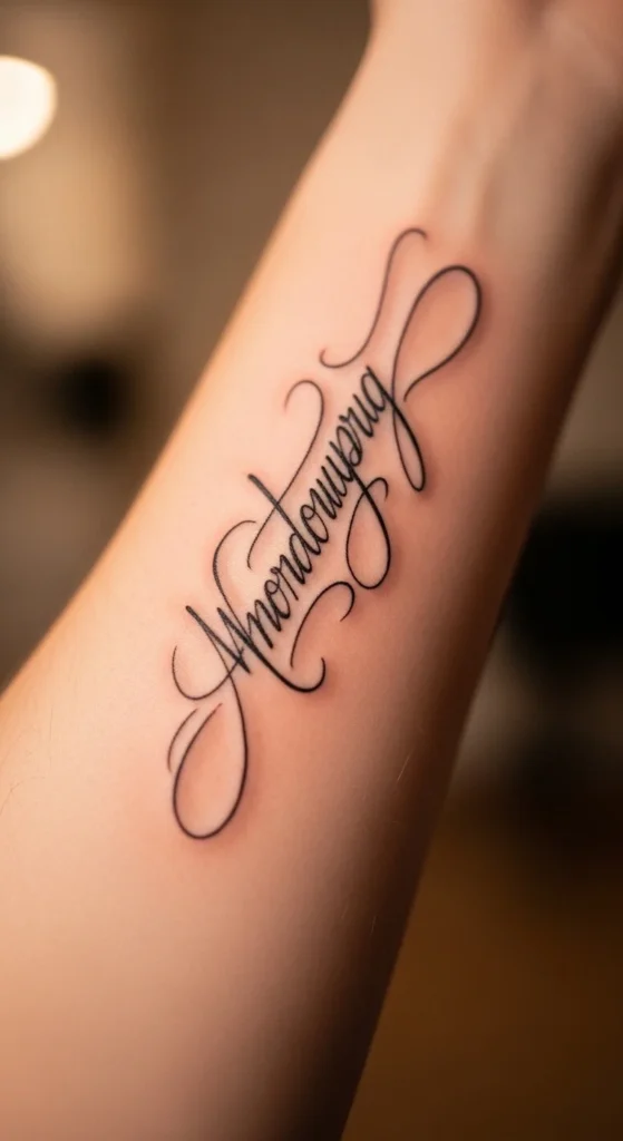
Inner arm placement feels more personal.
It’s less exposed, which helps with long-term satisfaction.
Keep the script smooth and readable.
Budget tip: this area heals well, reducing need for touch-ups.
Choose a design that flows with your arm shape.
12. Armband Cursive Wrap
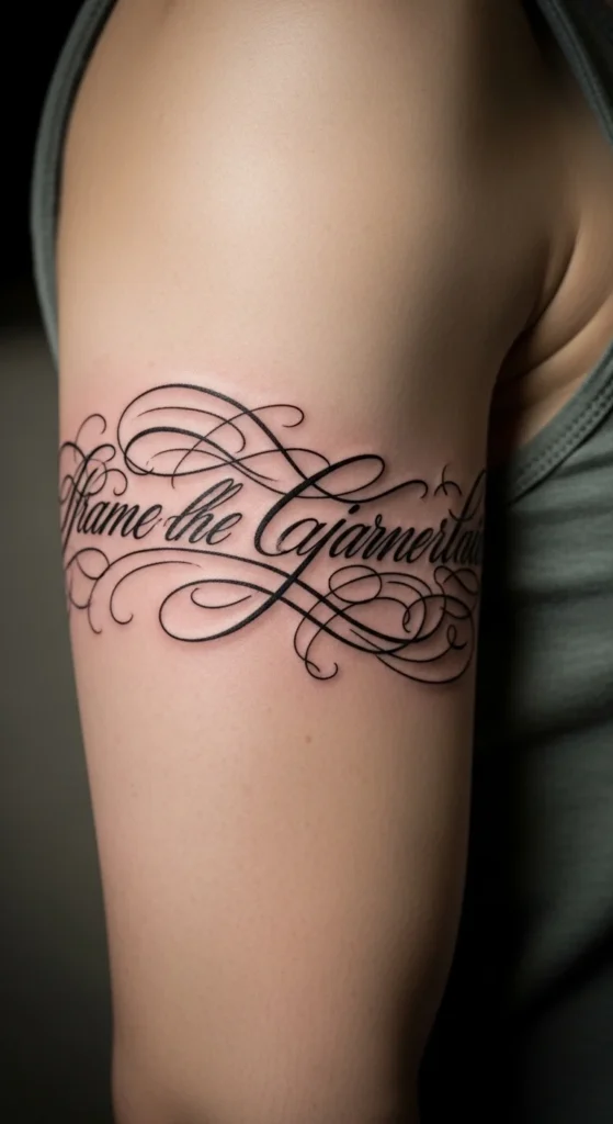
This style mimics jewelry.
Keep spacing even around the arm.
Avoid overly long words.
Budget tip: wrapping designs take longer. Keep it simple to save cost.
Test alignment carefully before tattooing.
13. Side Neck Bold Script
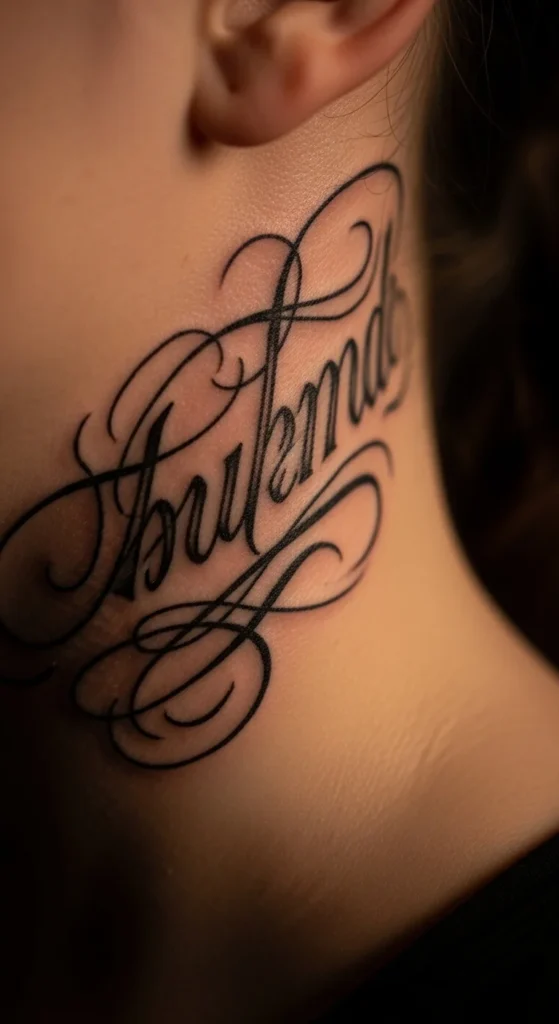
This is a statement placement.
Use thicker lines for better visibility.
Avoid excessive flourishes.
Budget tip: bold designs age better, reducing future costs.
Think carefully before choosing this level of visibility.
14. Shoulder Script with Floral Accent
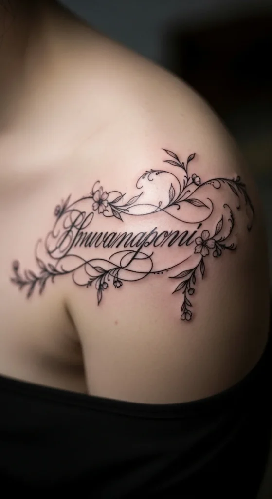
Florals can add depth if done lightly.
Keep flowers small and secondary.
Don’t let them overpower the word.
Budget tip: fewer elements keep the price manageable.
Choose simple floral outlines instead of detailed shading.
15. Gothic Cursive Twist
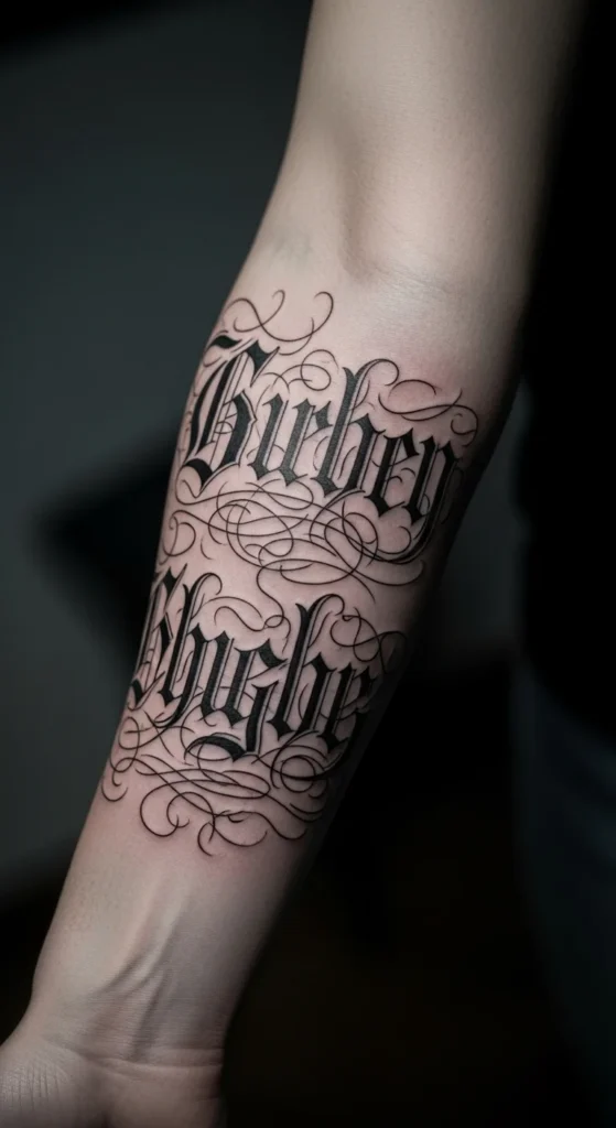
This adds edge to a soft concept.
Use it carefully. It can look heavy fast.
Keep letters sharp but readable.
Budget tip: avoid overly complex gothic styles. Simpler versions cost less.
16. Finger Side Micro Script
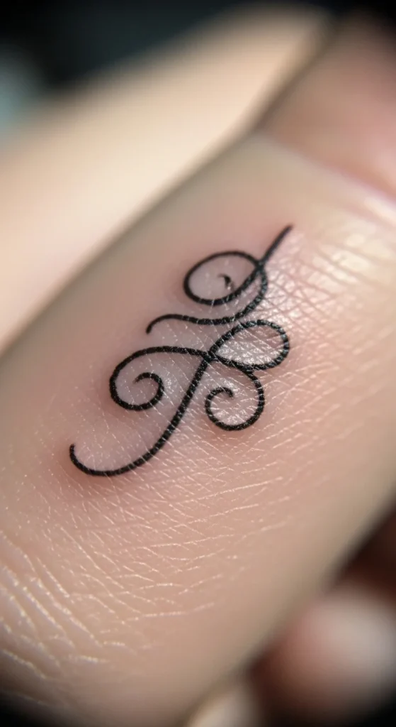
Finger tattoos fade quickly.
Keep it extremely minimal.
Expect regular touch-ups.
Budget tip: this is not a one-time cost. Plan for maintenance.
17. Spine Alignment Script
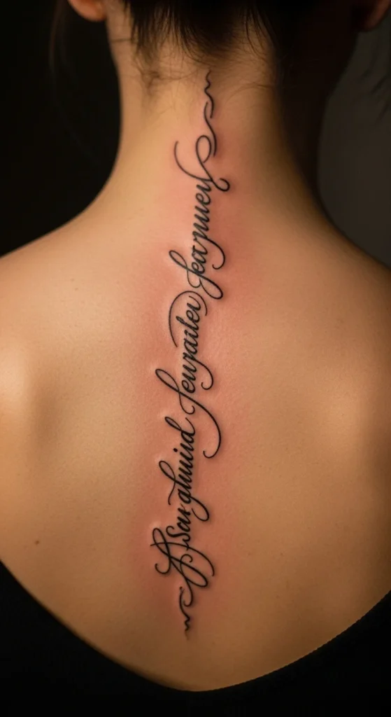
This placement looks balanced.
Keep the script centered.
Spacing is critical here.
Budget tip: longer designs increase cost. Keep it concise.
18. Hip Curve Script
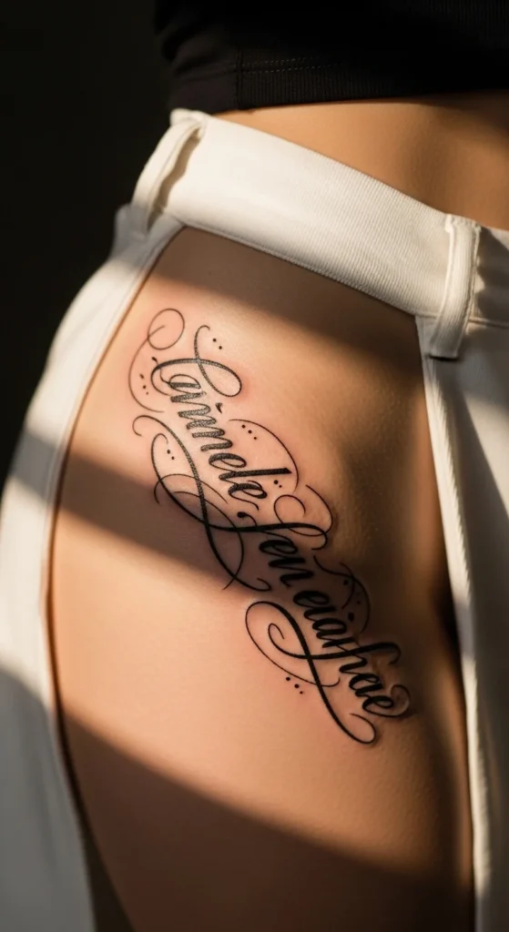
This placement follows natural curves.
It feels more private.
Keep the design flowing.
Budget tip: medium size works best here.
19. Cross + Script Combination
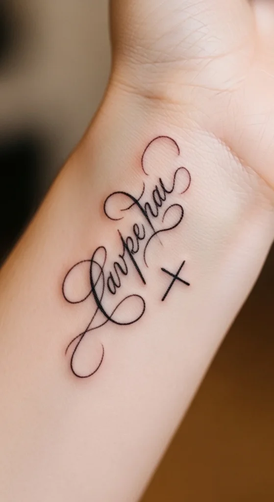
Adding a symbol changes the meaning.
Keep the cross small and simple.
Don’t overcrowd the design.
Budget tip: combining elements increases time. Keep it minimal.
20. Birthdate Accent Script
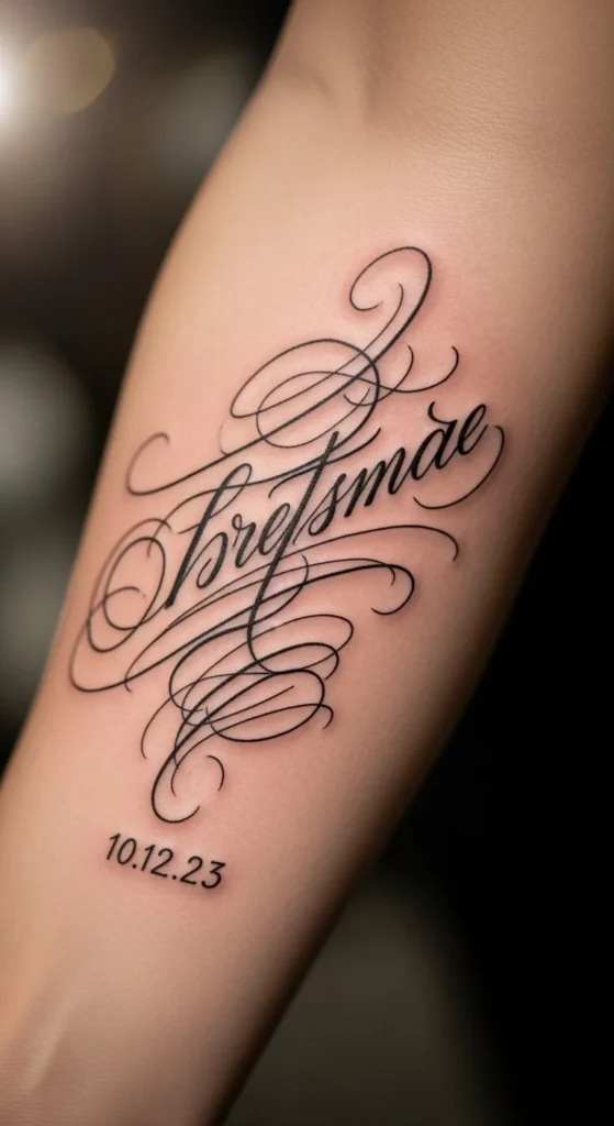
Adding a date personalizes the tattoo.
Keep the date smaller than the word.
Use a simple font for contrast.
Budget tip: small additions don’t add much cost.
21. Old English Cursive Blend
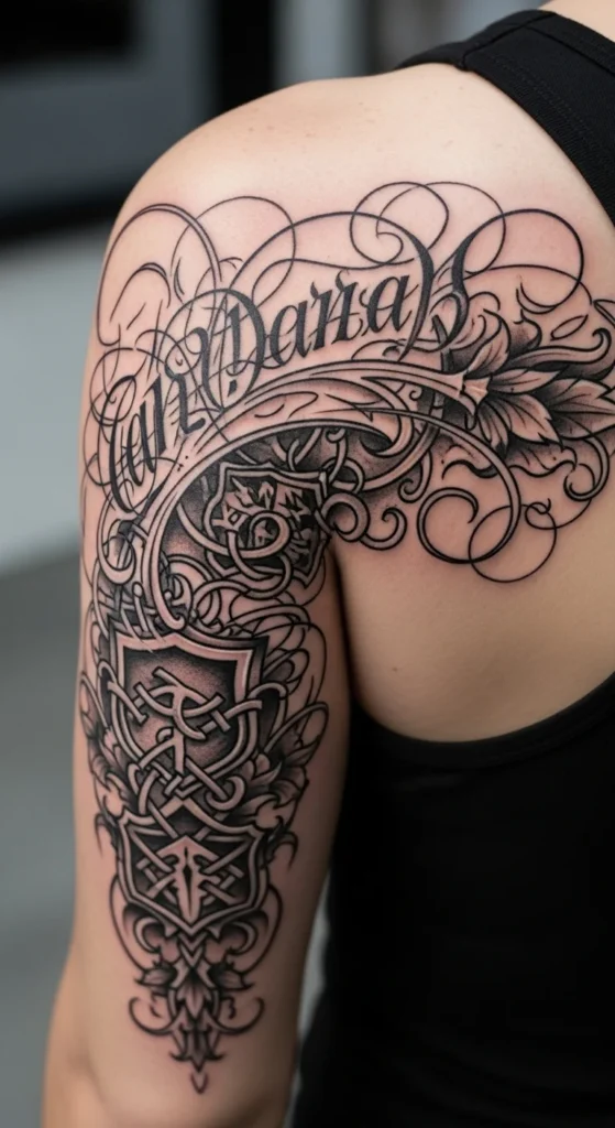
This creates contrast.
Keep it readable.
Avoid overly complex lettering.
Budget tip: hybrid styles take more time. Keep it simple.
22. Minimal Dot Accent Script
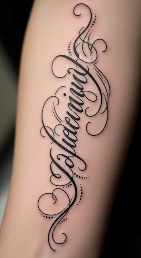
Dots add subtle detail.
Use them sparingly.
Too many look cluttered.
Budget tip: small accents don’t increase cost much.
23. Watercolor Background Script
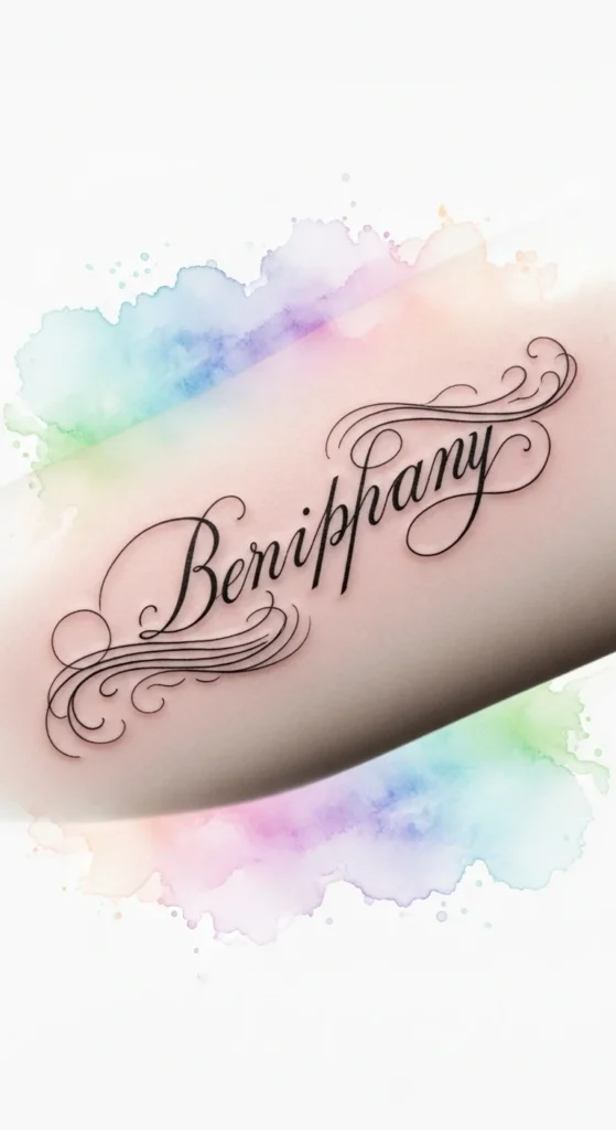
Color adds depth.
Keep it light and faded.
Avoid heavy saturation.
Budget tip: color increases cost. Keep it minimal.
24. Bicep Inner Curve Script
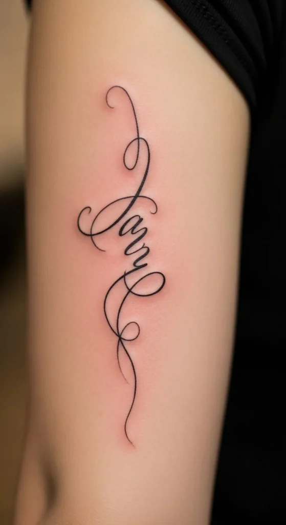
This area holds ink well.
Keep the script slightly curved.
Avoid tight spacing.
Budget tip: good healing reduces future expenses.
25. Upper Back Soft Script
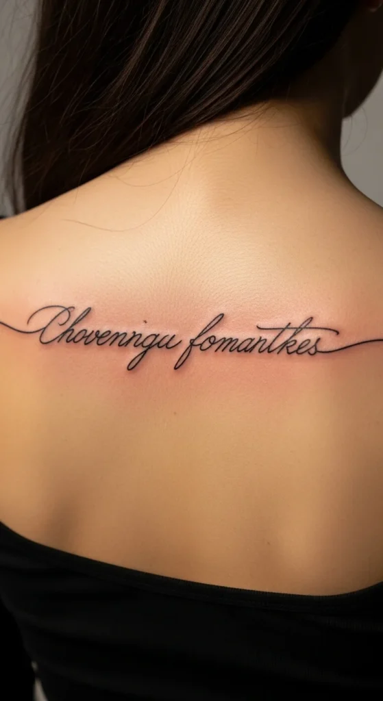
This placement gives space.
Use larger lettering.
Keep it balanced across shoulders.
Budget tip: larger designs cost more. Plan accordingly.
26. Ankle Minimal Script
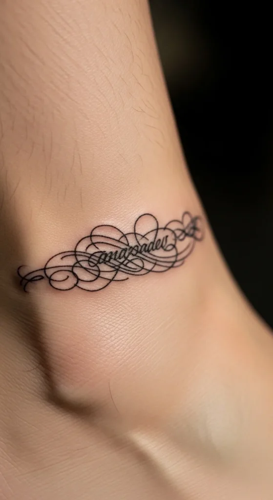
Ankle tattoos are subtle.
Keep them small.
Avoid heavy detail.
Budget tip: simple designs heal better here.
27. Curved Hand Script Statement
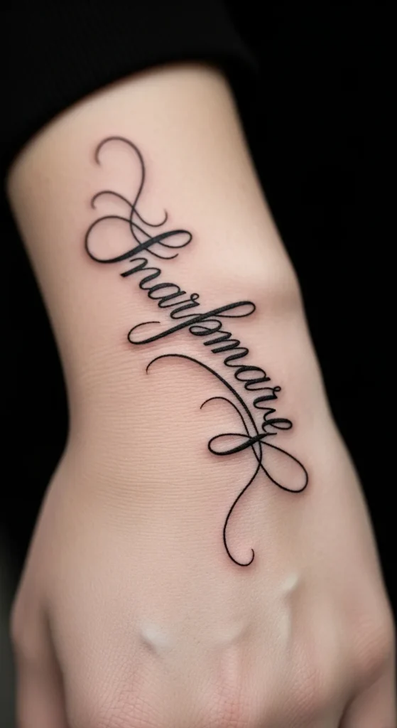
Hand tattoos are bold.
They fade and stretch more than most areas.
Keep the design strong and simple.
Budget tip: expect touch-ups.
Only choose this if you’re comfortable with high visibility.
Conclusion
Most “blessed” tattoos fail because people copy trends without thinking about placement, flow, or longevity. That’s where regret starts. If you want something that actually holds meaning, stop chasing what looks good online and start focusing on what fits your body and your lifestyle. Keep the design simple, readable, and personal. Test it before committing. Spend money on a skilled artist instead of extra decoration. The right tattoo doesn’t need complexity—it needs intention.