Tattoos that say “blessed” aren’t just decoration—they’re a statement about how someone sees their life. Gratitude, faith, survival, or even quiet confidence can all sit inside that one word. The problem? Most people copy the same overused styles, then regret it when it fades, blurs, or just looks generic. If you want something that actually holds up over time—visually and personally—you need to think beyond trends. The ideas below cut through the repetitive designs and show you how to make a “blessed” script tattoo that feels intentional, readable, and worth keeping.
1. Classic Fine-Line Cursive on the Inner Forearm
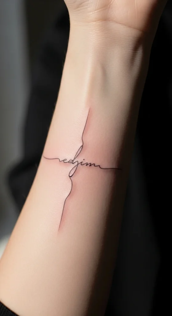
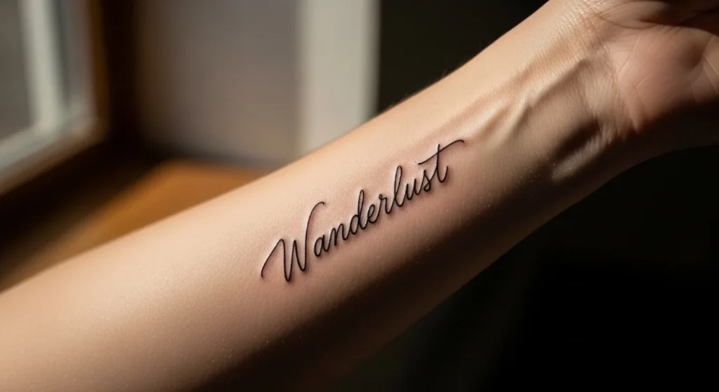
This is the version everyone starts with—and most people mess up. The idea is simple: a clean, flowing script on the inner forearm. But if the lines are too thin, it fades into nothing within a few years.
Keep the strokes slightly thicker than you think you need. That’s the difference between elegance and a blur later.
Placement matters. The inner forearm curves, so your artist should adjust spacing to avoid distortion.
Budget tip: Don’t cheap out here. A low-cost artist will rush the linework. Save up for someone who specializes in script.
DIY prep helps. Print your chosen font and wrap it around your arm to see how it bends.
If you want longevity, skip overly decorative flourishes. Simple wins.
2. Minimalist “Blessed” Behind the Ear
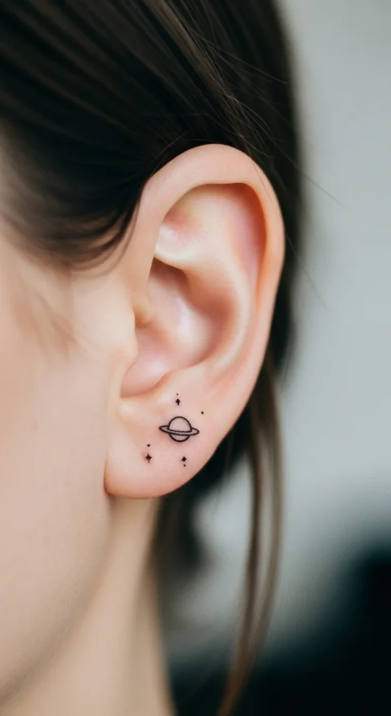
This one is subtle, but don’t confuse subtle with easy. Behind-the-ear tattoos fade fast because of friction and exposure.
Go slightly darker than you think. Light ink disappears quickly here.
Size matters. Too small, and it turns into a smudge. Aim for at least 2–3 cm.
It works best if you want something personal, not something to show off.
Budget angle: Smaller doesn’t always mean cheaper. Precision costs money.
Test it first. Use a temporary tattoo in that spot for a week. See how often it’s visible.
If you’re doing this for “aesthetic,” you’ll regret it. If it actually means something, it holds up.
3. Bold Script Across the Outer Forearm
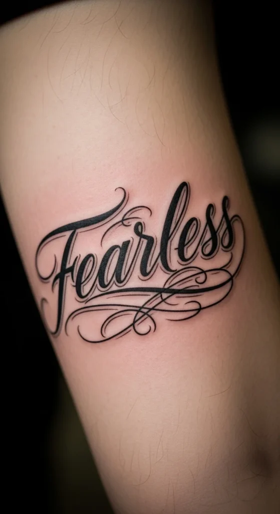
This is the opposite of subtle. It’s visible. It’s direct. And it’s where people start judging your choices.
That’s exactly why you need to get it right.
Use thicker lettering. Not blocky, but strong enough to age well.
Skip trendy fonts. They look outdated fast.
This placement works if you’re comfortable being seen. If not, don’t pretend.
Budget tip: Larger pieces cost more upfront but age better than tiny ones that need rework.
Mock it up with a marker first. Walk around with it for a day. If you feel weird, listen to that.
4. “I Am Blessed” Inner Bicep Wrap
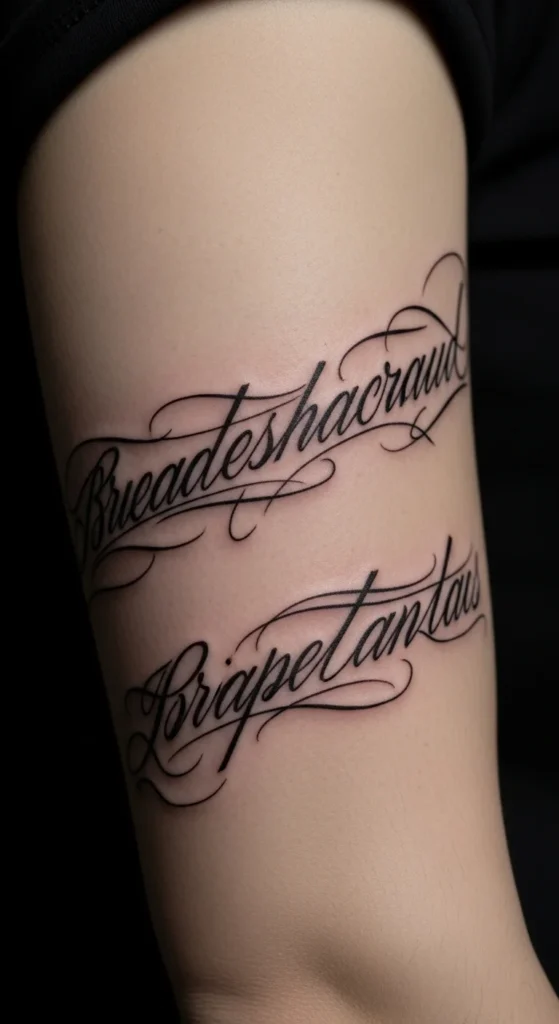
Adding “I am” changes the meaning completely. It becomes a statement, not just a label.
The inner bicep is private. That’s the point.
Wrap designs need careful spacing. If the artist misjudges it, the text bunches up.
Go for a slightly wider font so it doesn’t compress awkwardly.
Budget tip: This area hurts more. Don’t pick the cheapest artist just to get it over with.
Test placement by writing it on your arm and flexing. Watch how the skin moves.
5. Handwritten Signature-Style Script
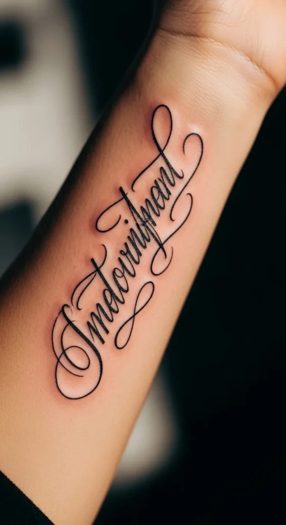
This is where most people miss the opportunity. Instead of picking a font, use actual handwriting.
Yours. Or someone important to you.
It instantly becomes unique. No duplication.
Scan handwriting and have the artist refine it slightly for tattooing.
Don’t keep it too thin. Real handwriting often needs bolding.
Budget tip: This doesn’t cost more—it just takes effort before the appointment.
If you skip this step, you’re just another copy.
6. Gothic Script for an Edgier Look
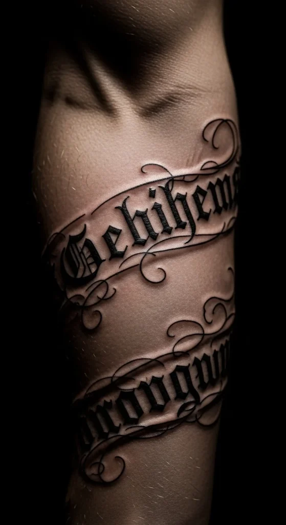
If you think cursive is overdone, gothic script solves that—but it brings its own risk.
Too complex, and it becomes unreadable.
Keep spacing wide. Gothic fonts need breathing room.
Best placements: ribs or chest.
Budget tip: Complex fonts take longer. Expect higher cost.
If you don’t understand the style, don’t get it. It shouldn’t look random.
7. Micro “Blessed” on the Wrist
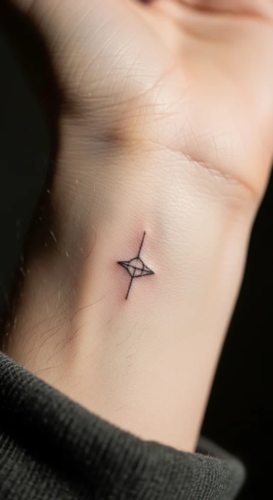
Tiny tattoos look good on Instagram, not always in real life.
The wrist moves constantly. Ink spreads faster.
Go slightly bigger than trend photos suggest.
Keep font simple. No fancy loops.
Budget tip: You’ll likely need a touch-up. Factor that in.
8. Vertical Spine Script
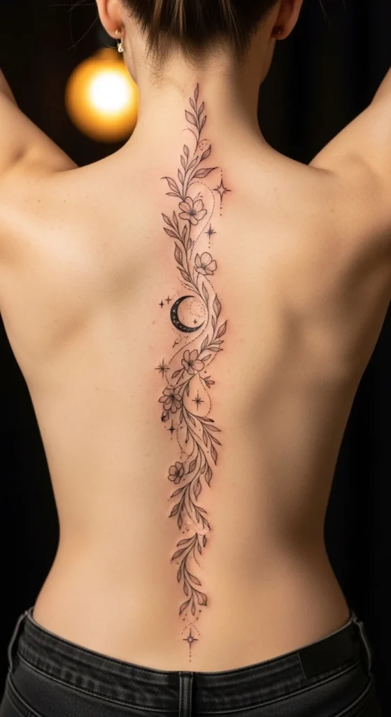
This one is about alignment. If it’s even slightly off, it looks wrong.
Use a clean font. No clutter.
Spacing between letters should match the spine curve.
Budget tip: Long tattoos cost more. No shortcuts here.
Test alignment with a temporary stencil before committing.
9. Blessed with a Small Cross Accent
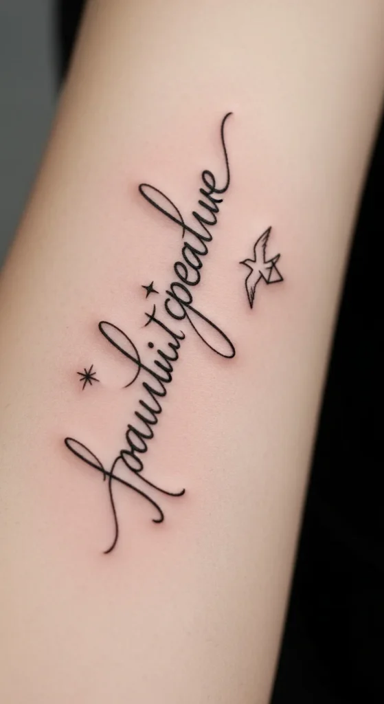
Adding a cross changes the message. It becomes explicitly religious.
Keep the symbol small. Let the word lead.
Avoid overcrowding.
Budget tip: Small add-ons don’t add much cost if planned together.
10. Collarbone Flow Script
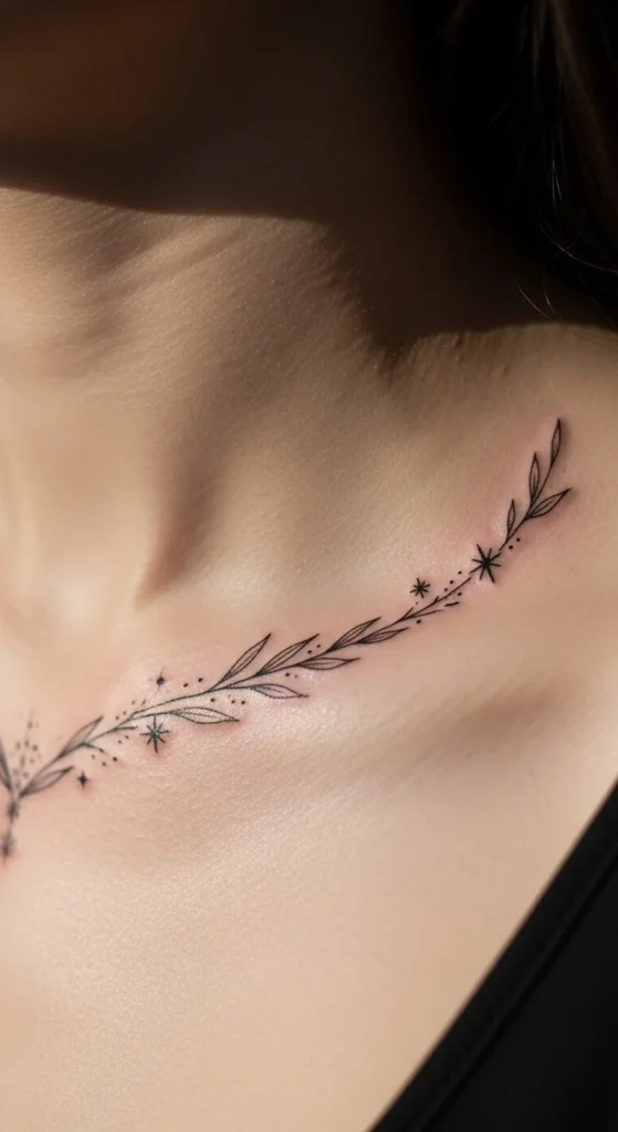
The collarbone gives natural flow—but also distortion.
Font should stretch slightly.
Don’t go too thin. This area fades.
Test with a sticker first.
11. Ribcage Script with Soft Curve
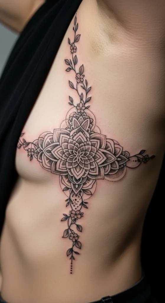
Pain level is high. That alone filters out impulsive decisions.
Keep design simple. Complex work here ages poorly.
Budget tip: Don’t rush. Take breaks during session.
12. Floral-Framed Blessed Script
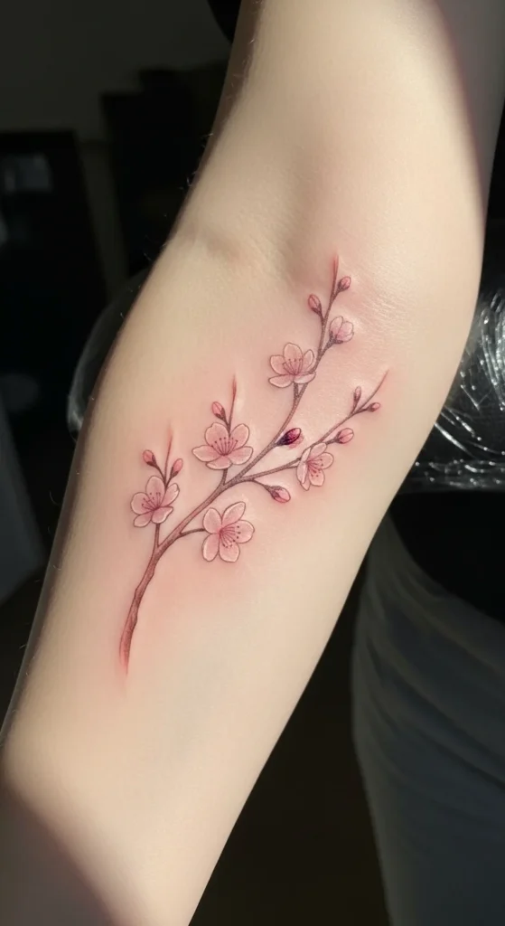
Florals can ruin a clean script if overdone.
Keep them light. Think outline, not heavy shading.
Budget tip: Skip color if you want lower cost and longer life.
13. All-Caps Modern Script
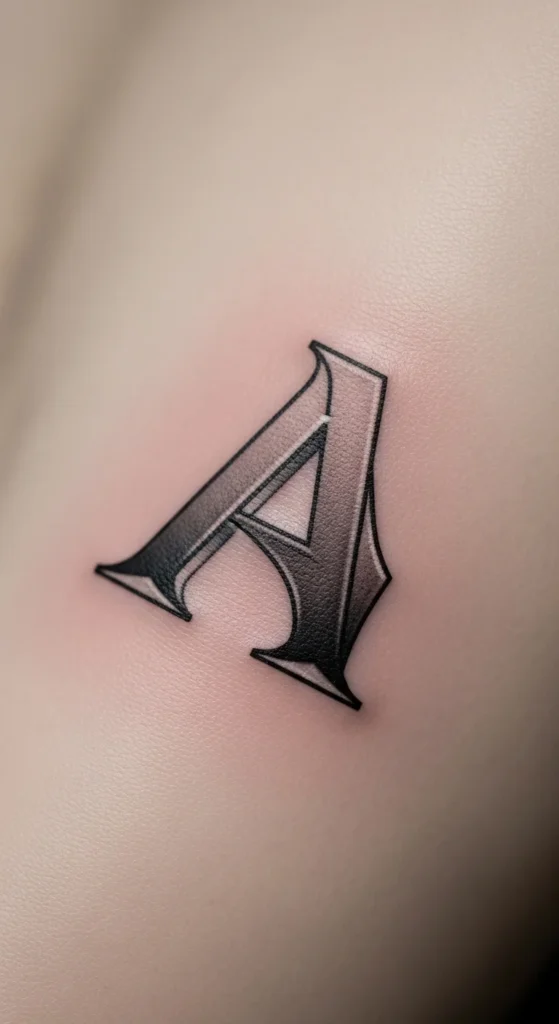
Caps feel strong but can look harsh.
Use spacing to soften it.
Best on larger areas like thigh or calf.
14. Blessed & Grateful Dual Phrase
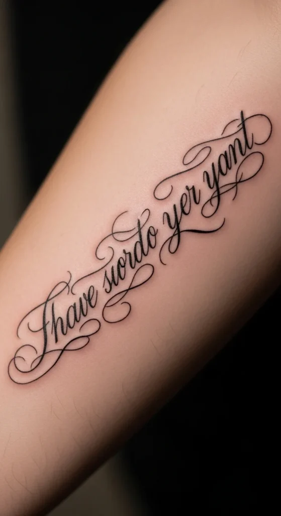
Two words double the risk of clutter.
Keep line height consistent.
Don’t shrink font just to fit more words.
15. Watercolor Background Script
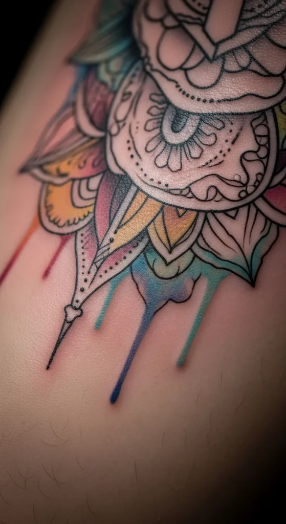
Looks good at first. Ages poorly if overdone.
Keep color light and minimal.
Budget tip: Color costs more and needs maintenance.
16. Nape of Neck Halo Accent
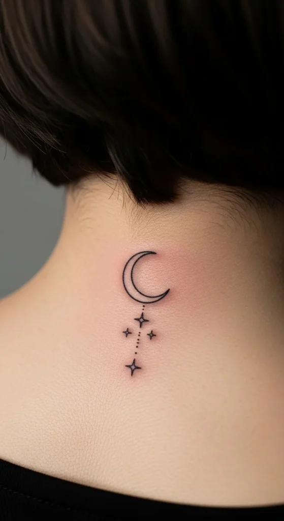
Keep halo subtle.
Too bold and it looks cartoonish.
17. Chest Plate Vintage Script
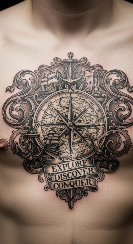
Vintage fonts need space.
Don’t compress them.
18. Sanskrit-Inspired Script Version
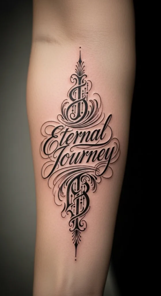
If you don’t understand the language, don’t fake it.
Research meaning first.
19. Minimal Ankle Script
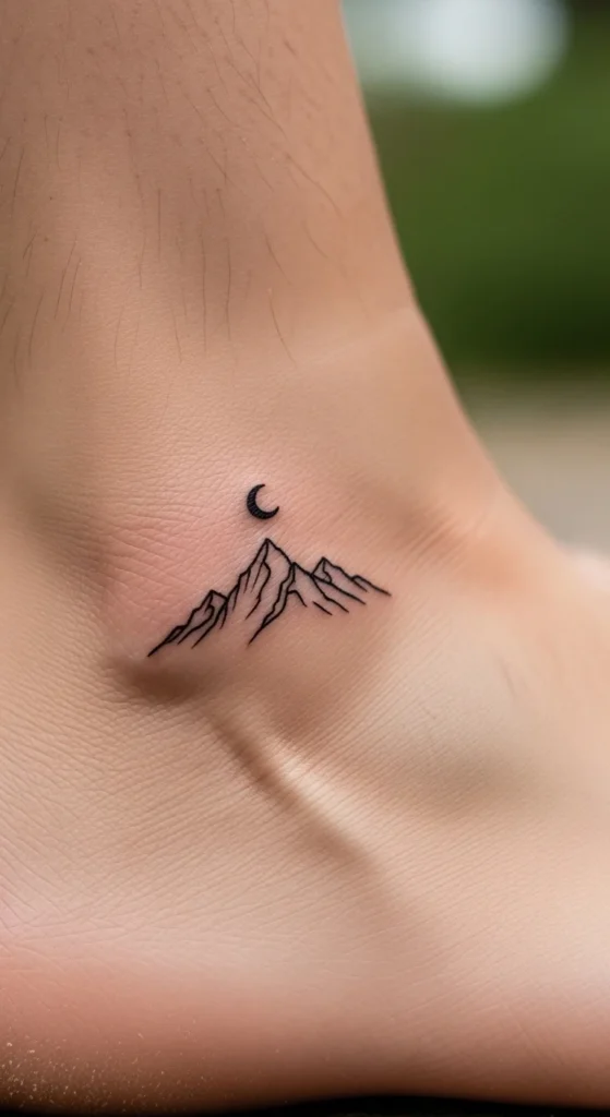
High friction area. Ink fades fast.
Go darker.
20. Calf Placement with Bold Script
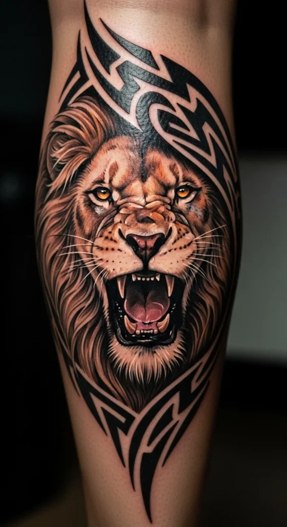
Good for visibility without being constant.
Use medium thickness lines.
21. Shoulder Blade Script Placement
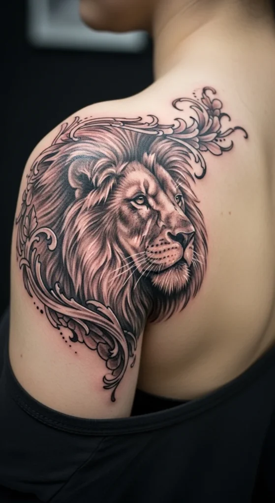
Flat area. Easy to execute well.
Good for larger designs.
22. Inner Finger Micro Script
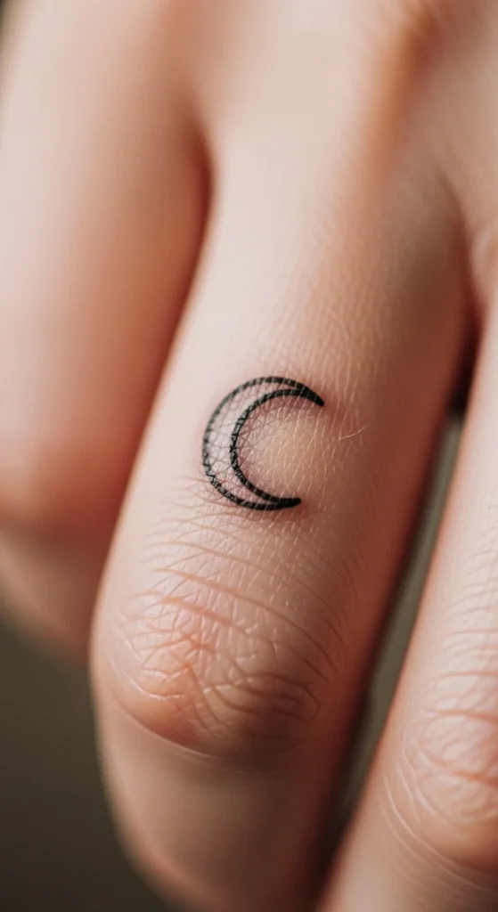
This fades the fastest. Expect rework.
Only do it if you accept that.
23. Side Hand Script Statement
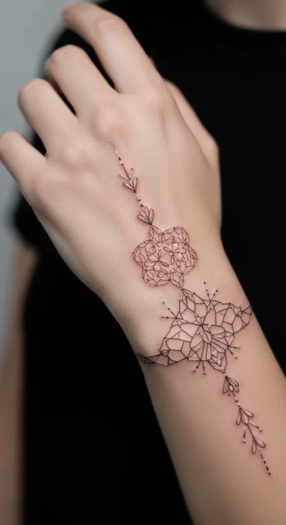
Highly visible. Career impact matters.
Don’t ignore that.
24. Back of Arm Vertical Script
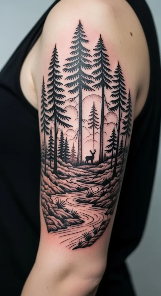
Less common. That’s the advantage.
Keep alignment tight.
25. Thigh Script with Soft Curve
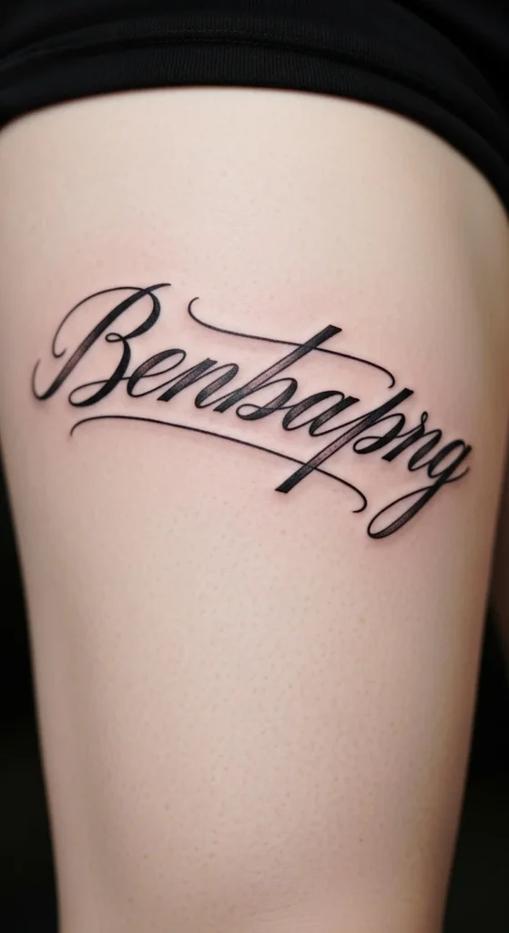
Great for larger fonts.
Less fading compared to exposed areas.
26. Wrist Wraparound Script
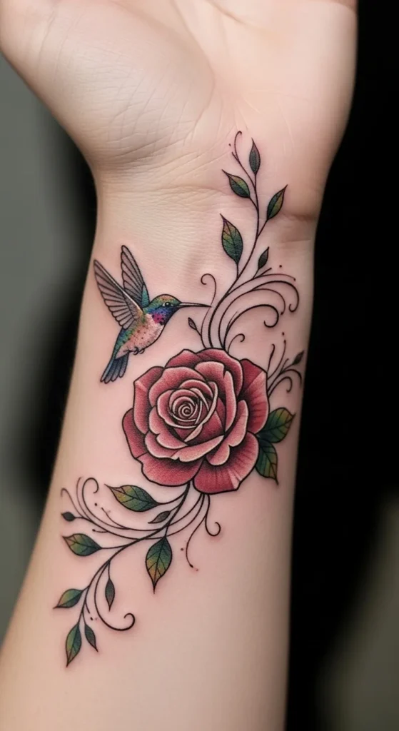
Needs perfect spacing.
Otherwise looks uneven.
27. Dual Font Contrast Script
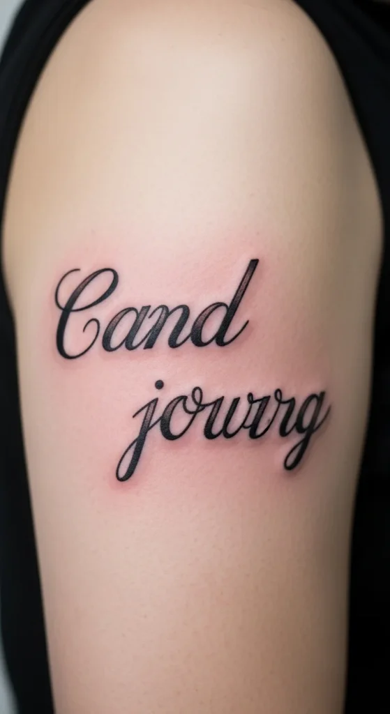
Mixing fonts is risky.
Use contrast carefully.
28. Minimal Dot Accent Script
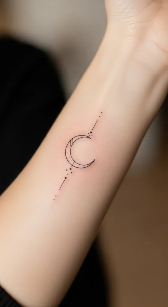
Small dots can enhance spacing.
Don’t overuse them.
Conclusion
Most “blessed” tattoos fail for the same reasons: copied fonts, poor placement, and zero thought about aging. If you’re honest about it, the design isn’t the hard part—discipline is. Picking the right size, paying for a skilled artist, and avoiding trends you don’t even like will decide whether your tattoo still makes sense in five years. Slow down. Mock it up. Sit with it. If it still feels right after that, then it’s worth putting on your body permanently.