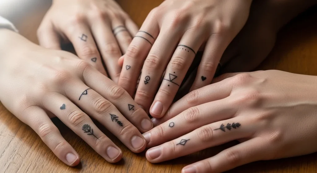
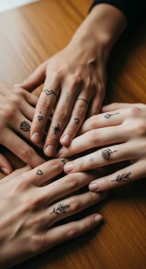
Finger tattoos sit in a tricky space. They’re small, highly visible, and prone to fading. That means most people either overcomplicate the design or pick something trendy that ages badly. The smarter approach is simple: clean shapes, clear meaning, and smart placement. This list strips away the noise and focuses on designs that actually work on fingers—visually, practically, and long-term.
1. Tiny Heart Outline
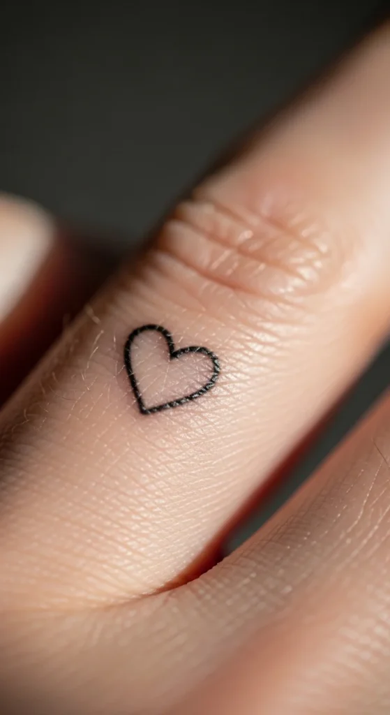
A tiny heart works because it respects the size of the canvas. Anything bigger starts looking forced.
Place it on the side of your finger if you want something low-key. On top, it becomes more visible, which not everyone can carry confidently.
Keep it as a single fine line. Filling it in looks good on day one but ages worse on fingers.
Budget tip:
Ask your artist for a micro-line version, not standard line thickness. It fades better and looks cleaner over time.
DIY mistake to avoid:
Don’t copy thick Instagram hearts. Those are usually edited or freshly done.
If you’re doing this with a partner, don’t overthink matching designs. Same symbol, slightly different placement feels more natural.
2. Minimal Crown Symbol
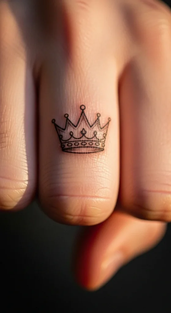
Crowns go wrong when people try to add too much detail. On fingers, detail turns into blur.
Stick to a simple three-point crown outline. That’s it.
Placement matters. The index finger gives it authority. The thumb makes it feel casual.
If you want meaning, don’t default to “royalty.” Think self-control or personal discipline. That reads better long-term.
Budget tip:
Skip shading. It costs more and doesn’t hold well here.
DIY example:
Draw your own version with a pen first. If it looks messy on skin, it won’t magically look better tattooed.
3. Fine Line Anchor
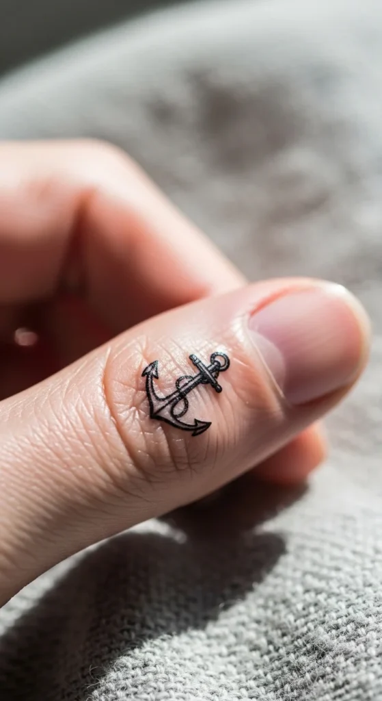
Anchors only work when they’re stripped down.
Forget ropes, textures, or shadows. Use a clean silhouette anchor.
Best placement:
Side finger or near the base, where the skin moves less.
This symbol gets overused by people who don’t connect with it. If “stability” isn’t something you actually value, pick something else.
Budget tip:
Small anchors are quick. You shouldn’t be paying premium rates for this.
DIY insight:
Print a small anchor and tape it to your finger. Walk around for a day. If it feels right, go ahead.
4. Lightning Bolt Micro Design
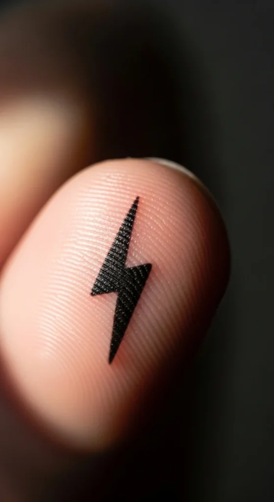
This design is about sharpness. If the lines aren’t crisp, it looks like a scratch.
Go for a thin zig-zag, not a chunky comic-style bolt.
Placement:
Fingertip or upper finger for visibility.
Avoid pairing it with other symbols. It loses impact when crowded.
Budget tip:
This should take minutes. If your artist is charging like it’s a complex piece, walk away.
5. Tiny Star Cluster
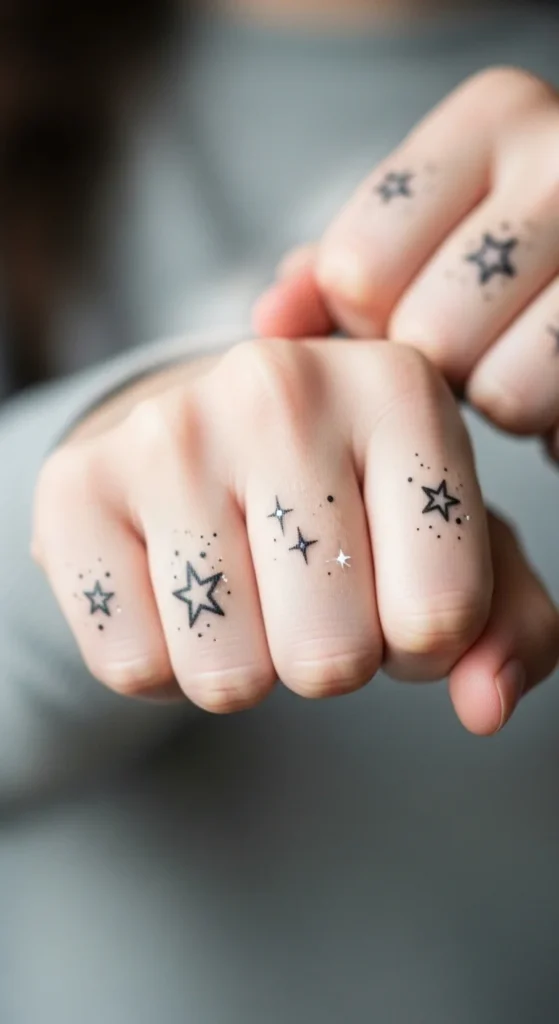
One star is basic. A cluster of 2–3 tiny stars adds personality.
Place them across knuckles or side finger for flow.
Don’t overdo it. More than three starts looking cluttered fast.
DIY tip:
Use a fine marker and test spacing. Spacing is what makes this design work—not the stars themselves.
6. Wave Line Tattoo
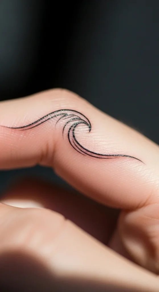
Waves work best as a single flowing line.
No foam details. No shading.
Placement:
Side of the finger, following the natural curve.
This one ages well because it’s simple.
Budget tip:
Ask for a continuous line without breaks. It holds better.
7. Geometric Band Ring
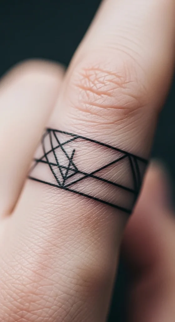
This is the cleanest “ring tattoo” option.
Stick to thin parallel lines or subtle patterns.
Avoid thick bands. They blur quickly.
If you want something personal, add a tiny break or angle in the line.
DIY example:
Use a pen to draw a ring and see how it looks from different angles. Most people forget that hands move constantly.
8. Lotus Micro Tattoo
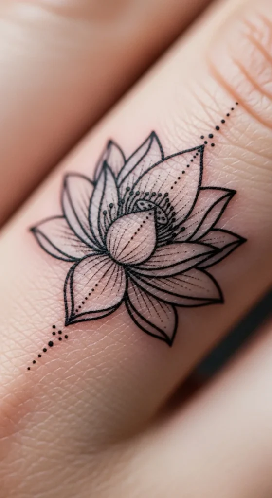
Lotus designs fail when they’re too detailed.
Use a 3–5 petal outline version.
Placement:
Inner finger for a more private feel.
Budget tip:
Skip color. It fades faster and costs more.
9. Crescent Moon Outline
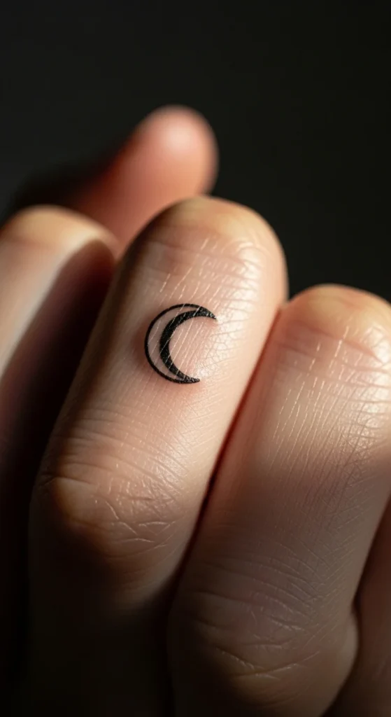
Keep it thin and sharp.
A thick crescent looks clumsy on fingers.
Best placement:
Inner finger or side.
If you want variation, slightly tilt it. That small change makes it feel unique.
10. Bird Silhouette
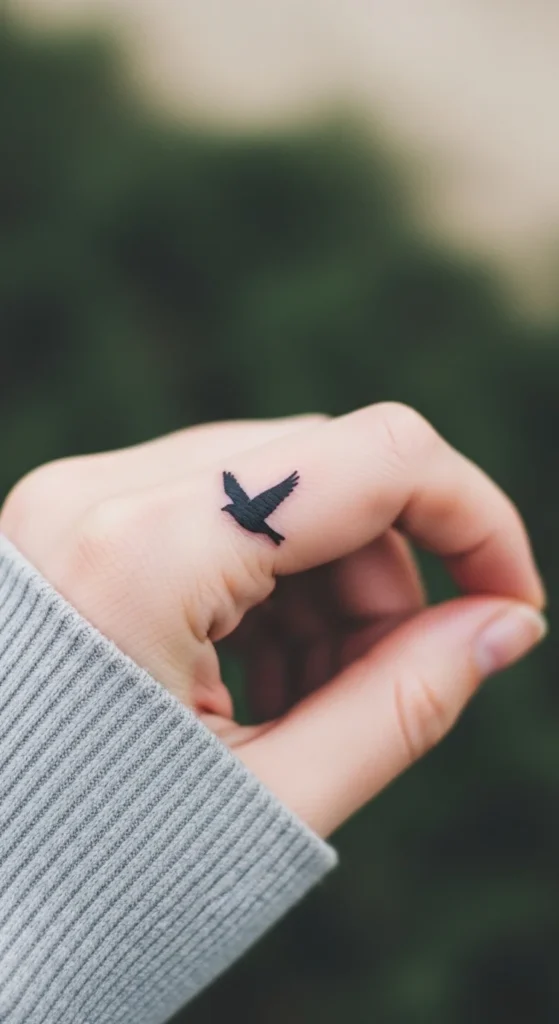
Use a single bird in flight, not a flock.
Small silhouettes age better than detailed birds.
Placement:
Top of finger for visibility.
Avoid overthinking meaning. Keep it personal.
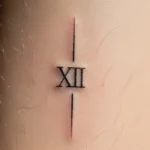
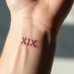
11. Roman Numeral Date
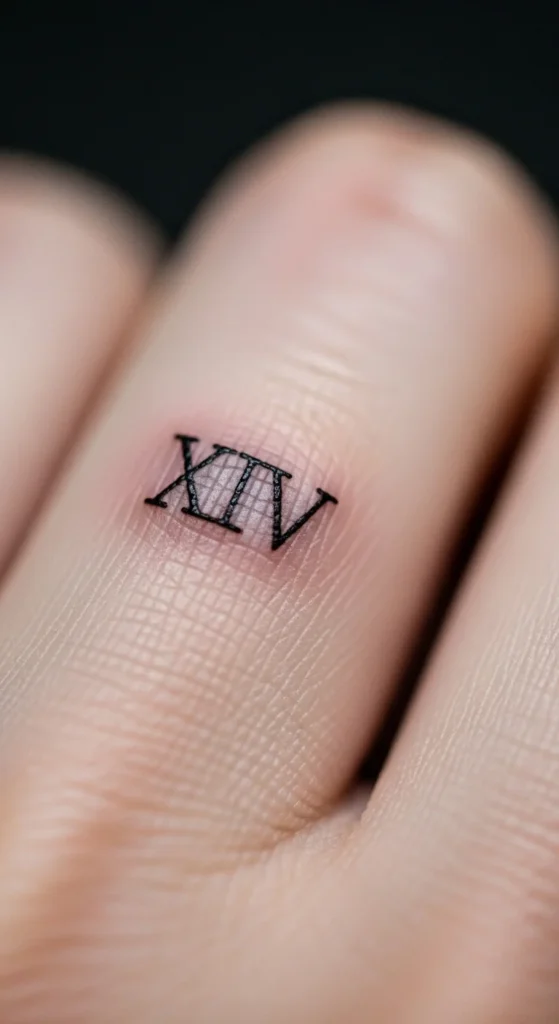
This only works if the numbers are tight and evenly spaced.
Long dates look awkward. Keep it short.
Placement:
Along the finger length, not across.
DIY tip:
Write it out first. If it looks cramped, it will look worse tattooed.
12. Mehendi-Inspired Pattern
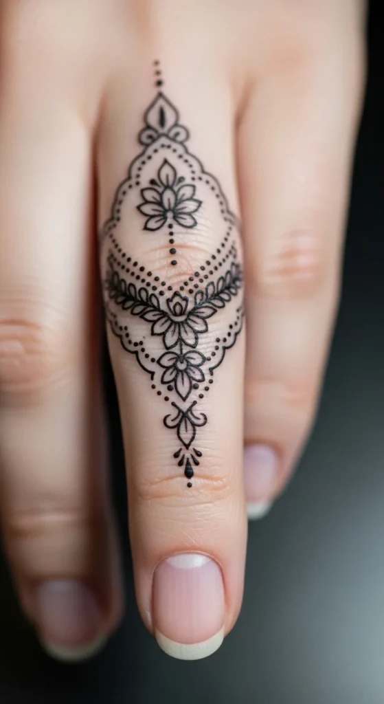
Keep it light and flowing, not dense.
Focus on vines and dots, not full coverage.
This works best on side fingers or extending from hand to finger.
Budget tip:
Ask for linework only. No heavy fill.
13. Fine-Line Leaf Branch
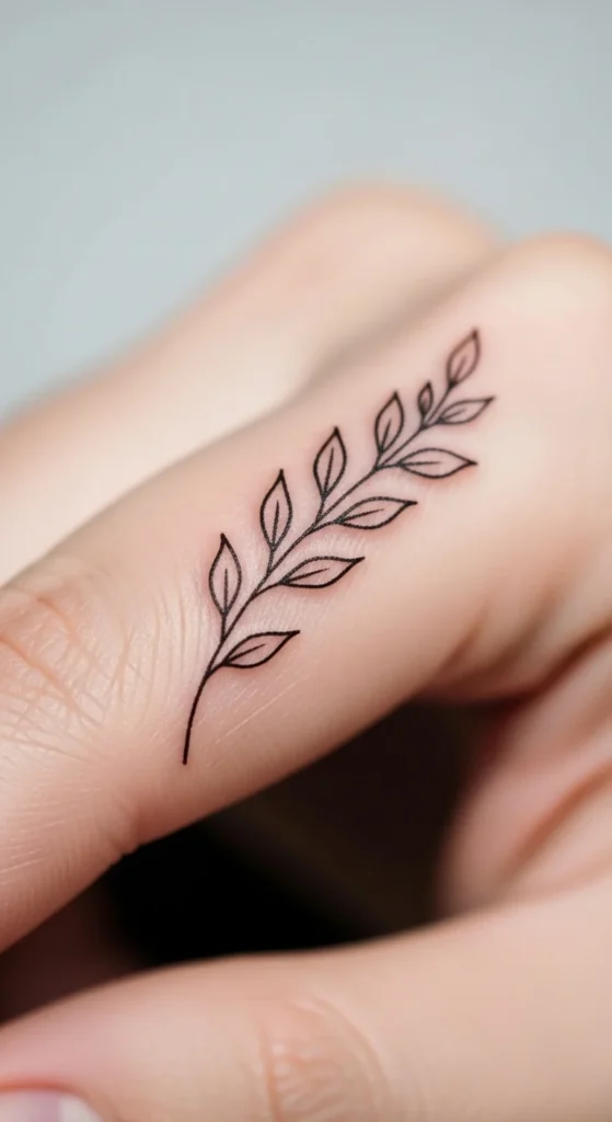
This design follows the finger’s natural shape.
Use small spaced leaves, not packed ones.
Placement:
Side finger works best.
DIY tip:
Draw a line and add leaves. If it feels crowded, reduce them.
14. Dot Constellation

This is one of the easiest designs to mess up.
Spacing is everything.
Use 3–5 dots max.
Placement:
Knuckles or side finger.
Budget tip:
This should be cheap. It’s simple work.
15. Small Cross Tattoo
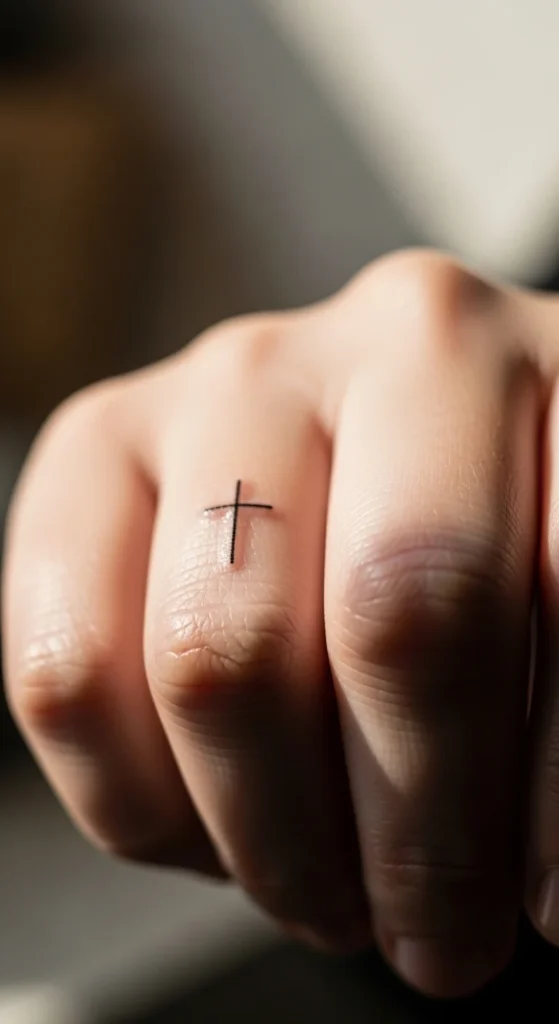
Keep it thin and balanced.
Thick crosses look heavy on fingers.
Placement:
Ring finger is common, but inner finger feels more personal.
16. Lion Outline (Simplified)
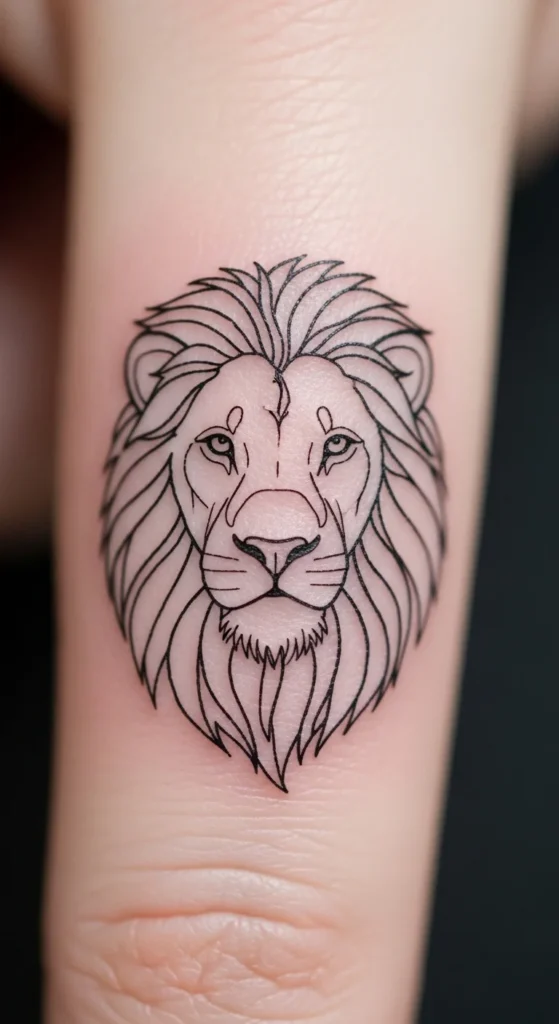
Don’t try realism here. It will fail.
Use a simple outline suggestion, not detail.
Placement:
Top of finger if you want it visible.
17. Infinity Symbol
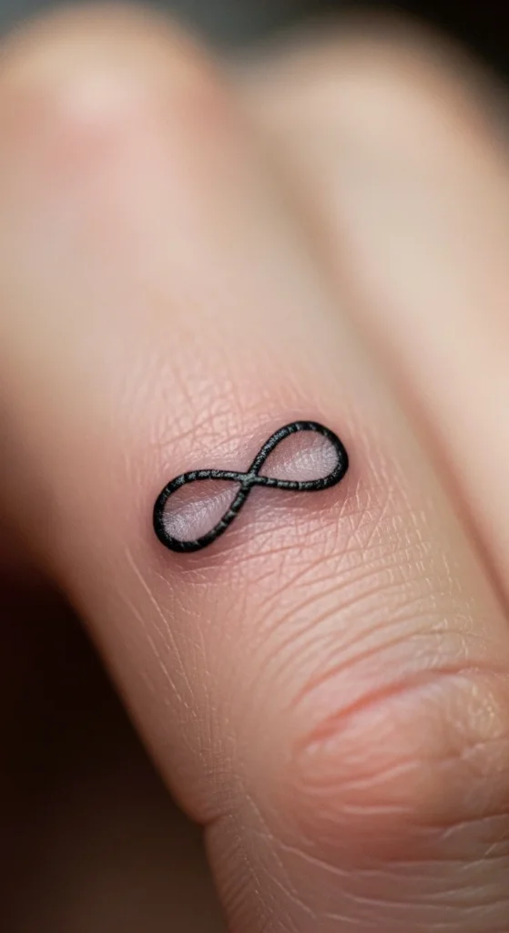
Classic but still works.
Keep it small and centered.
Avoid thick lines.
18. Initial Letter Tattoo

Use a simple font or handwritten style.
Avoid decorative fonts. They blur.
Placement:
Inner finger for privacy.
19. Tribal Line Pattern
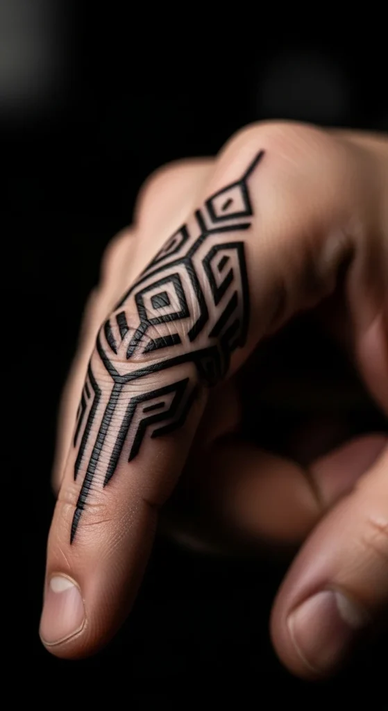
Keep it modern, not heavy.
Use clean angular lines, not dense tribal fills.
20. Micro Arrow
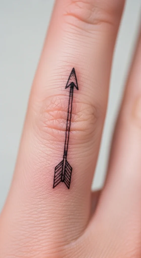
Simple line + small tip.
Placement:
Along the finger length.
Symbol feels stronger when aligned with direction.
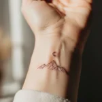
21. Mountain Outline
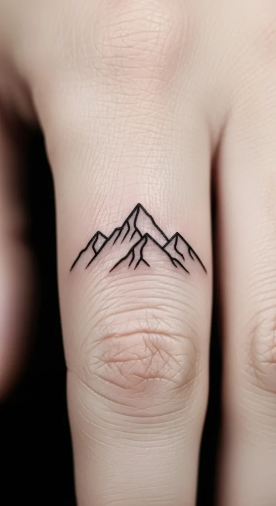
Use a single peak line, not a full landscape.
Placement:
Side finger.
22. Knuckle Dot Pattern
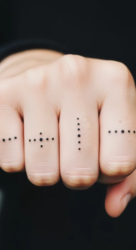
Even spacing is everything.
Use symmetry.
Too many dots ruins it.
23. Sun Symbol
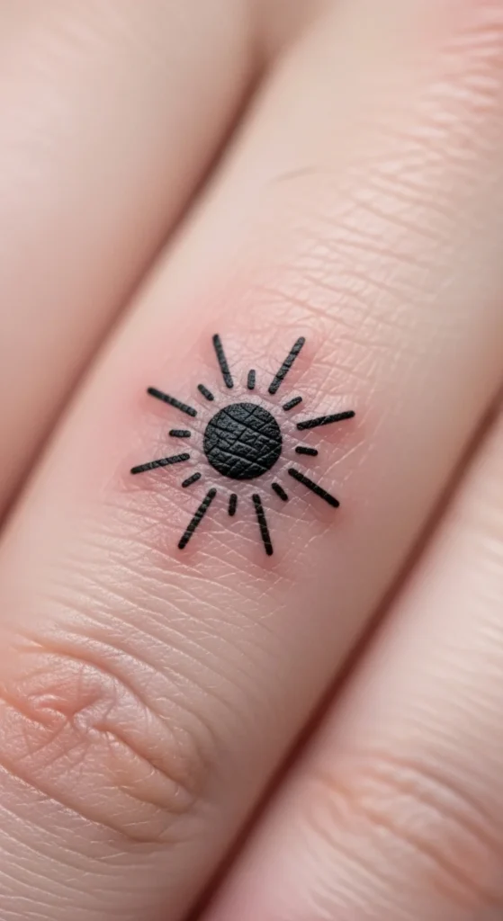
Keep rays short and thin.
Circle + lines. Nothing more.
24. Finger Frame Lines
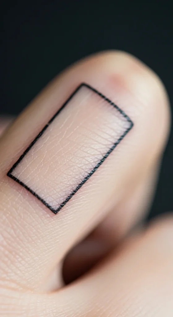
Lines along edges create a clean structure.
Works best with very thin lines.
25. Abstract Squiggle Line
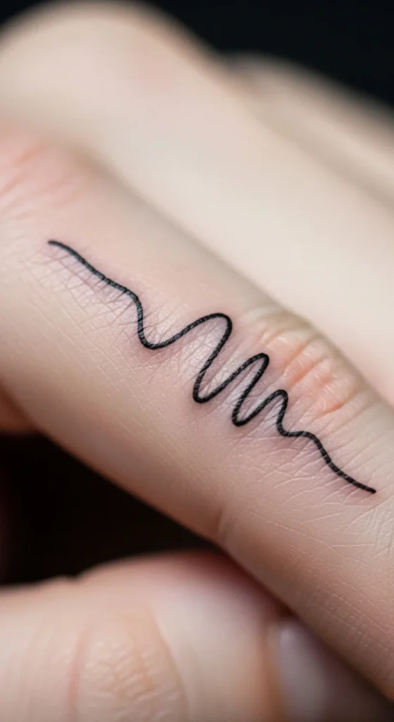
This is where you can be personal.
Draw your own shape.
Keep it simple enough to age well.
Conclusion
Most finger tattoos fail for one reason: people treat them like larger tattoos. That’s the mistake. The skin here is unforgiving. Movement, friction, and fading will expose bad design fast.
If you take anything from this, keep it simple. Thin lines, clear shapes, and smart placement beat complexity every time.
Test designs on your skin before committing. Pay attention to how your hands move. And don’t chase trends—you’ll regret that faster than the tattoo fades.
Pick something you won’t get tired of seeing every single day. That’s the real filter.