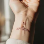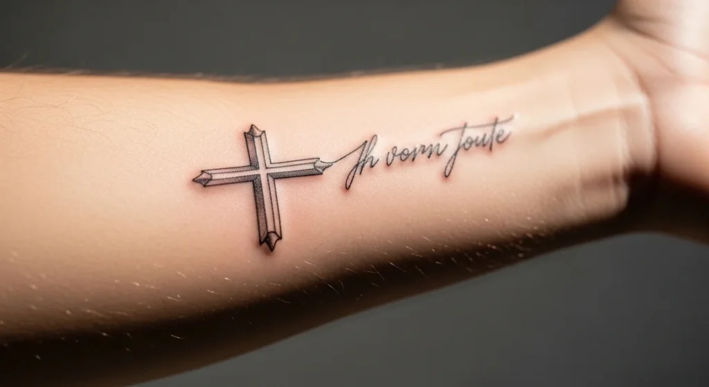
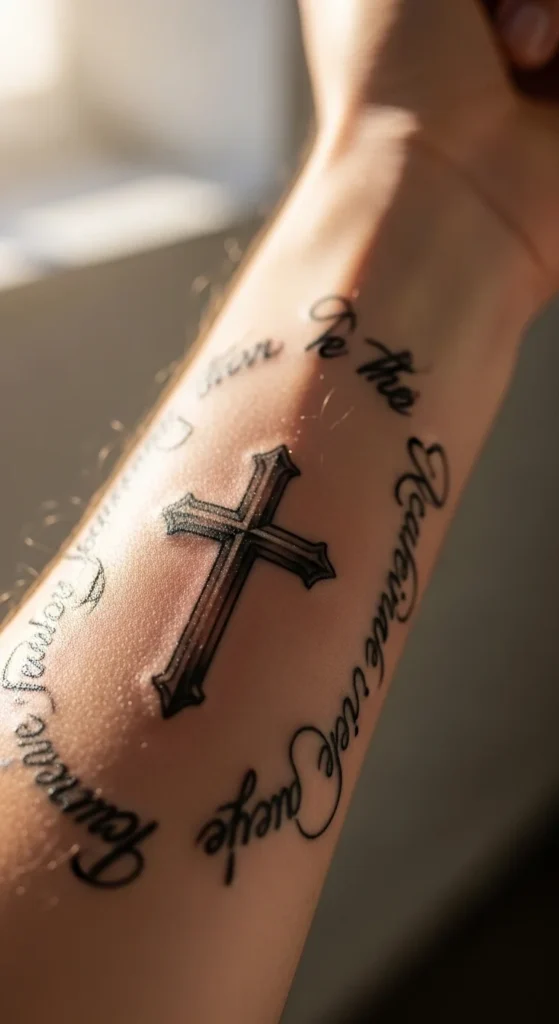
Faith tattoos are everywhere. Most of them are lazy copies.
A “Blessed + cross” tattoo only works if it’s designed with intent. Otherwise, it turns into something you stop noticing after a few months. Worse, it becomes something you regret because it says nothing new.
The difference isn’t the symbol. It’s the execution. Placement. Scale. Restraint.
Here are 26 ideas that actually hold meaning—and won’t age badly.
1. Cursive “Blessed” Arched Over a Cross
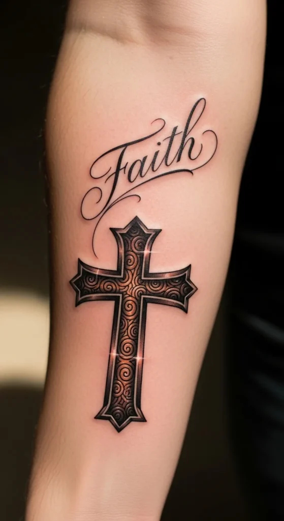
Most people ruin this by forcing symmetry.
The arch should follow your arm’s natural curve. Not a perfect half-circle. That looks fake.
Keep the lettering thin. Thick cursive spreads over time. You don’t want a blurred mess in five years.
Forearm placement works best. It reads naturally when your arm moves.
Cheap test: print your design and tape it on your arm. Live with it for a day. If it feels awkward, it is.
2. Chain-Wrapped Cross with Pendant Look
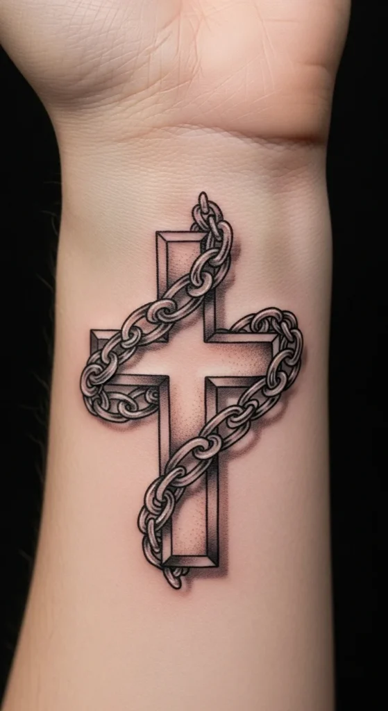
Chains sound cool. They’re easy to mess up.
Too many links = visual clutter. It turns into a dark patch.
Keep it simple. Suggest the chain instead of drawing every link.
Wrist or upper forearm works. Anywhere else kills the illusion.
If your artist can’t show healed examples of chain tattoos, walk away.
3. Three Crosses with “Blessed” Banner
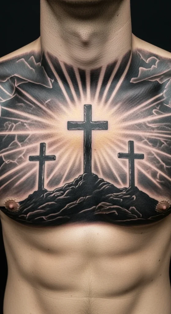
This references Calvary. It’s heavy.
But it’s also overused.
If you go with this, change the layout. Angle the crosses slightly. Add spacing.
Don’t cram it into a small area. It needs breathing room.
Chest or upper back only. Anywhere smaller looks like a sticker.
4. Minimalist Cross with Fine-Line “Blessed”
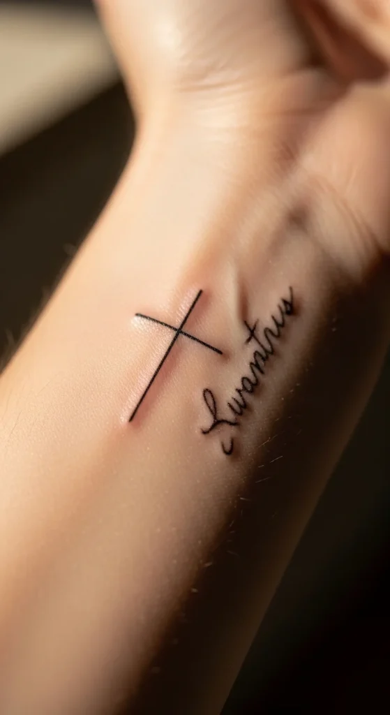
This is where most people should start.
Simple. Cheap. Ages well.
Thin lines heal cleaner and cost less.
Keep spacing wide. Minimal doesn’t mean cramped.
Great for wrist, ankle, or behind ear.
5. Floral Cross Framing “Blessed”
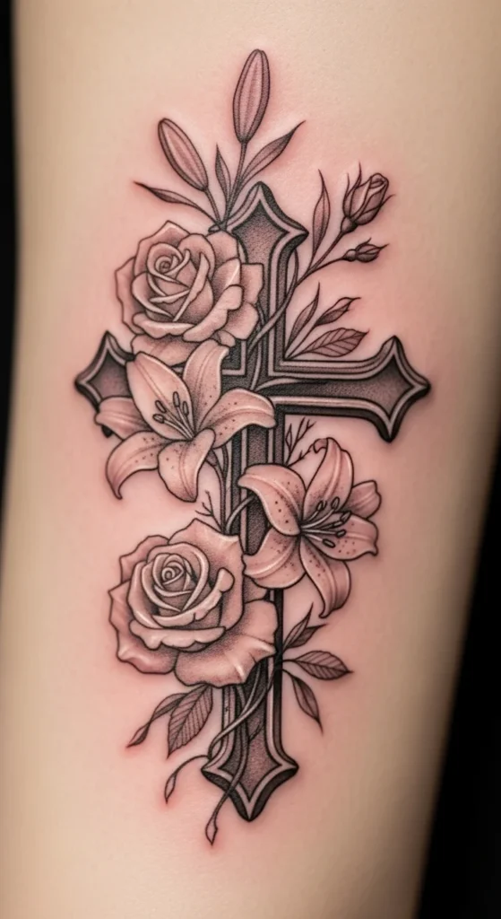
Florals can look good. Or messy.
Pick one flower type. Not three. Mixing styles creates chaos.
Roses = strength. Lilies = purity. Choose one meaning.
Keep petals light. Heavy shading kills detail.
6. Bold Blackwork Cross with Script Overlay
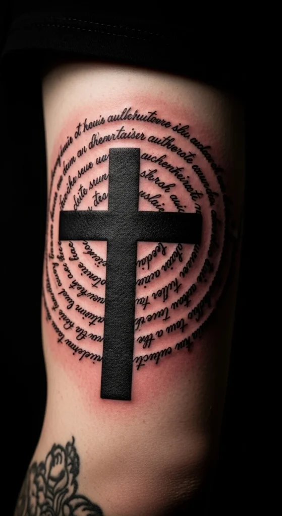
This is aggressive. It works if you commit.
The cross should dominate. The script is secondary.
Don’t let the text fight the symbol.
Best for upper arm or sleeve starters.
7. Dove Above Cross, “Blessed” Below
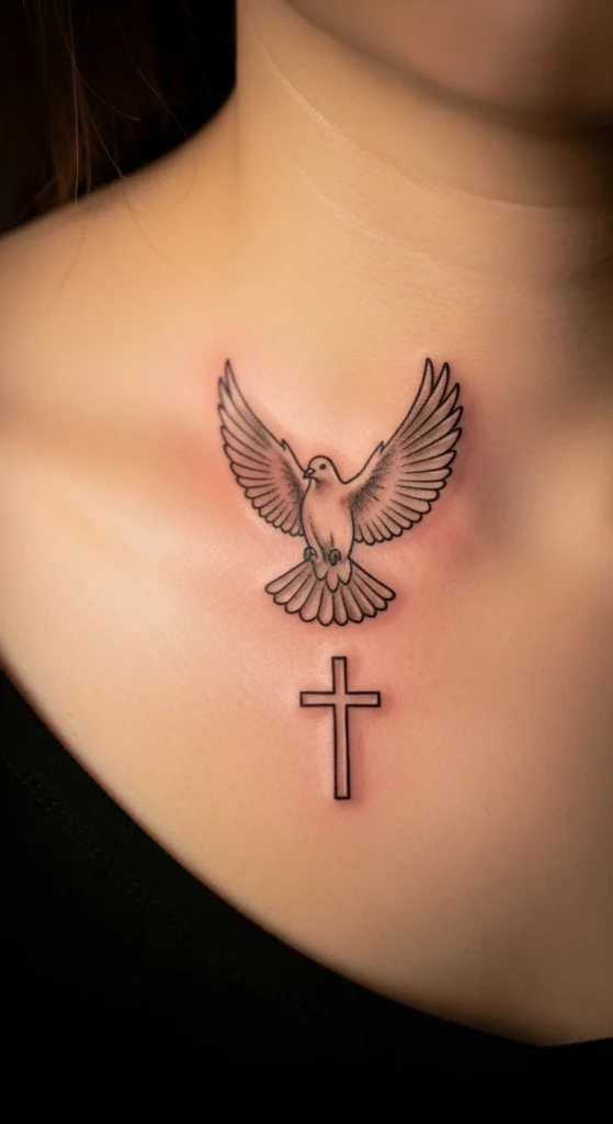
This adds motion.
But don’t over-detail the feathers. That’s where tattoos fail.
Keep the dove simple. Suggest shape, not every feather.
Works well near collarbone.
8. Gothic Cross with Old English Script
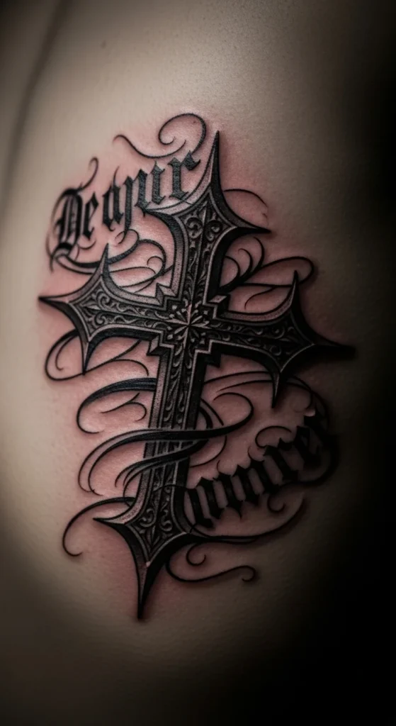
This is edgy.
But Old English fonts blur fast.
Go slightly thinner than you think you should.
Vertical placement works best—ribcage or spine.
9. Cross with Nails Detail and Script
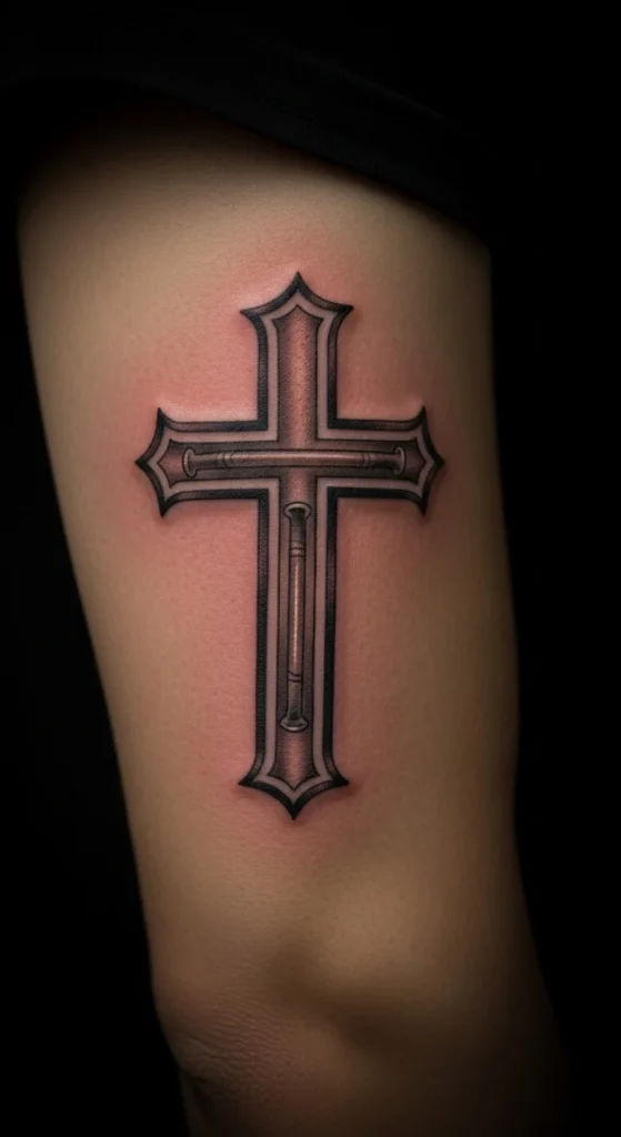
This leans into sacrifice symbolism.
Keep it subtle. Don’t go full realism unless your artist is elite.
Otherwise, it looks cheap fast.
10. Celtic Cross with Circular Script
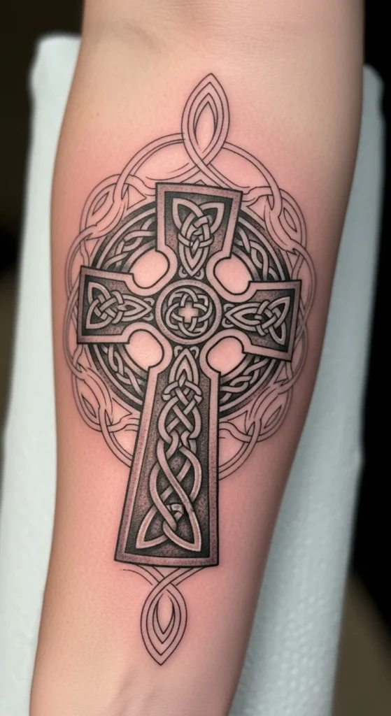
Good if you have heritage ties.
The circle adds structure. Use it to guide the script.
Don’t overcrowd the ring.
11. Heart-Cross Hybrid Design
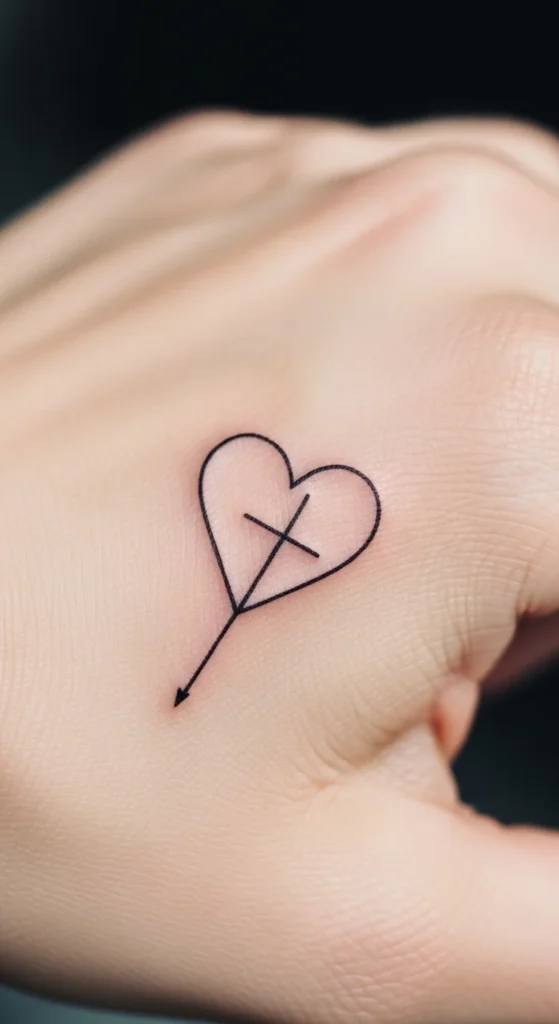
This is subtle.
Works best small. Don’t scale it up.
Finger or wrist placement only.
12. Radiant Cross with Light Rays
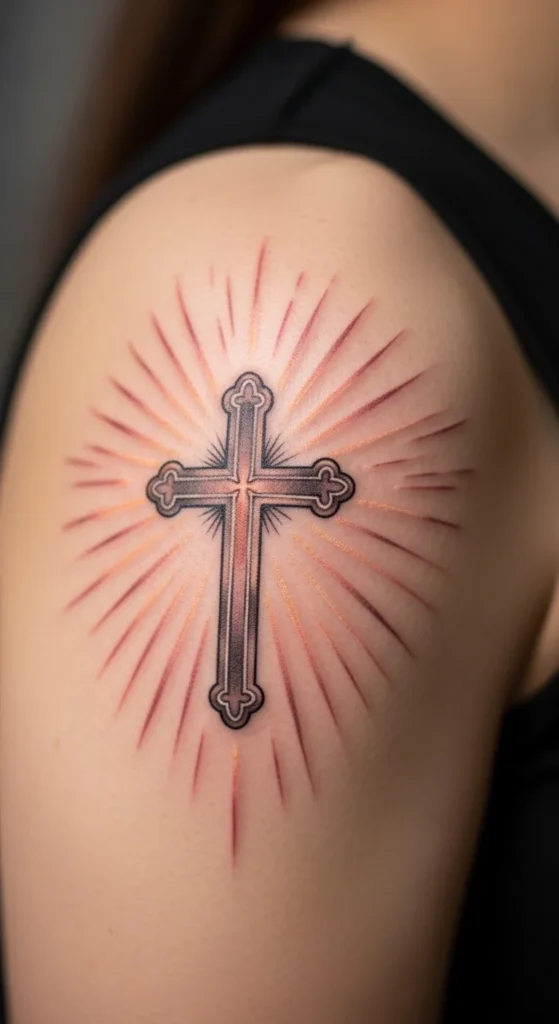
Light rays can look great.
Or like a sunburst mistake.
Keep rays uneven. Perfect symmetry looks fake.
13. Latin “Benedictus” Cross Design
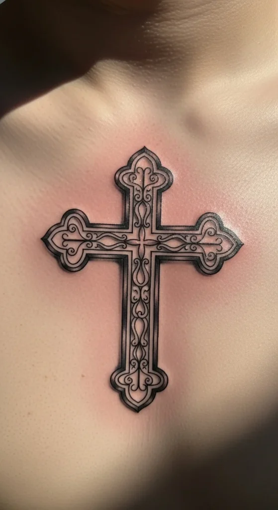
Switching language adds depth.
But don’t do it unless you understand it.
Otherwise, it’s just decoration.
14. Anchor Cross with “Blessed”
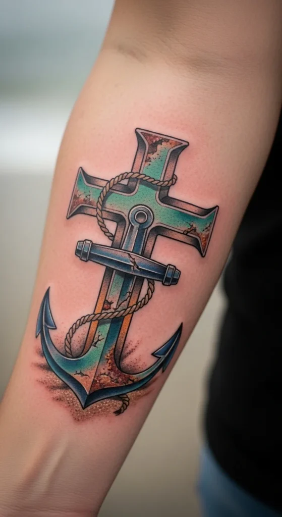
This adds stability symbolism.
Keep lines clean. Anchor shapes get messy fast.
Great for lower arm.
15. Crown of Thorns Cross Design
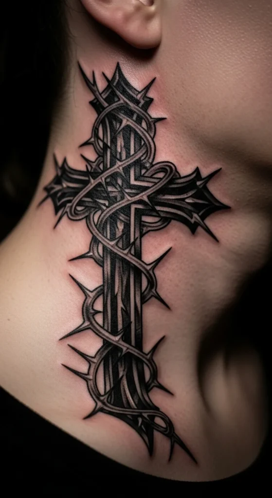
This is intense.
Don’t place it somewhere highly visible unless you’re ready for reactions.
Keep thorns minimal. Over-detailing ruins it.
16. Watercolor Cross Fade Effect
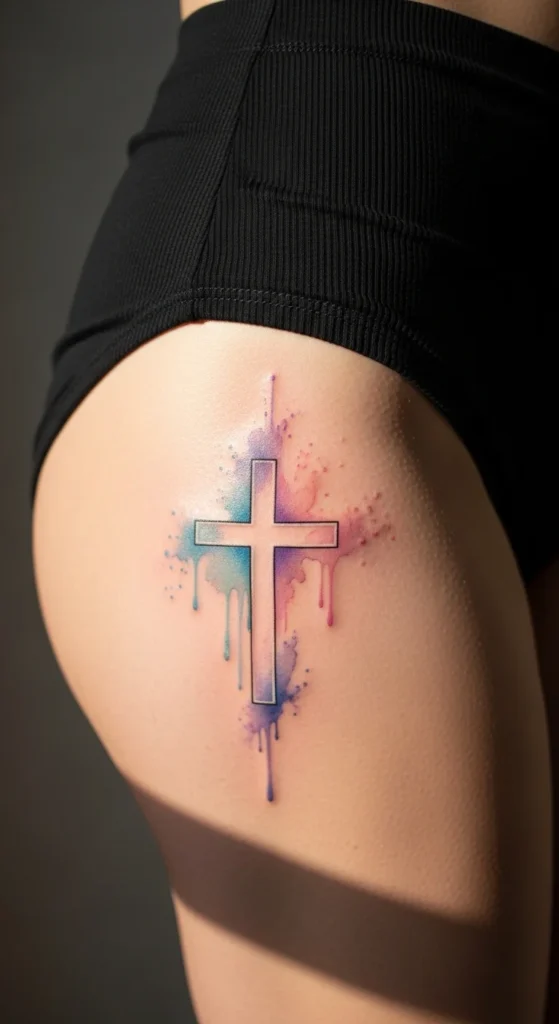
Watercolor fades fast.
Accept that upfront.
Keep the base cross solid so something remains over time.
17. Tribal Cross Outline with Script
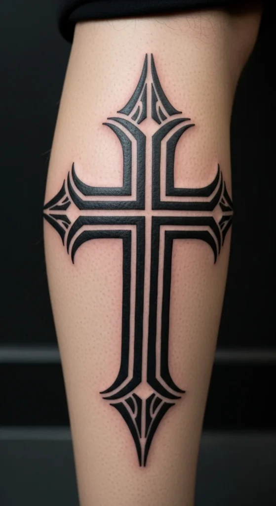
Tribal needs precision.
If lines aren’t clean, it looks cheap.
Pick a skilled artist or skip this.
18. Micro Cross Dotting the “i”

This is smart.
Subtle. Personal.
Works best in small placements like fingers or behind ear.
19. Lion Beside Three Crosses
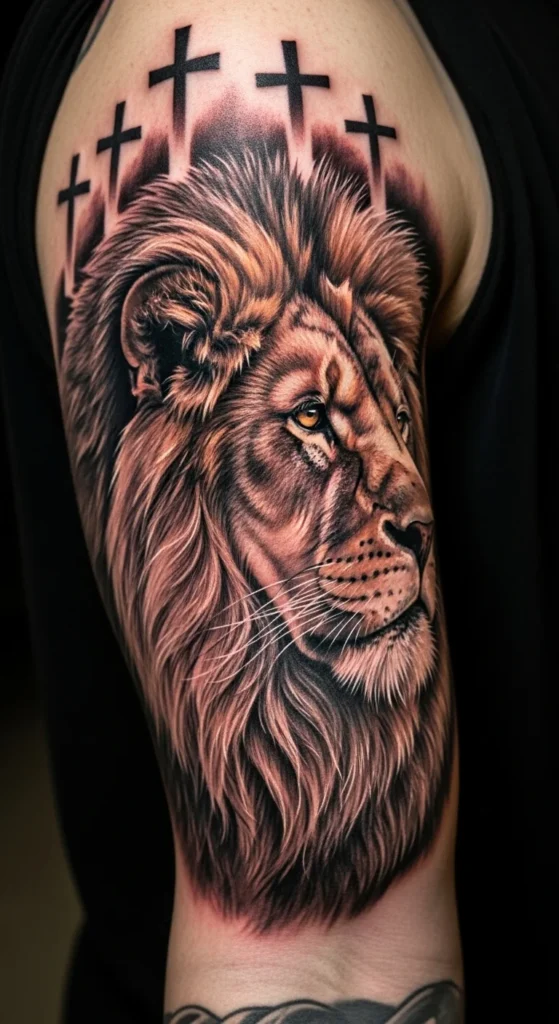
This is bold.
Don’t shrink it. It needs space.
Otherwise, the lion turns into a blur.
20. Cross with Shadow Depth Effect
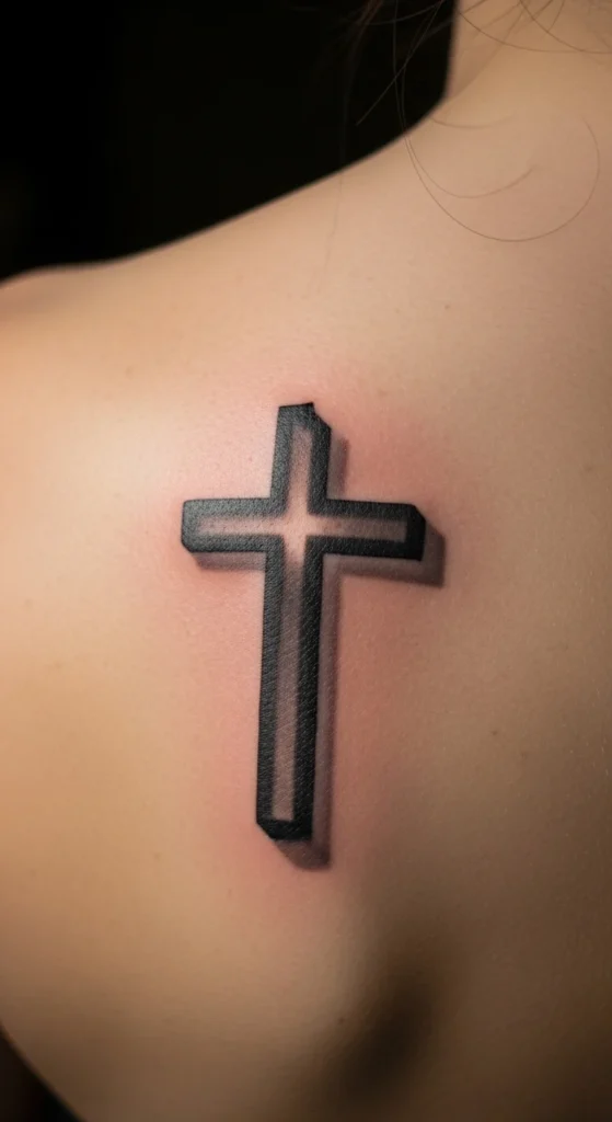
Adds dimension.
Keep shadows soft. Hard edges look fake.
21. Geometric Cross with Script Overlay
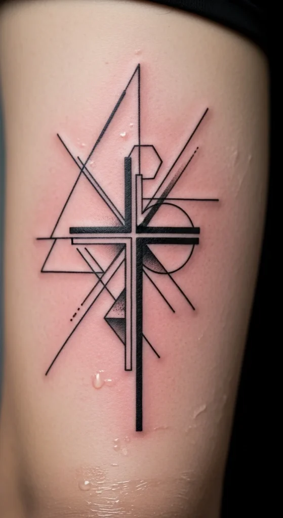
Modern look.
Precision matters. Bad lines ruin it instantly.
22. Broken Cross with Rebuilt Script Meaning
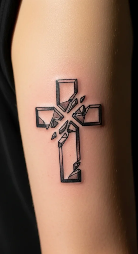
Symbolizes struggle.
Keep breaks subtle. Too much looks chaotic.
23. Cross Embedded in Landscape Scene
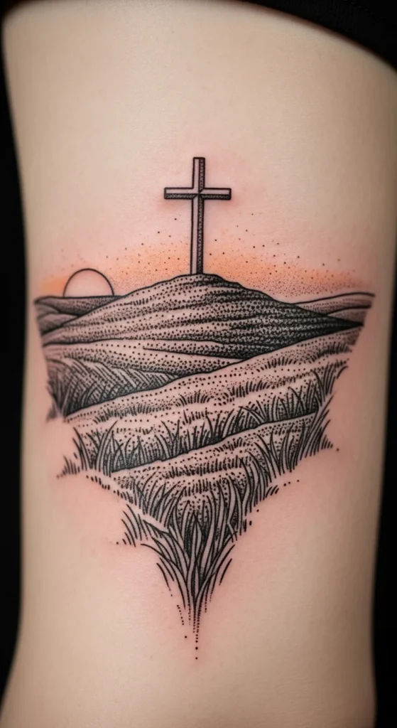
Adds storytelling.
But don’t overpack details.
24. Minimal Dotwork Cross + Script
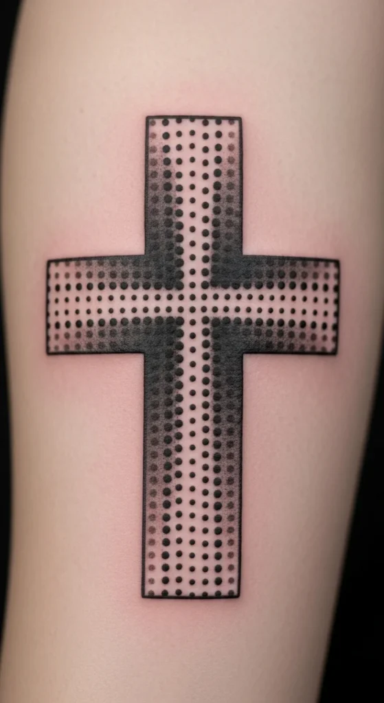
Dotwork ages well.
But only if spacing is clean.
25. Vertical Spine Cross with Script Flow
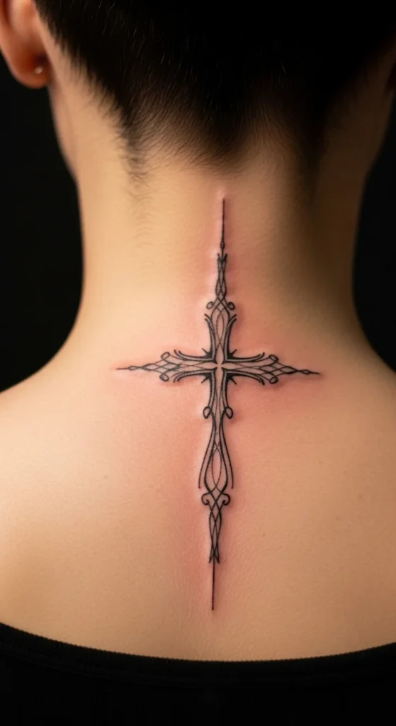
Strong placement.
Painful area. Be ready.
Keep alignment straight or it looks off forever.
26. Hidden Cross Within Lettering
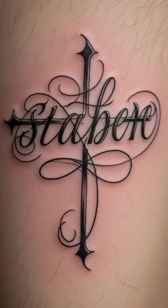
This is the smartest option.
It doesn’t scream. It reveals itself.
That’s what gives it longevity.
Conclusion
Here’s the reality: the symbol isn’t what makes the tattoo meaningful. Your choices do.
Most people copy designs and regret them later because they never questioned placement, scale, or execution.
If you’re serious about this, slow down. Test designs. Challenge your own taste.
A tattoo like this shouldn’t just look good on Instagram.
It should still make sense when you’re 50.