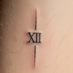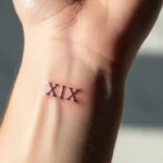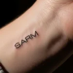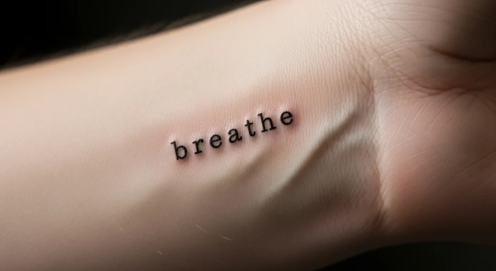
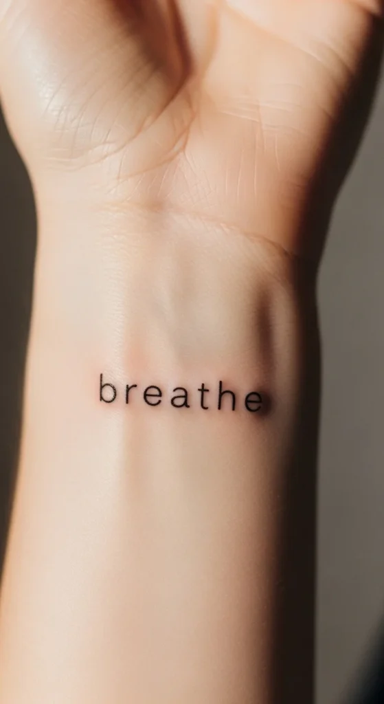
A tiny word on your skin sounds simple—until you realize most of them end up looking cheap, blurry, or deeply regrettable five years later. The difference between a premium-looking micro tattoo and a forgettable one isn’t luck. It’s decisions—brutally intentional ones.
If you’re treating this like a quick aesthetic choice, you’re already setting yourself up for mediocrity.
Let’s fix that.
Start With Meaning—Not Aesthetic
Here’s where most people mess up: they pick a word because it sounds nice, not because it holds weight.
“Hope.” “Love.” “Breathe.”
These aren’t bad—but they’re overused to the point of meaning nothing.
If your tattoo could belong to a thousand strangers, it’s not personal—it’s generic.
Do this instead:
- Write down 5–10 words that actually reflect your life, not your Pinterest board
- Journal around each one for a few days
- Ask yourself: Will this still matter when my life looks completely different?
If the answer is “maybe,” it’s not strong enough.
Premium tattoos feel specific, not universal.
Choose Fonts That Age Well (Not Just Look Good Today)
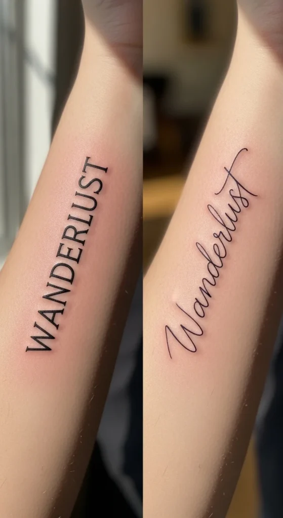
Fine-line script looks elegant—until it spreads and becomes unreadable.
You don’t need something “pretty.” You need something that survives time.
What works:
- Clean sans-serif fonts (think Helvetica-style)
- Slightly thicker strokes than you think you need
- Consistent spacing between letters
What to avoid:
- Ultra-thin cursive (it will blur)
- Overly decorative fonts
- Tight letter spacing (letters will merge)
If you’re prioritizing style over legibility, you’re choosing short-term aesthetics over long-term quality. That’s amateur thinking.
Size Matters More Than You Think
You want it small. Everyone does.
But here’s the reality: too small = guaranteed degradation.
Ink spreads. Skin ages. Friction happens.
A tattoo that looks perfect today can turn into a smudge in a few years if it’s undersized.
Rule of thumb:
- Go 20–30% bigger than your instinct
- Ensure each letter has breathing room
- Ask your artist how it will look in 5–10 years—not just fresh
If you insist on “tiny,” accept that you’re trading longevity for aesthetic.
Placement: Stop Choosing Based on Trends
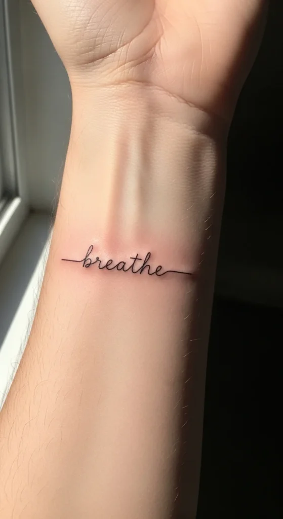
Behind the ear. Finger. Wrist. Ankle.
Yes, they’re popular. No, that doesn’t mean they’re smart.
Different placements age differently—and some are objectively worse.
High-risk placements:
- Fingers (constant friction, fading, distortion)
- Side of hand (fastest fading areas)
- Behind ear (blurs faster than you expect)
More reliable placements:
- Inner forearm (flat surface, low distortion)
- Upper arm (less friction, better aging)
- Outer wrist (visible but relatively stable)
Also consider this:
Do you want to see it daily—or forget it’s there?
Because that changes everything.
Test It Before You Commit
You’re about to make something permanent. Acting impulsively here is just reckless.
Smart approach:
- Get a temporary version of your chosen word
- Wear it for 1–2 weeks
- Notice how often you look at it—and how it makes you feel
If you forget it’s there within days, that’s a red flag.
If it starts feeling cringe, that’s an even bigger one.
This step alone eliminates most bad tattoo decisions—but people skip it because they’re impatient.
Work With the Right Artist (This Is Non-Negotiable)
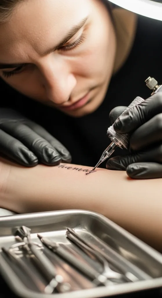
Not all tattoo artists can execute fine-line word tattoos properly.
And no—“they’re cheap” is not a valid reason.
Look for:
- A portfolio with healed micro tattoos (not just fresh ones)
- Clean, consistent line work
- Experience specifically with lettering
Red flags:
- Blurry healed results
- Uneven spacing in letters
- No examples of small text tattoos
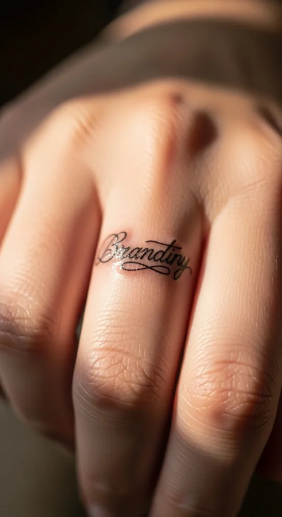
If the artist isn’t obsessed with precision, your tattoo won’t look premium—no matter how good your idea is.
Keep It Minimal—But Intentional
Minimalism isn’t about doing less. It’s about removing everything unnecessary.
That includes:
- Extra words
- Decorative flourishes
- Random symbols that don’t add meaning
If you’re adding a heart, dot, or line—ask yourself why.
If the answer is “it looks cute,” rethink it.
Strong minimal tattoos feel deliberate, not decorative.
Think About Long-Term Maintenance
No one talks about this, but they should.
Your tattoo won’t stay “fresh” forever unless you treat it properly.
Basic rules:
- Avoid picking scabs during healing (you’ll ruin line quality)
- Use sunscreen consistently (fading is real)
- Moisturize to maintain skin clarity
Neglect this, and even a perfect tattoo will degrade.
Final Thought: Most People Rush This—Don’t
Here’s the uncomfortable truth:
Most small word tattoos look average because people treat them like accessories.
They’re not.
They’re permanent design decisions on living skin.
If you:
- Choose a word with actual meaning
- Prioritize legibility over trends
- Size it correctly
- Place it strategically
- And work with a skilled artist
…you’ll end up with something that actually looks premium.
Anything less, and you’re gambling with regret.
Save this before you book your appointment.