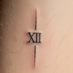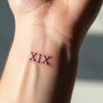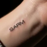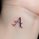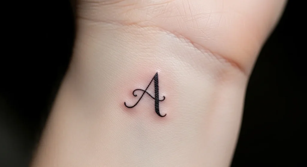
A tiny tattoo sounds simple—just a letter, right? Wrong. Most people underestimate how easily a “minimal” tattoo can turn into something blurry, cheap-looking, or worse… meaningless a year later. A classy initial tattoo isn’t about size—it’s about intention, design discipline, and restraint.
Done right, it looks timeless. Done poorly, it looks like a rushed decision.
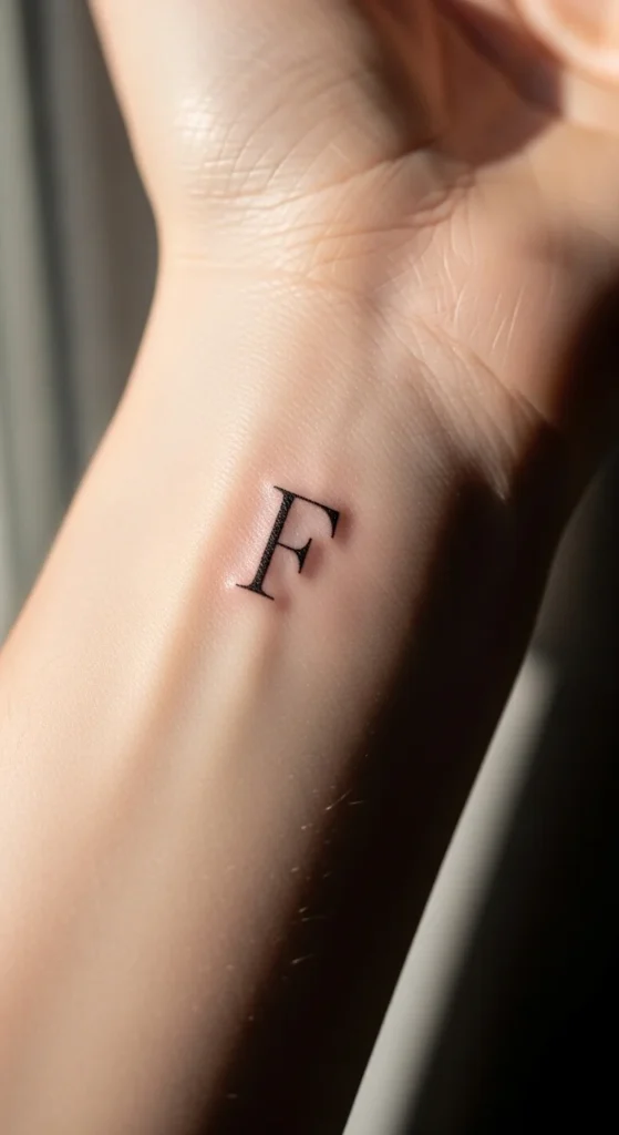
Start With Meaning (Not Just Aesthetic)
If your only criteria is “this looks cool,” you’re already setting yourself up for regret. Initial tattoos work because they mean something specific—not vague.
Ask yourself:
- Is this tied to someone permanent (family > relationships)?
- Would this still matter in 10 years?
- Does this represent identity or just a phase?
Hard truth: Most people pick initials emotionally, not rationally. That’s why they regret them.
Better choices:
- Parent or child initials
- Your own initial (identity anchor)
- A meaningful date paired with a letter
Avoid:
- Romantic partners (unless you enjoy cover-ups later)
- Trend-based symbols with no personal anchor
Choose a Font That Ages Well
Here’s where people mess up badly: they pick fonts for style, not longevity.
Tiny tattoos blur over time. That elegant cursive you love? It turns into a smudge.
What actually works:
- Sans-serif fonts → clean, readable, modern
- Simple block letters → best under 1 inch
- Fine-line (but not ultra-thin) → balance between detail and durability
What to avoid:
- Overly decorative script
- Thin cursive on joints or bones
- Fonts with too many tiny details
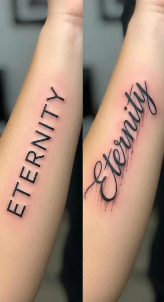
If your artist can’t show healed examples of similar micro lettering, walk away. You’re not buying ink—you’re buying precision.
Size Matters More Than You Think
Everyone says, “I want it tiny.” That’s usually a mistake.
Ink spreads slightly over time. A tattoo that looks perfect on day one can look muddy in a year if it’s too small.
Smart rule:
Go 20% larger than your initial instinct.
Why?
- Preserves spacing
- Keeps edges sharp longer
- Prevents merging lines
If you insist on micro-size, accept the trade-off: less detail, simpler design.
Placement: Where Class Meets Longevity
Placement isn’t just aesthetic—it determines how your tattoo ages and how often you’ll see it.
Best placements for classy initials:
- Inner wrist → subtle, personal
- Inner arm (bicep area) → private, clean aging
- Collarbone → elegant and minimal
- Behind ear / nape → discreet but stylish
Risky placements:
- Fingers (high fading, constant touch)
- Joints (distortion over time)
- Feet/ankles (friction + fading)
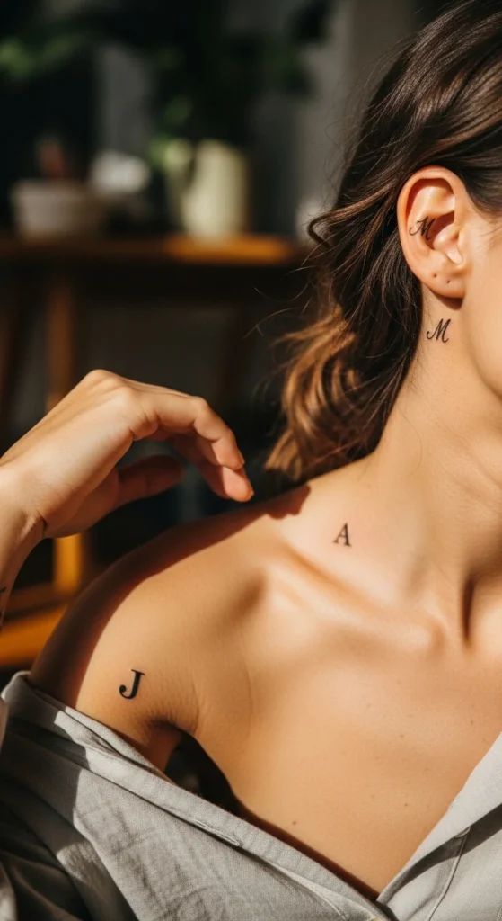
Don’t just ask “does it look good here?” Ask:
“Will it still look good after years of movement, sun, and skin changes?”
Add Subtle Details (Without Overdoing It)
Minimal doesn’t mean boring—but it also doesn’t mean stacking symbols until it loses elegance.
Tasteful additions:
- Tiny heart or dot
- Roman numeral date
- Small geometric accent
- Birthstone-inspired color dot (very subtle)
What ruins the look:
- Too many elements
- Large symbols overpowering the letter
- Mixing styles (e.g., gothic + fine-line chaos)
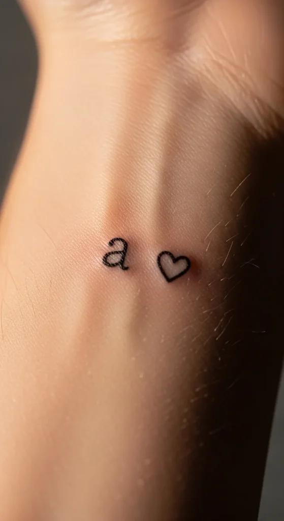
A classy tattoo whispers. It doesn’t shout.
Test Before You Commit
You’re about to make something permanent. Acting impulsively here is just lazy thinking.
Do this first:
- Try a henna version
- Wear it for 1–2 weeks
- Observe how it feels in daily life
Questions to ask yourself:
- Do I like seeing this every day?
- Does the placement feel right?
- Does it still feel meaningful after the novelty fades?
If you get bored of it in two weeks, imagine 20 years.
Choose the Right Artist (This Is Non-Negotiable)
This is where most people sabotage everything.
A general tattoo artist ≠ a micro tattoo specialist.
What to look for:
- Healed photos of small lettering
- Clean, crisp line work
- Consistency across multiple clients
Red flags:
- Only fresh tattoos shown
- Shaky or uneven lines
- Overconfidence without proof
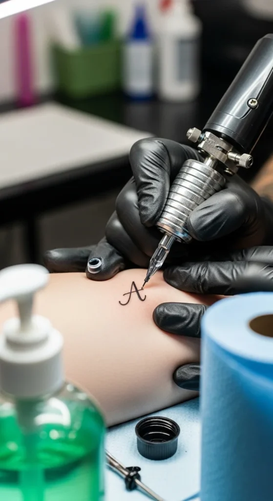
If your artist isn’t obsessive about detail, your tattoo will show it forever.
Keep It Timeless With Black Ink
Color fades. Trends change. Skin tone shifts.
Black ink:
- Holds contrast over time
- Works on all skin tones
- Keeps the design sharp and readable
That “cute colored detail” might look good now—but in a few years, it could look washed out.
Final Thought: Classy = Controlled
A classy initial tattoo isn’t about creativity—it’s about restraint.
- Simple beats complicated
- Meaning beats trend
- Longevity beats impulse
Most people overdesign and underthink. Don’t be that person.
Choose something you won’t need to explain.
Save this guide before you book your appointment—future you will either thank you or regret ignoring it.