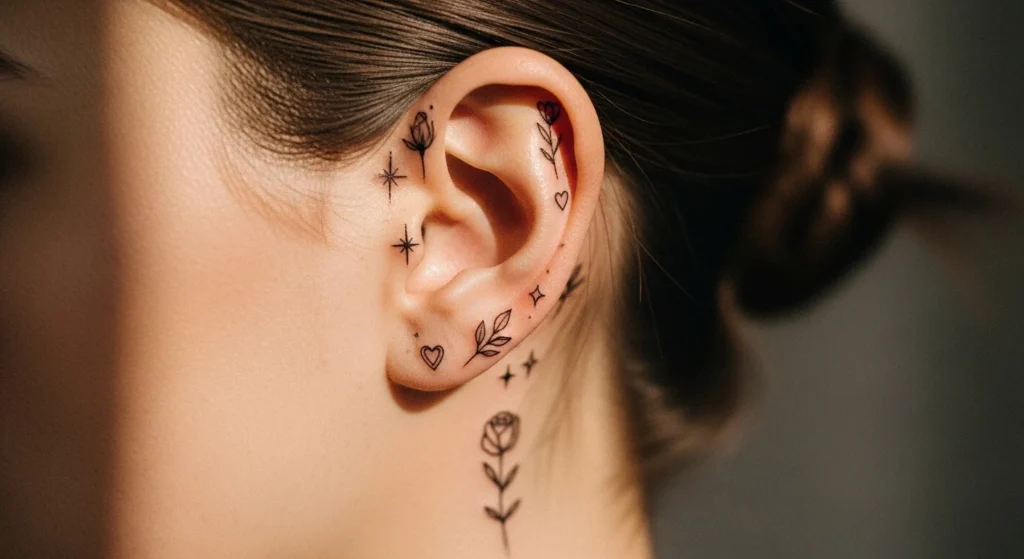
28 Adorable Cute Behind-the-Ear Tattoo Ideas That Get Compliments

Behind-the-ear tattoos hit a very specific sweet spot. Hidden most of the time. Visible when you want them to be. That controlled visibility is exactly why people choose this placement.
But here’s what most people get wrong: they treat this area like a canvas. It isn’t. It’s tight, curved, and prone to fading. If your design isn’t simple, it won’t age well.
The ideas below aren’t random trends. They’re designs that fit the space, heal better, and still look clean later.
1. Tiny Heart Outline
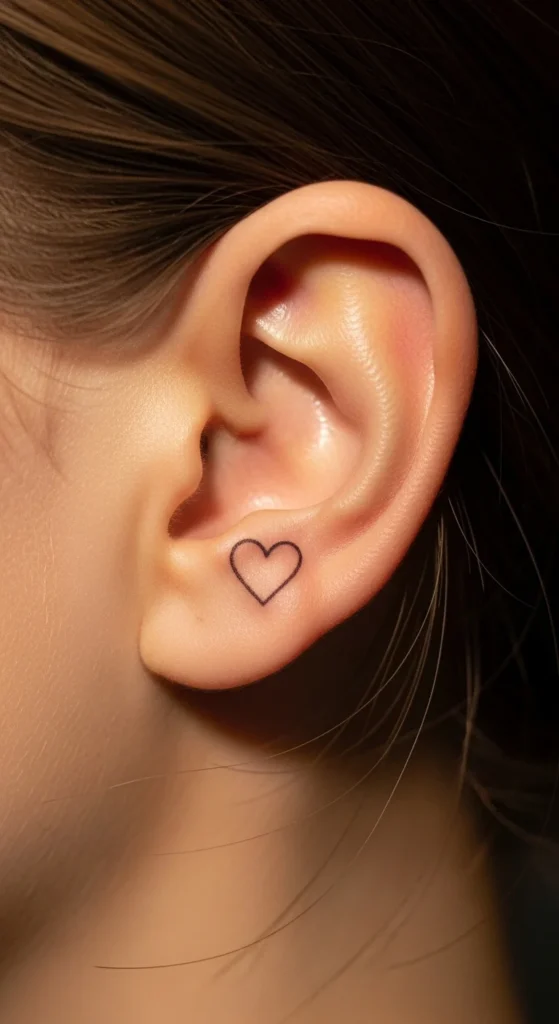
A tiny heart is the safest entry point. It’s simple, readable, and doesn’t blur easily. Go with an outline instead of filled ink. Filled shapes spread faster here. Keep it slightly above the mastoid bone so it shows when hair moves. Don’t go too small—tiny often becomes invisible after healing. Cheap, fast, and hard to mess up if you keep it minimal.
2. Fine-Line Lavender Stem
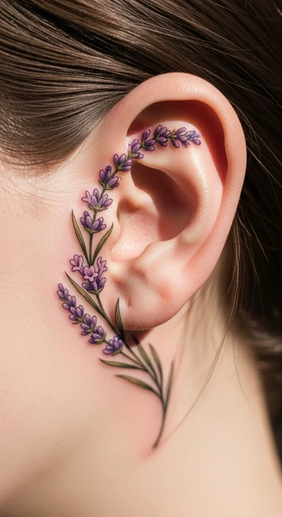
Lavender follows the ear’s curve naturally. That’s why it works. Keep buds spaced out so they don’t merge over time. Skip color if you care about longevity. Black linework holds better. Don’t add shading—it won’t last. This design looks soft but only works if the lines stay thin and clean.
3. Crescent Moon Curve
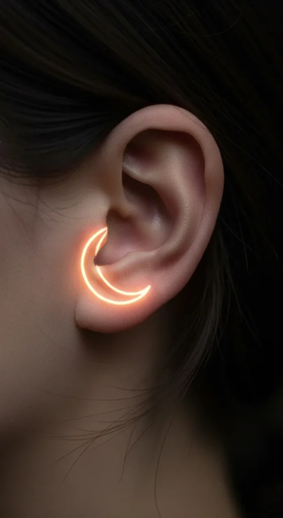
The crescent shape fits the ear perfectly. Keep it thin and simple. Adding texture inside the moon is a mistake—it fades fast. One or two tiny stars are fine, but more than that ruins the balance. Let the shape do the work.
4. Minimal Star Trio
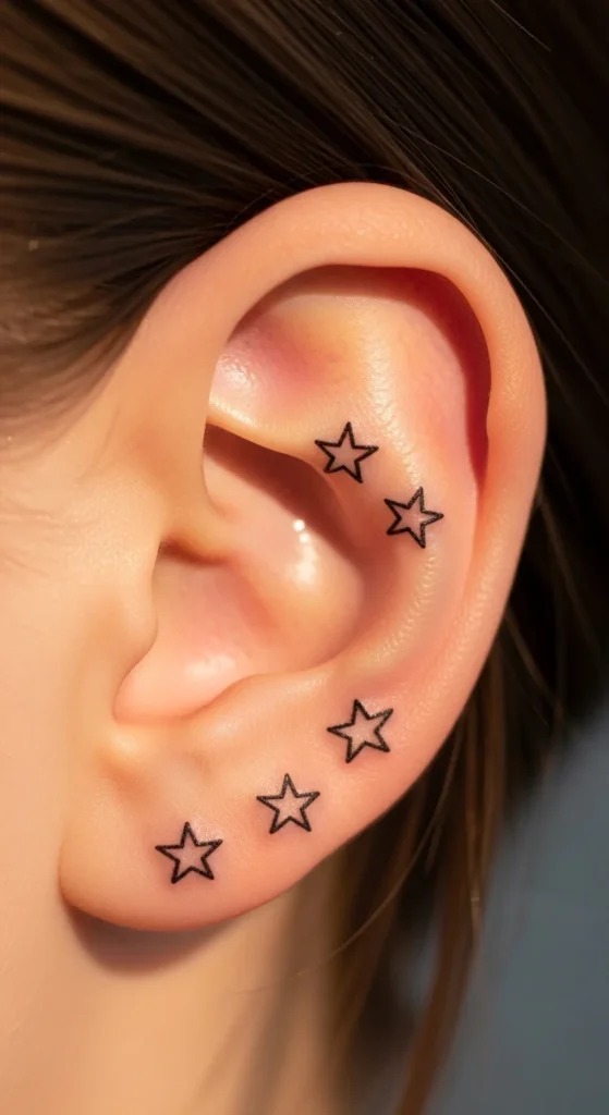
Three stars create balance without clutter. Keep spacing even. Don’t shrink them too much or they’ll blur. Slight size variation adds depth. Cheap, quick, and visually clean if done right.
5. Single Leaf Line
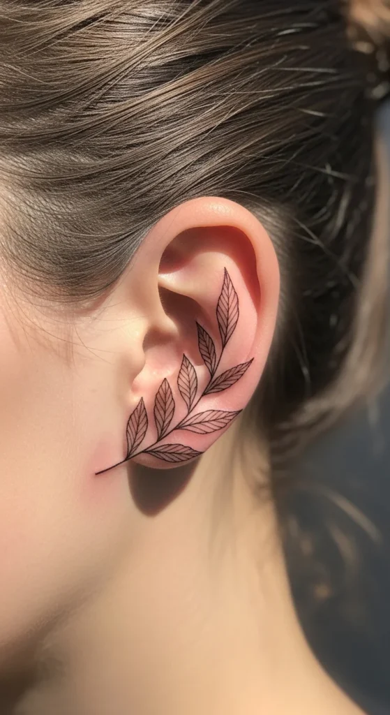
A single leaf works because it’s simple and organic. Use a thin outline with minimal detail. Keep it narrow. Wide shapes age badly here. Follow the ear curve for better flow.
6. Tiny Diamond Symbol
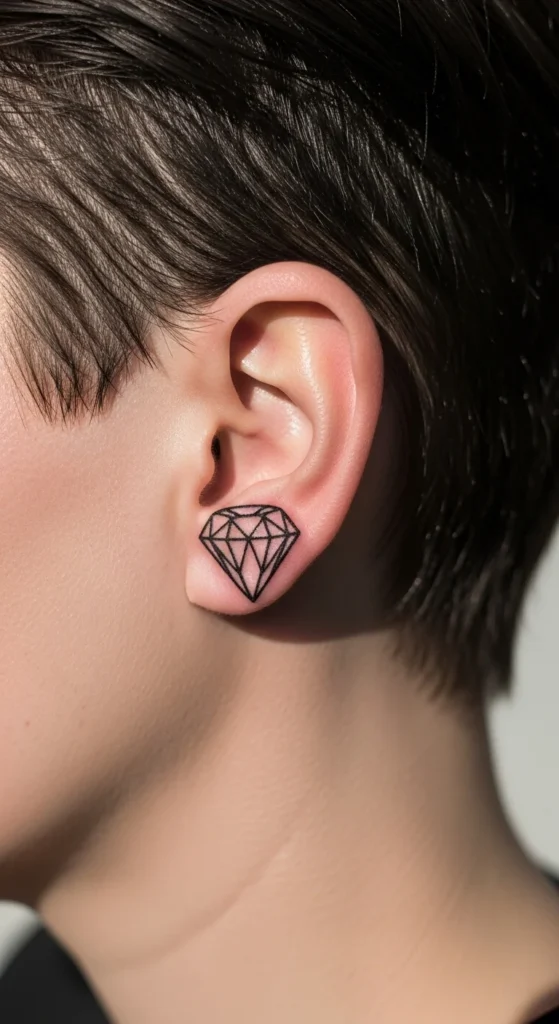
Geometric shapes hold well. A diamond gives structure without complexity. Skip inner lines and shading. Keep it clean. Slight tilt adds interest without making it messy.
7. Minimal Wave Line
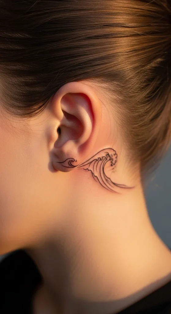
A wave line is simple but expressive. Keep it smooth and thin. No extra detail. You can add a second line for variation, but don’t overdo it.
8. Tiny Initial Letter
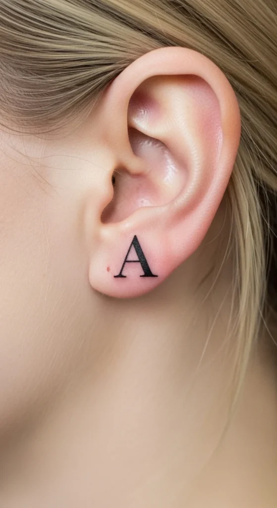
Initials only work if readable. Use simple fonts. Avoid script styles—they blur fast. Keep size practical. Not too small.
9. Butterfly Micro Outline
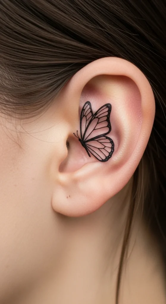
Butterflies can look good or terrible. The difference is detail. Keep it outline-only. No shading. No heavy wings.
10. Constellation Dots
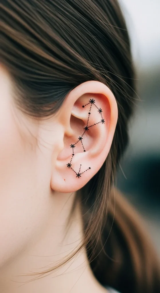
Use 3–5 dots max. Thin connecting lines. Space matters more than detail. Overcrowding ruins it.
11. Semicolon Symbol
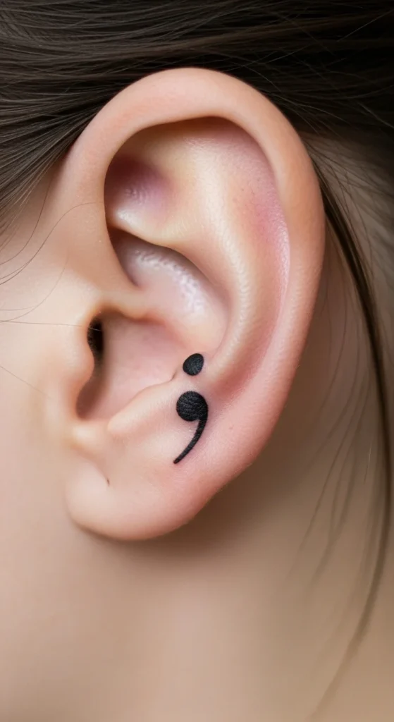
Simple and meaningful. Keep it bold enough to stay visible. Too small and it disappears.
12. Tiny Cross Line
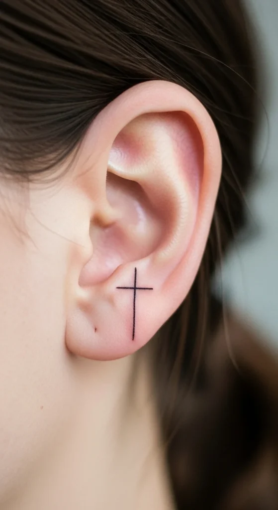
Use thin straight lines. No thickness. Center placement works best.
13. Small Anchor Symbol
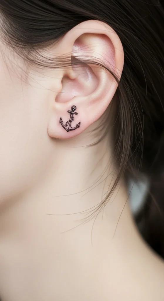
Anchors get messy fast. Keep it stripped down. No ropes. No shading.
14. Tiny Music Note
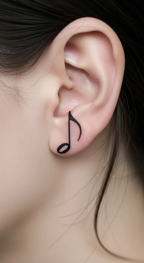
Stick to one note. Clusters look crowded. Keep lines sharp.
15. Mini Sun Outline
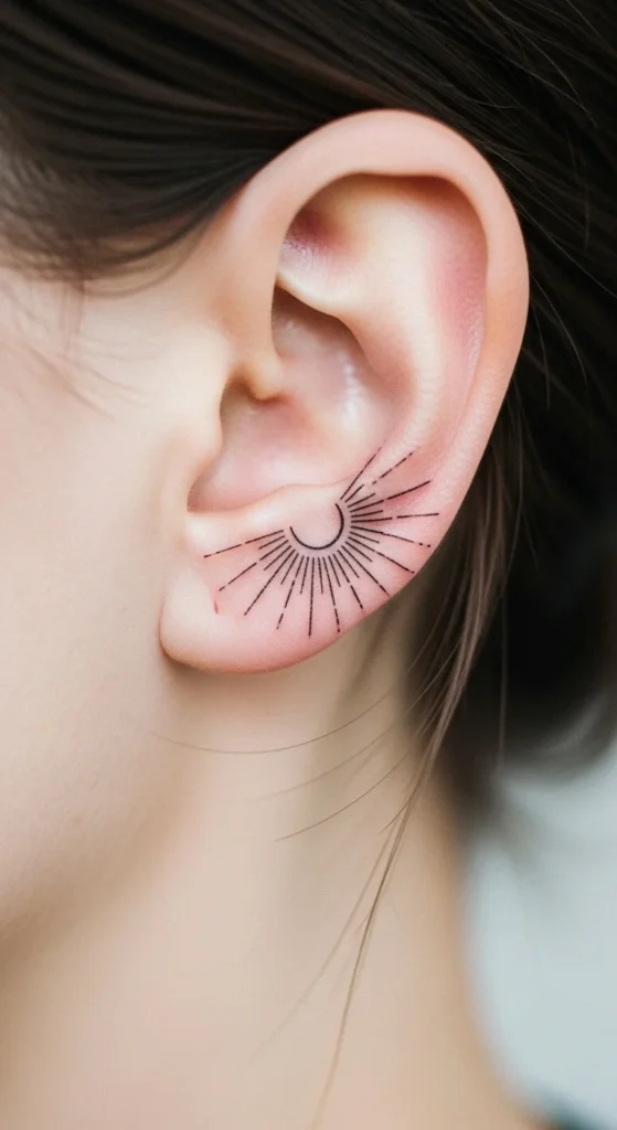
Even rays. No shading. Keep spacing clean.
16. Cute Bunny Silhouette

Silhouettes work better than detailed animals. Keep edges smooth.
17. Koala Mini Outline
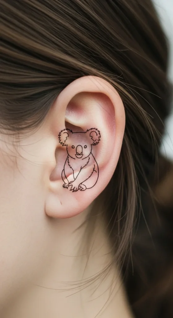
Same rule: outline only. No facial detail.
18. Tiny Infinity Loop
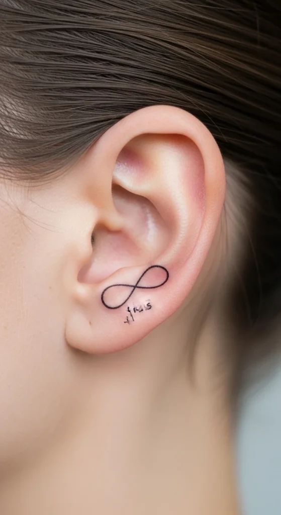
Keep loops thin. Avoid thickness.
19. Geometric Triangle
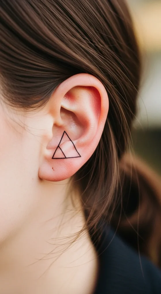
Simple geometry ages well. No fills.
20. Minimal Arrow
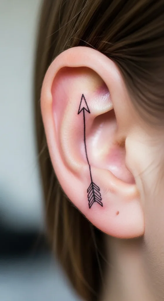
Keep it straight. Skip feather details.
21. Tiny Crown Outline
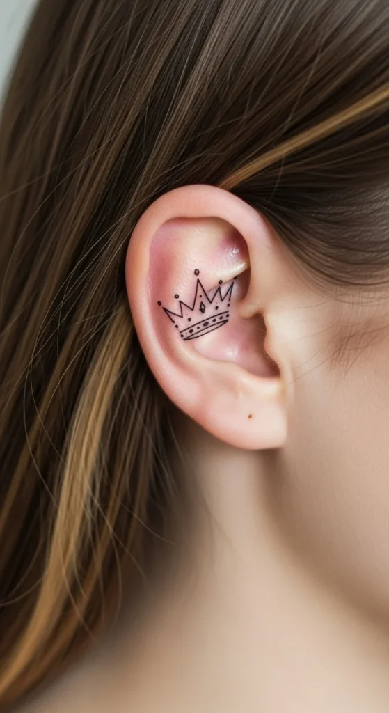
Crowns get messy. Keep it basic. No jewels.
22. Small Lightning Bolt
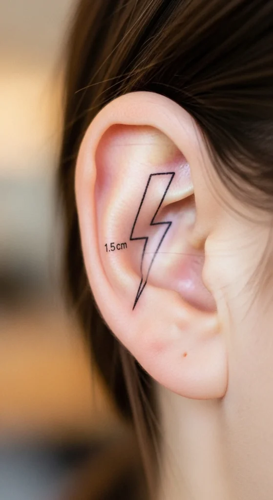
Sharp angles. Thin lines. No fill.
23. Micro Rosebud
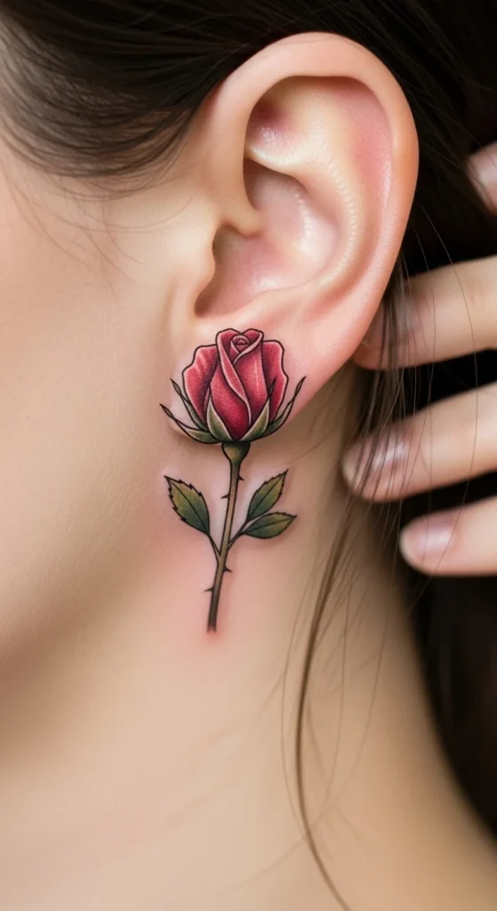
Bud > full rose. Less detail means better aging.
24. Tiny Paw Print
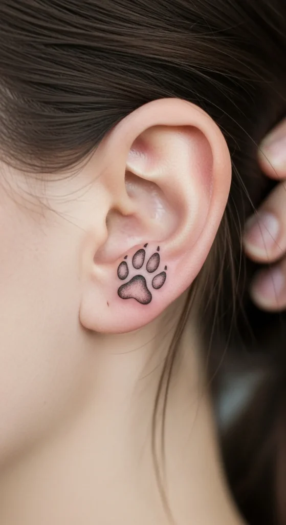
Keep spacing clean. Don’t shrink too much.
25. Minimal Eye Outline
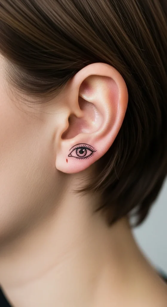
No shading. Just outline.
26. Small Feather Line
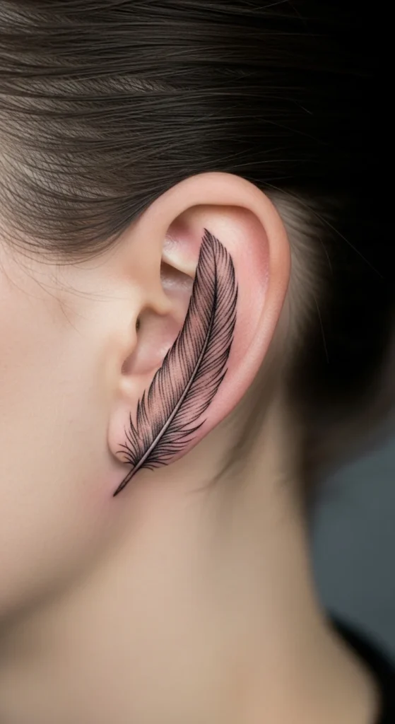
Light lines only. Avoid heavy strokes.
27. Tiny Script Word
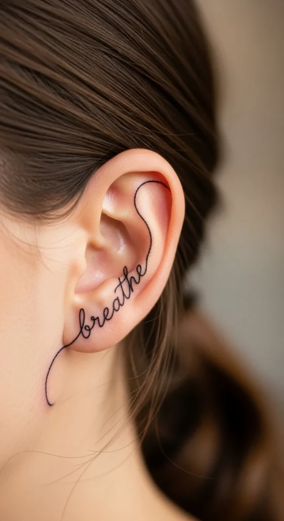
Short words only. Wide spacing. Simple font.
28. Minimal Wave + Dot Combo
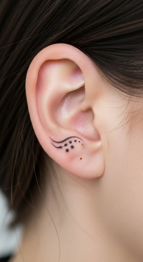
A wave paired with a single dot adds interest without clutter. Keep both elements thin and spaced.
Conclusion
Most behind-the-ear tattoos fail for one reason: people try to do too much in a tiny space. That’s the mistake.
If the design isn’t simple, it won’t last. If the lines aren’t clean, it won’t stay readable.
Pick something that still looks good when it fades slightly. Not just when it’s fresh.
And stop chasing “unique.” In this placement, simple is what actually works.