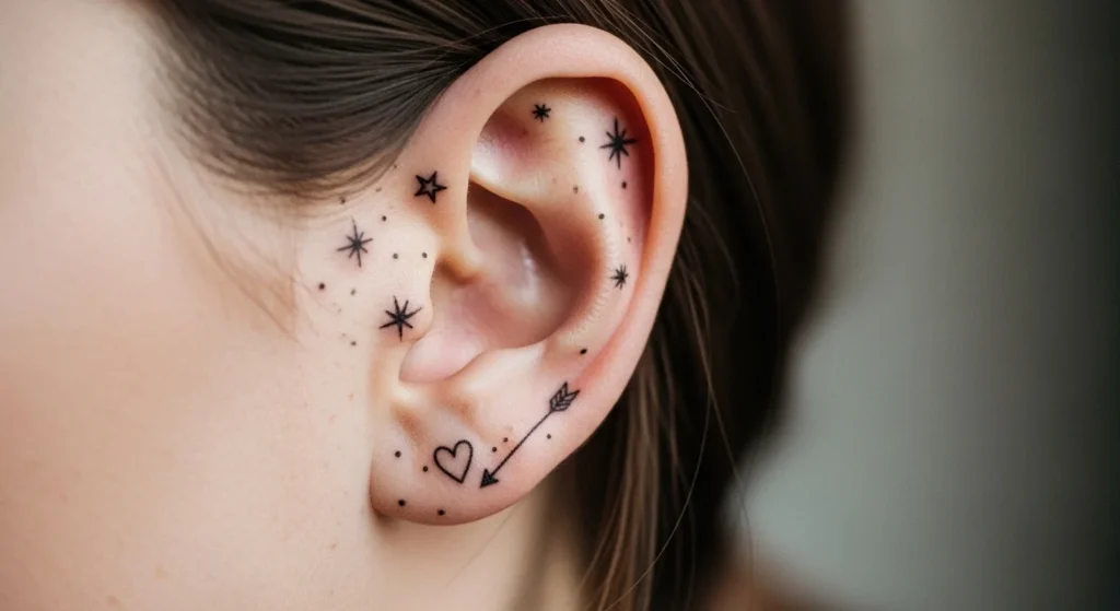
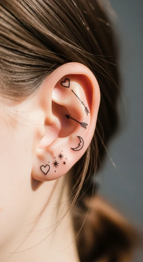
Behind-the-ear tattoos sit in that rare sweet spot: subtle but expressive. You don’t need loud designs or big ink to make a point. A single clean line or tiny symbol can say more than a full sleeve—if you choose right. The catch? Most people overcomplicate it, pick designs that blur, or ignore placement entirely. This guide strips it down to what actually works: simple, sharp, and practical ideas that stay crisp, heal well, and won’t sabotage your professional image.
1. Single Fine-Line Arrow
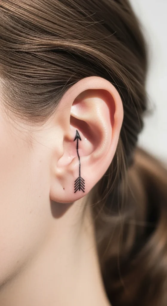
A single arrow is one of the safest bets. It’s clean. It’s readable. And it ages better than most trendy designs.
Keep it vertical. That follows the natural curve behind your ear and avoids awkward spacing.
Go for fine black linework. Skip color unless you want fading issues later.
Budget tip: Ask your artist for a one-needle line. It’s cheaper and faster. Many shops will charge minimum price, so keep it simple to stay under budget.
DIY mistake to avoid: Don’t print a thick arrow stencil at home and expect it to shrink well. Thin lines matter here.
Placement matters more than design. Too close to the bone? Pain spikes. Slightly lower? Much easier.
2. Tiny Outline Heart
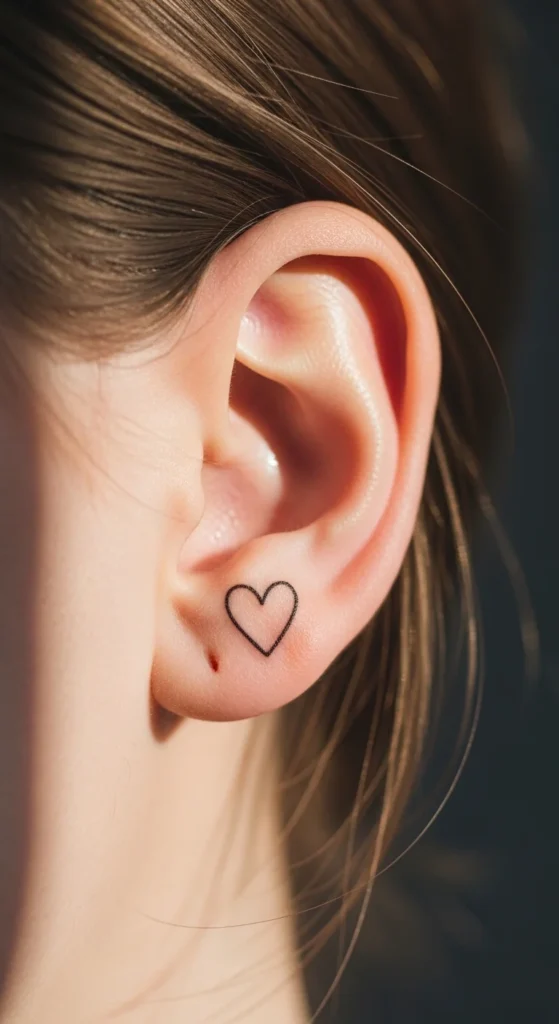
This is overused—but for a reason. It works.
Stick to a hollow outline, not filled. Filled hearts blur faster in small sizes.
Black ink holds longer. Red fades unevenly unless your artist is skilled.
Keep it tiny. Around 5–8 mm is ideal. Bigger starts looking clumsy in this spot.
Budget angle: This takes under 10 minutes. Don’t overpay.
DIY thinking trap: Don’t try to “customize” it with shading or extra lines. That’s where it goes wrong.
Position it slightly behind the ear curve, not directly centered. It looks more natural that way.
3. Three-Dot Constellation
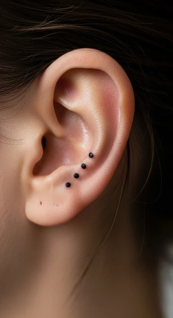
Three dots. That’s it.
But placement makes or breaks it. Space them evenly along the ear curve.
This design fits the area perfectly because it follows natural anatomy.
You can align them vertically or slightly angled. Both work.
Cheap option: This is one of the lowest-cost tattoos possible.
Mistake to avoid: Don’t make the dots too small. They’ll fade into nothing. Ask for slightly bold dots.
If you want meaning, tie it to Orion’s Belt or a personal milestone. But don’t overthink it.
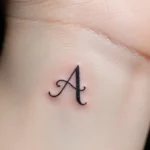
4. Minimal Initial Letter
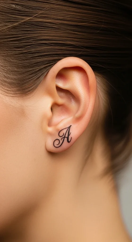
Initial tattoos fail when they’re unreadable. Most people pick overly fancy scripts.
Use simple cursive or clean sans-serif.
Keep it under 1 cm. Anything larger looks forced.
Budget tip: Bring a printed font. Saves time and avoids redesign fees.
DIY fail: Don’t trace Pinterest fonts blindly. Many aren’t tattoo-friendly.
Ask your artist to adjust spacing slightly. Skin stretches differently than paper.
5. Lightning Bolt Line
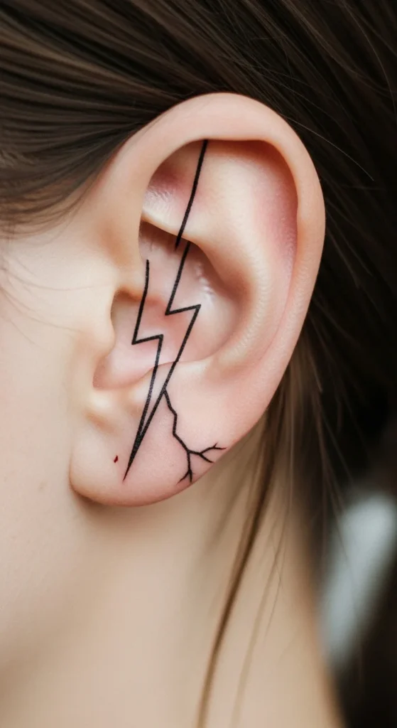
This one works if you keep it sharp and simple.
No shading. No thickness variation.
Just a clean zigzag line.
Placement tip: Slightly angled looks more natural than perfectly vertical.
Budget note: Quick job. Don’t let anyone overcharge.
Avoid making it too thin. It needs a bit of weight to stay visible over time.
6. Single Leaf Outline
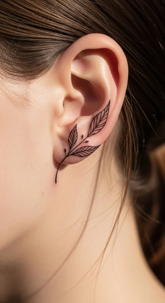
Nature designs fail when they get too detailed.
Stick to one leaf. No veins. No shading.
A simple curved outline works best.
Position it to follow the ear’s shape.
Cheap option: Minimal work = minimal cost.
DIY trap: Don’t try to replicate a real leaf photo. Simplify it.
7. Semicolon Symbol
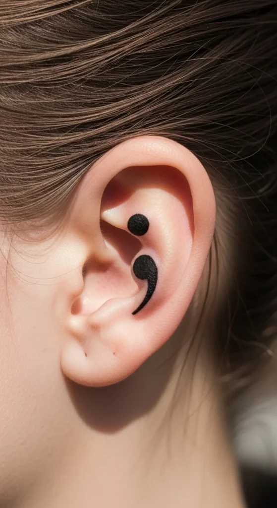
This one carries weight. But visually, keep it clean.
No extra decoration unless you’re pairing it intentionally.
Dot + curve. That’s it.
Budget-friendly and fast.
Mistake: Making it too small. The dot needs to stay visible.
8. Tiny Crescent Moon
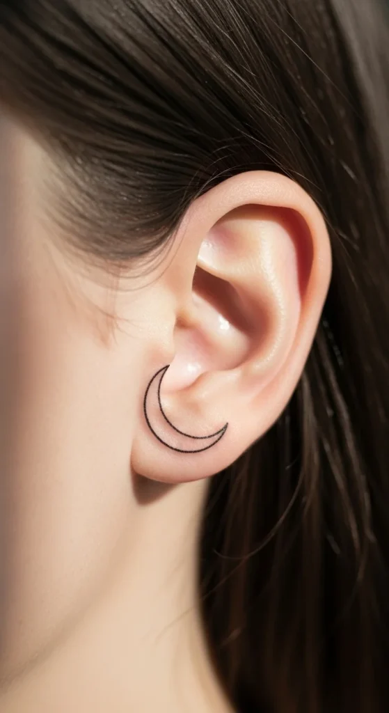
Crescent moons age well if you keep them thin but not fragile.
Avoid filled black shapes.
Keep the curve smooth.
Placement tip: Align with ear contour.
Cheap and simple.
9. Minimal Star Outline
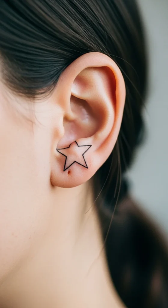
Stars fail when lines cross too tightly.
Go slightly larger than you think.
Keep spacing clean.
Budget tip: Combine with dots if you want more value from one session.
10. Single Musical Note
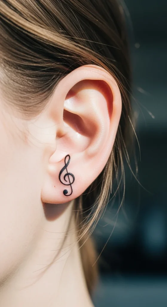
Clean and personal.
Stick to one note. Not a full staff.
Avoid thick fills.
Cheap and quick.
11. Tiny Anchor Symbol
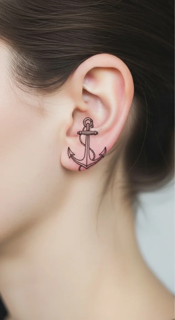
Keep it stripped down.
No rope detail.
Just the shape.
Too much detail ruins it.
12. One-Line Wave
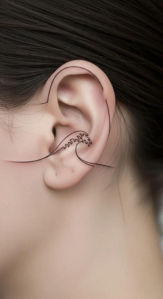
This is trending for a reason.
One continuous stroke.
No breaks.
Make sure the artist specializes in line flow.
13. Small Butterfly Outline
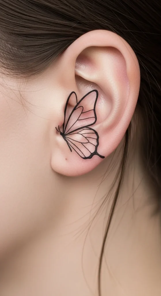
Skip filled wings.
Outline only.
Keep symmetry simple.
Too detailed = blur risk.
14. Zodiac Symbol
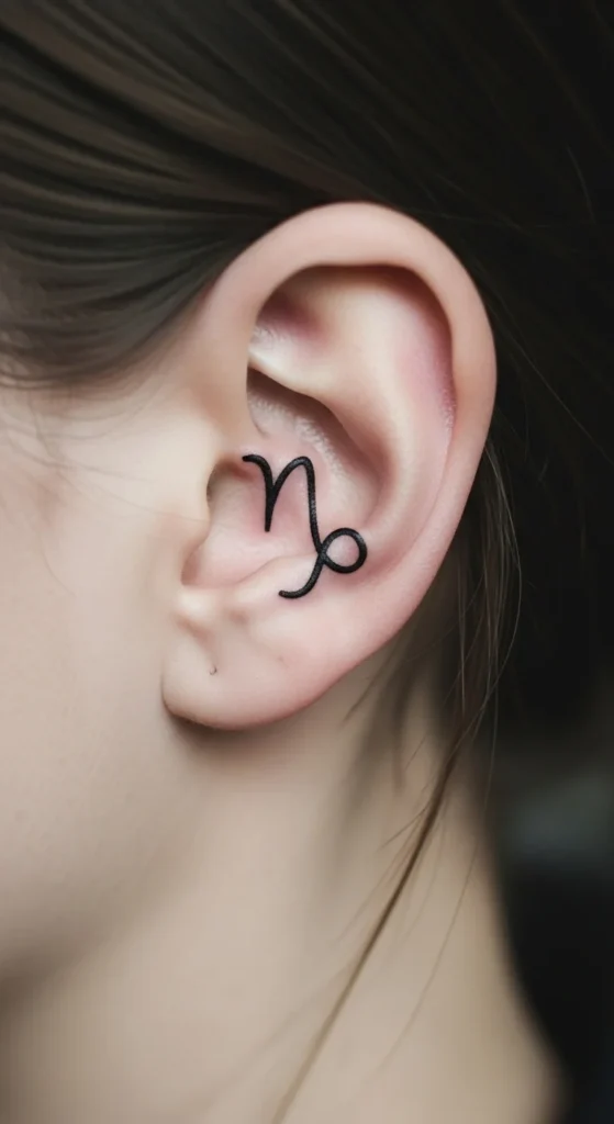
These work because they’re designed to be simple.
Pick the official symbol, not a stylized version.
Keep it clean.
15. Tiny Planet Circle
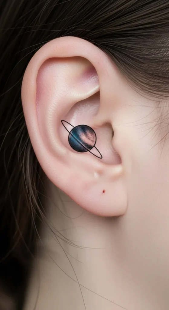
Simple circle + ring.
No shading.
Keep lines even.
16. Dainty Turtle Silhouette
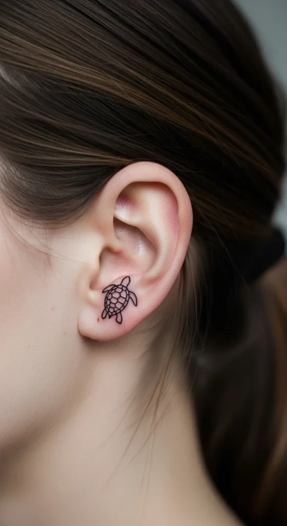
Keep it iconic.
Simplify the shape.
Avoid texture.
17. Single Word Script (“Love”)
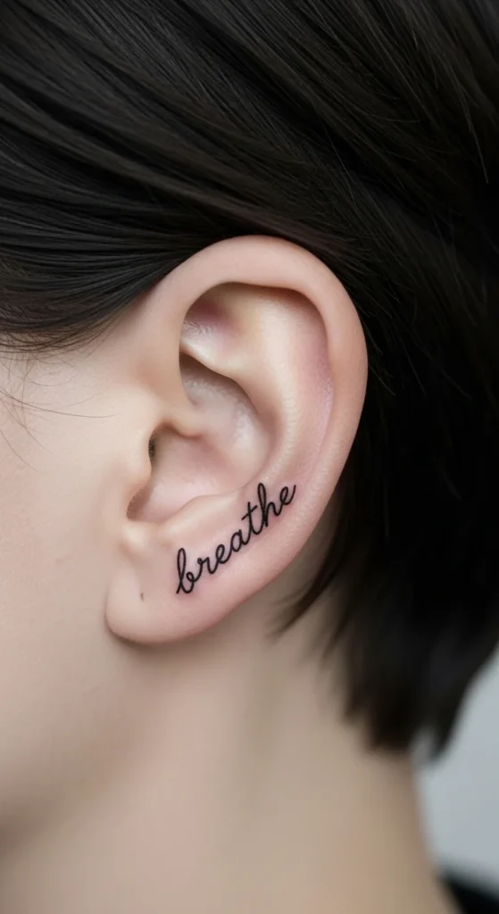
Short words only.
3–5 letters max.
Readable font.
No heavy flourishes.
18. Minimal Angel Wing
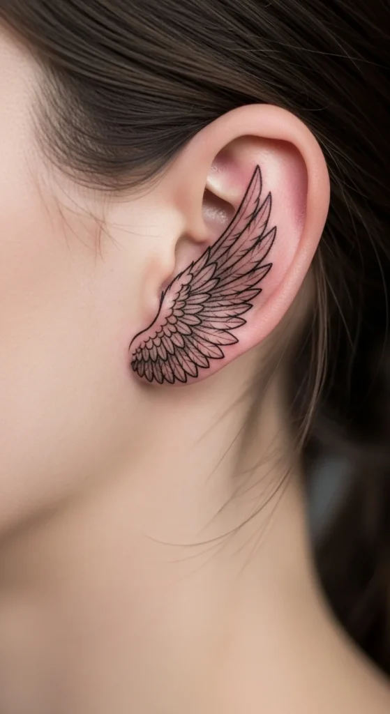
One wing, not two.
Simplify feathers.
Keep spacing clean.
19. Tiny Daisy Chain (3 Flowers)
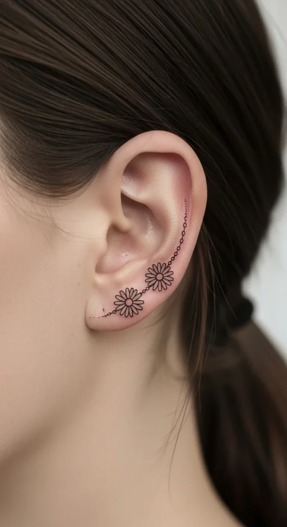
Limit to 3.
More looks crowded.
Keep petals simple.
20. Simple Geometric Triangle
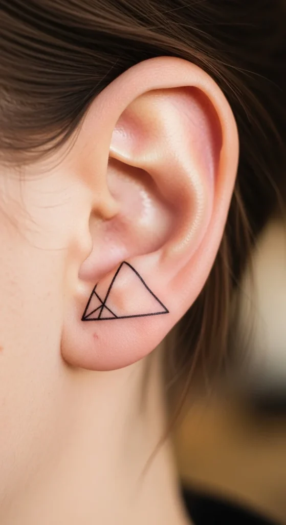
Straight lines matter.
Use stencil precision.
Keep it centered.
21. One-Line Infinity Symbol
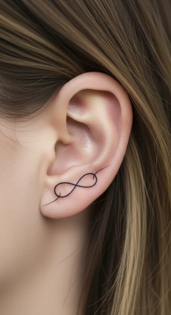
Smooth curve is everything.
No breaks.
Avoid thick lines.
22. Minimal Cross Symbol
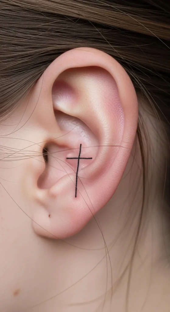
Keep proportions balanced.
Too long looks awkward.
Clean lines only.
23. Tiny Sun Outline
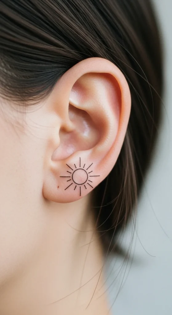
Short rays.
Even spacing.
No shading.
24. Abstract One-Line Curve
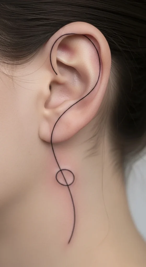
This is where you get creative.
But don’t overdo it.
One clean flowing line.
That’s it.
Conclusion
Most people mess this up by chasing meaning instead of execution. Behind-the-ear tattoos reward restraint. Simple lines. Clean spacing. Smart placement. That’s what lasts.
If your design needs explaining, it’s already too complicated for this spot.
Pick something that holds up at 5 mm. Place it where hair can hide it when needed. And don’t cheap out on line quality—that’s where most regret starts.
Keep it minimal, or don’t do it at all.