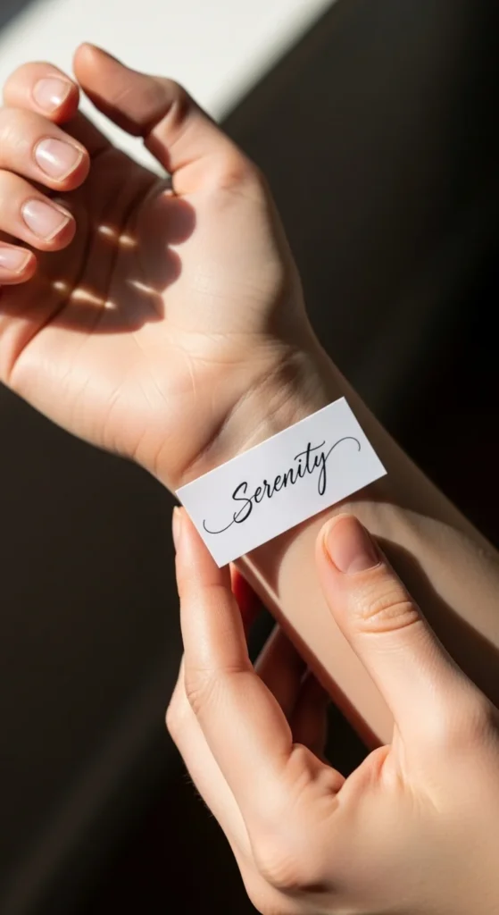
Tiny word tattoos are powerful—one word can carry a lifetime of meaning. But here’s the catch: small text tattoos are one of the easiest styles to ruin over time.
Ink spreads, skin changes, and suddenly that meaningful word becomes… hard to read.
The good news? With the right font, size, and placement, your text tattoo can stay crisp for years.
Let’s make sure yours stays readable—not regrettable.
Choose the Right Font (This Is Everything)
Not all fonts are tattoo-friendly—especially at small sizes.
Best options:
- Clean sans-serif fonts like Helvetica or Futura
- Minimal handwritten styles (simple, not overly decorative)
- Even stroke widths (no extreme thick/thin contrast)
Avoid:
- Fancy cursive with loops
- Serif fonts with tiny details
- Ultra-thin lettering
👉 Why? Small decorative elements blur together as ink naturally spreads.
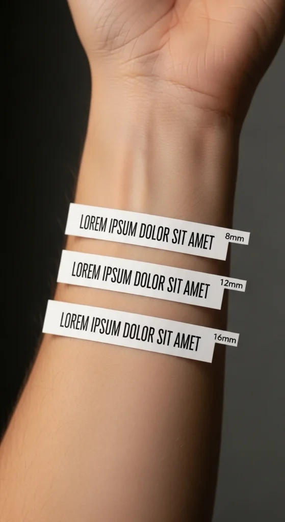
Follow the 10–12mm Rule
If you remember one thing—make it this.
- Minimum letter height: 10–12mm
- Smaller than that = high risk of blur
- Slightly bigger = way better longevity
💡 Tip: What looks “too big” today will look perfect after healing.
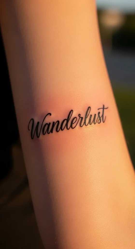
Keep It Short and Simple
Long quotes might sound meaningful—but they don’t translate well into tiny tattoos.
Best approach:
- Stick to 1–3 words max
- Choose impactful, meaningful words
- Keep spacing clean and open
Examples:
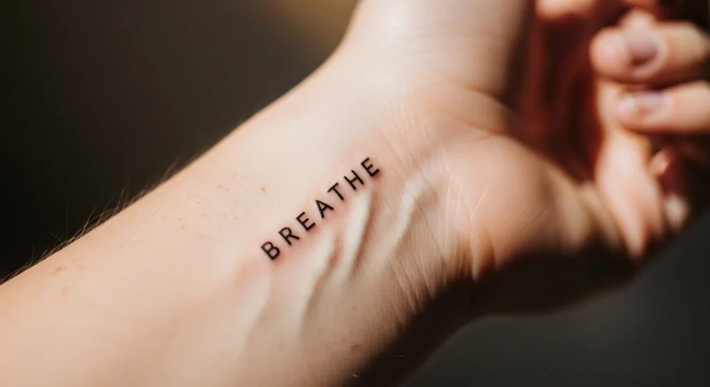
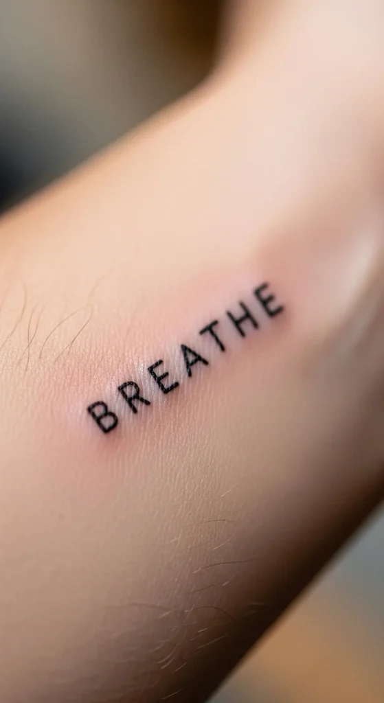
- “Breathe”
- “Stay soft”
- “Enough”
👉 Fewer letters = more space = better readability over time.
Pick a Placement That Won’t Distort
Your skin moves—a lot. And movement = distortion.
Best placements for small text:
- Inner Wrist
- Collarbone
- Upper chest
- Forearm
Avoid:
- Fingers
- Hands
- Feet
👉 These areas fade faster due to friction and constant movement.
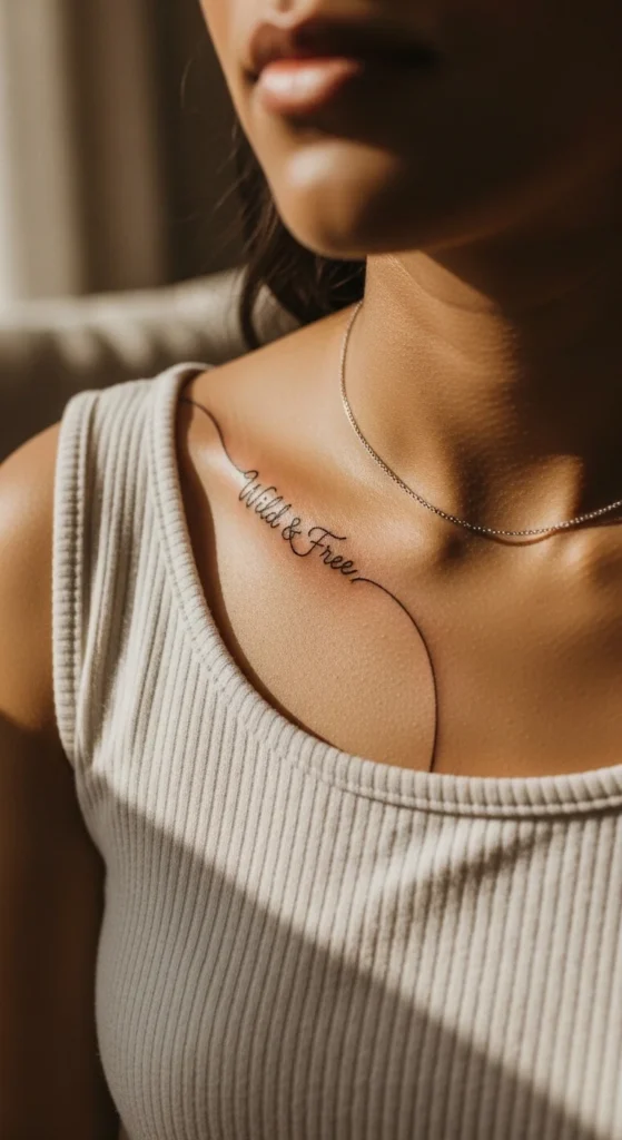
Let the Text Follow Your Body
Straight lines don’t always work on curved surfaces.
Instead:
- Curve text along your collarbone
- Slightly arc words on wrists or arms
- Match the natural flow of your body
Result: A tattoo that looks more natural—and stays readable as your skin moves.
Go Slightly Bolder Than You Think
Ultra-thin lettering might look delicate—but it won’t last.
- Slightly thicker lines resist fading
- Bolder strokes keep letters defined
- Helps prevent letters from merging
👉 Think “clean and visible,” not “barely there.”
Test Before You Ink (Non-Negotiable)
This step saves so many regrets.
- Print your tattoo at actual size
- Place it on your body
- Step back and check readability
Ask yourself:
- Can I read it easily from a distance?
- Do letters look cramped?
If yes to either → adjust size or spacing.
Consider Adding a Frame or Banner
This is an underrated trick.
- Thin banners or simple lines can frame text
- Helps protect edges from visual blur
- Adds structure to small designs
👉 Especially helpful if you’re worried about fading edges.
Choose Black Ink for Clarity
When it comes to small text, black ink wins every time.
- Highest contrast on skin
- Ages more evenly
- Keeps letters readable longer
Avoid:
- Light colors
- Watercolor styles
- Faded grey-only text
Plan for Touch-Ups
Even with perfect design choices, text tattoos may need maintenance.
- Touch-ups every 2–5 years
- Especially for very small or thin lettering
👉 It’s part of keeping your tattoo looking intentional.
Common Mistakes That Ruin Text Tattoos
Avoid these at all costs:
- Choosing fonts that are too decorative
- Going too small for readability
- Writing long quotes in tiny space
- Ignoring placement impact
- Skipping test prints
Quick Checklist for Readable Text Tattoos
Before booking your appointment:
- ✔ Font is clean and simple (sans-serif or minimal script)
- ✔ Letter height is at least 10–12mm
- ✔ Phrase is short (1–3 words)
- ✔ Placement avoids high friction areas
- ✔ Lines are slightly bold (not ultra-thin)
- ✔ You tested the design at real size
Final Thoughts: Small Text, Big Impact
A small text tattoo can be one of the most meaningful pieces you ever get—but only if it stays readable.
Think long-term:
- Choose clarity over trend
- Go bigger than you think
- Keep it simple and intentional
✨ Save this guide before your tattoo appointment—because tiny text should still make a big statement.