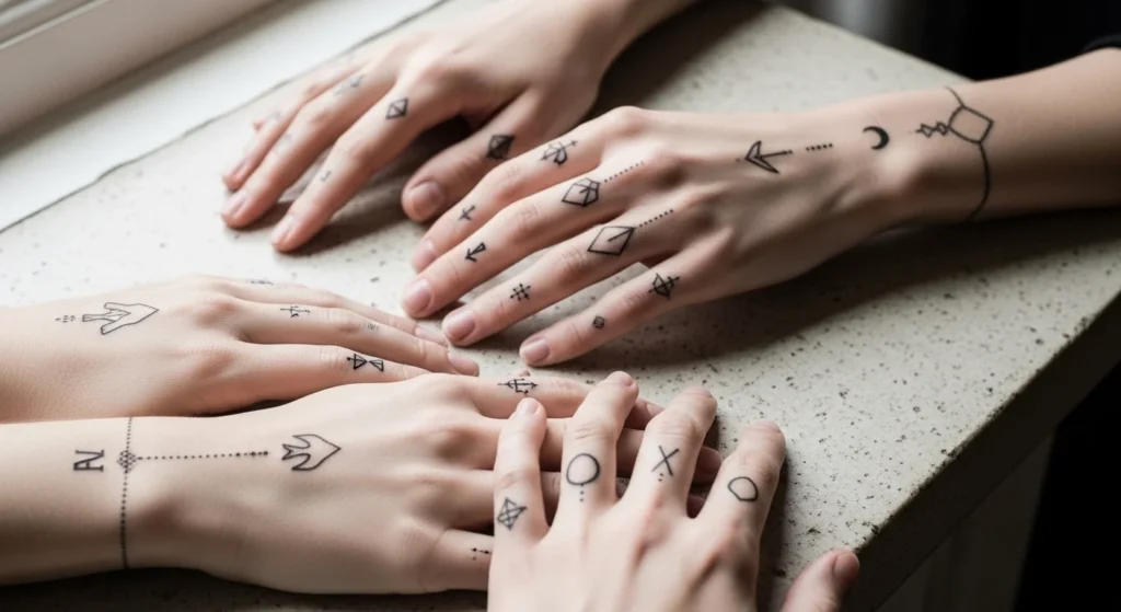

Minimalist hand tattoos look clean because they don’t fight for attention. They sit quietly on the skin and still feel intentional. That’s also why they’re popular for first-timers and for anyone who wants something they can wear in daily life without feeling “too much.” The secret is simple: pick a design that reads clearly from a distance, choose a spot that doesn’t rub constantly, and avoid lines that are hair-thin. This list shares 24 minimalist hand tattoo ideas with practical placement notes, budget-friendly ways to test a concept at home, and easy choices that help your tattoo stay sharp on high-use skin.
1. One-Line Flying Bird
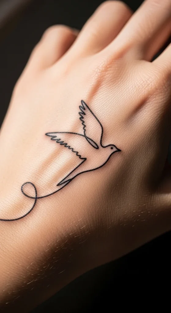
A single-line bird looks artistic without feeling busy. It works well on the back of the hand or near the thumb because there’s room for the curve to breathe.
Ask for one continuous stroke with a line that isn’t too thin. Hands fade faster, and ultra-thin lines can soften quickly. A slightly thicker line still feels minimalist but lasts longer.
Budget tip: practice the shape at home. Print a bird outline, trace it on tracing paper, and tape it to your hand for a day. Take photos. If the bird disappears in photos, go slightly larger.
Keep the design simple. No feathers. No shading. The silhouette does the work.
This tattoo also pairs well with future additions. A tiny star, a dot trail, or a small crescent moon can sit nearby without clashing.
If you want a clean, airy look, this idea checks all the boxes.
2. Single Wave Outline
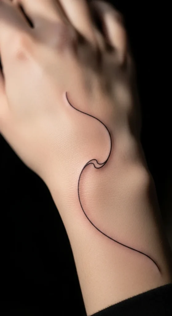
A wave line looks calm and clean. It follows the natural curve of your hand, so it looks like it belongs there.
Place it along the pinky-side edge or near the wrist. Those spots can be easier to hide and often heal smoothly.
Ask for a steady line weight. Tiny wobble shows more on minimalist designs, so pick an artist with crisp linework.
Budget-friendly test: draw a wave with eyeliner for a week. If it smudges a lot in one spot, shift the placement away from that high-rub area.
Keep it short. Long lines can warp with movement. A small wave still reads as a wave, and it stays tidy.
This design is also easy to build on later. Add a second smaller wave. Add a tiny sun dot above it. Still minimalist, still clean.
3. Three-Dot Triangle
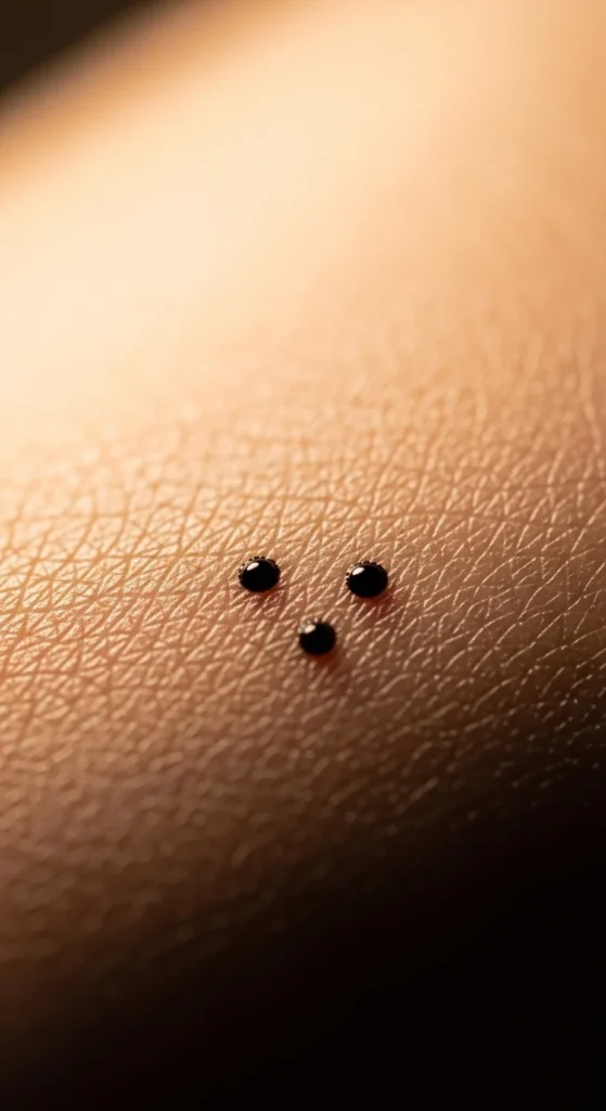
Three dots arranged as a triangle look modern and neat. It’s one of the simplest tattoos you can get, yet it still looks intentional.
Place it near the thumb base or between the knuckles. Keep spacing even. That spacing is what makes it look polished.
Ask for dots that are filled and slightly larger than pinpricks. Very tiny dots can fade into “freckles” on hands.
Budget tip: use a washable marker and place three dots. Take a photo from arm’s length. If you can’t see them, increase size slightly.
You can also add meaning without adding clutter. Some people use three dots for past, present, future. Or family. Or a private reminder.
It’s quick to tattoo, easy to heal, and easy to touch up later.
4. Tiny Triangle Outline
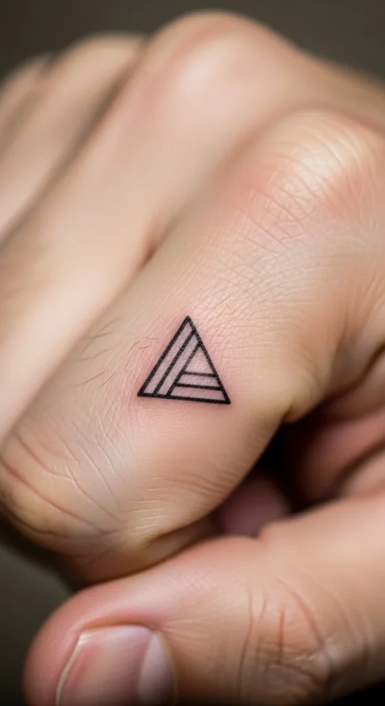
A small triangle looks clean and balanced. It fits almost anywhere.
Pick a spot with less friction, like the back of the hand near the index finger or closer to the wrist.
Ask for slightly thicker corners. Thin corners fade first. A triangle still feels minimalist even with a sturdier outline.
Budget tip: cut a tiny triangle from paper and tape it on your hand for a day. This helps you decide size and placement quickly.
You can keep it plain or add one tiny dot inside. That dot gives a subtle “design choice” without making it busy.
Triangles also layer well with other shapes later. A circle nearby. A second triangle. A small line under it. Still clean, still minimal.
5. Single Clean Circle
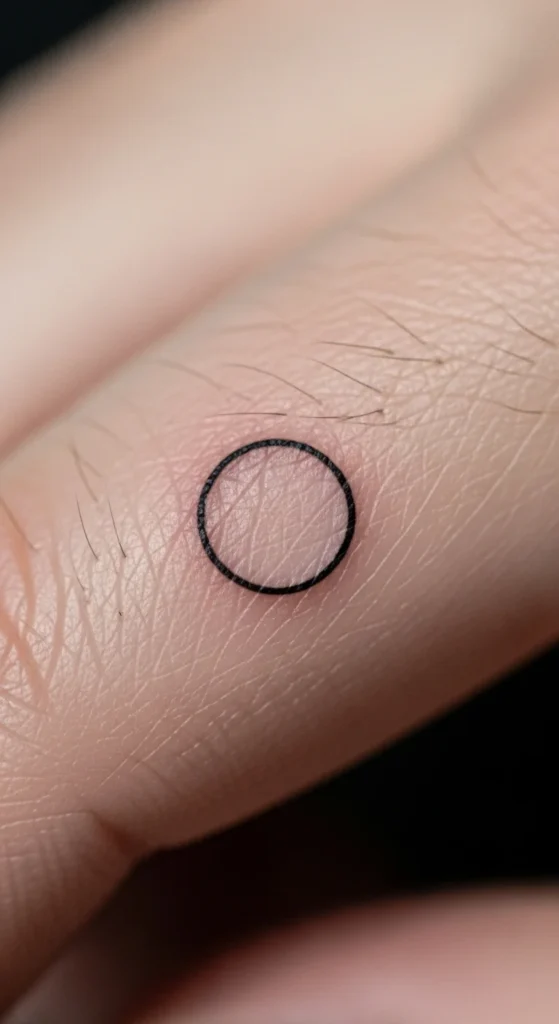
A circle is minimalist perfection. It’s also unforgiving. If the line is shaky, you’ll see it.
Pick an artist with strong linework. Ask to see healed photos of small circles and fine-line tattoos.
Place it near the thumb base or closer to the wrist. Those spots can hold ink better than finger sides.
Budget tip: trace a coin outline lightly on your skin with a cosmetic pencil. Then shrink it. Tiny circles can disappear fast, so don’t go too small.
A circle can symbolize wholeness, calm, or balance. Or it can just be a clean shape you like. Both are valid.
If you want a twist, add one tiny dot at the bottom like a “sunrise” mark. Still minimalist.
6. Negative Space Arrow
Negative space arrows look clean because they rely on skin showing through. You get a minimalist look without heavy ink.
Place it on the back of the hand or near the thumb. Keep it short and simple.
Ask for a bolder outline around the empty center. That outline keeps the arrow readable over time.
Budget tip: draw an arrow outline and leave the inside blank. Take photos. If it looks too faint, ask for a slightly thicker outline.
Arrows also carry easy meaning. Forward motion. Progress. Focus.
If you want it extra clean, skip feathers and extra lines. A simple triangle arrowhead and a short shaft are enough.
This design looks tidy, modern, and easy to wear daily.
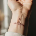
7. Small Crescent Moon
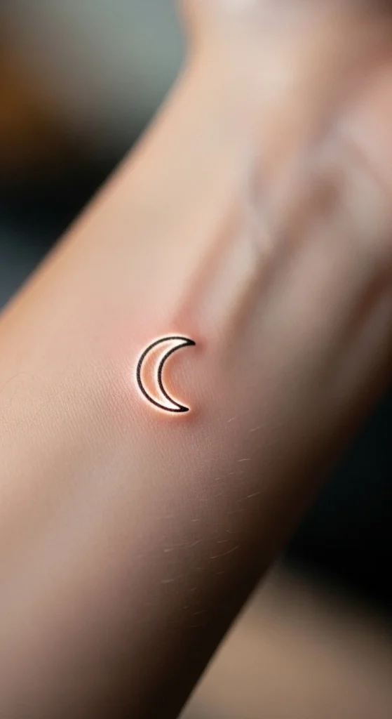
A crescent moon is simple and elegant. It also fits nicely on the hand without feeling crowded.
Place it near the wrist or thumb base. Avoid finger sides if you want it to last longer.
Ask for an outline that’s not hair-thin. Hands see sun and washing, so a sturdier outline helps.
Budget test: draw a crescent with a fine marker. If the curve looks off on your hand shape, rotate it slightly. A small rotation can make it look more natural.
You can keep it solo or pair it with one tiny dot or star. That adds a “night sky” feel while staying minimal.
Moons can represent cycles, calm, or personal growth. You don’t have to explain it to anyone. It can be private.
8. Mini Moon Phase Row
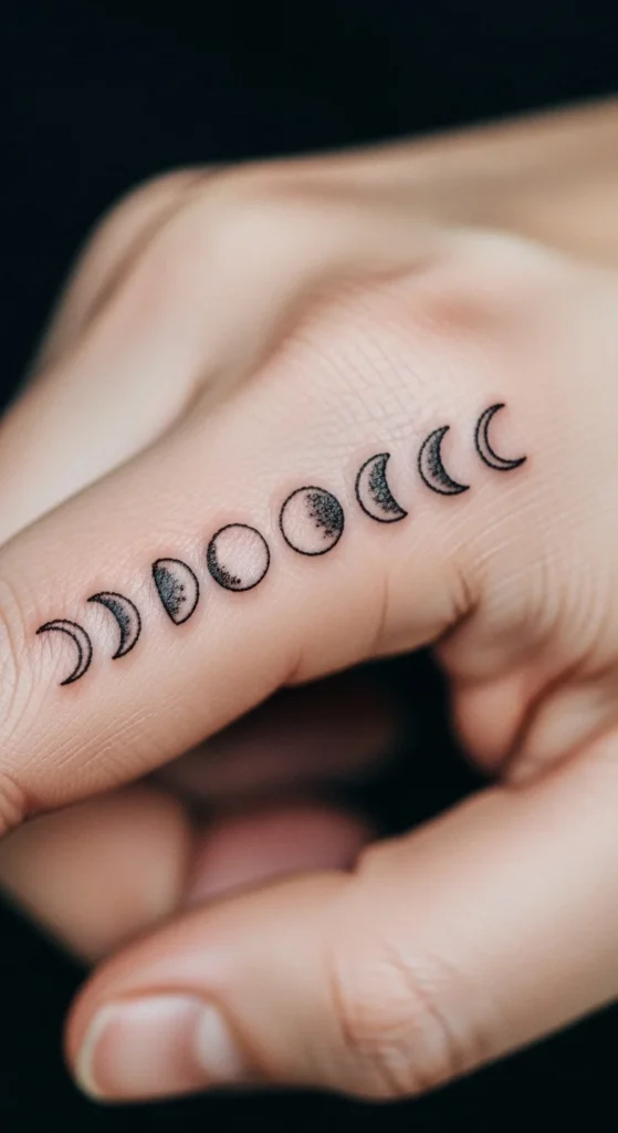
A small row of moon phases looks organized and clean. It’s minimalist but still visually interesting.
Keep it short. Three to five phases max works best on hands.
Place it near the wrist or along the side of the hand. Choose an area with less rubbing.
Ask for consistent spacing. Spacing is everything with minimalist designs.
Budget tip: print a tiny moon phase strip and tape it on your skin to test length. If it wraps too far, shorten it.
Avoid filling every moon. Outlines hold the minimalist look and heal cleaner.
This design reads well in photos. It also pairs nicely with other simple tattoos later, like a tiny star or a wave line.
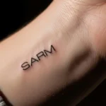
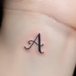
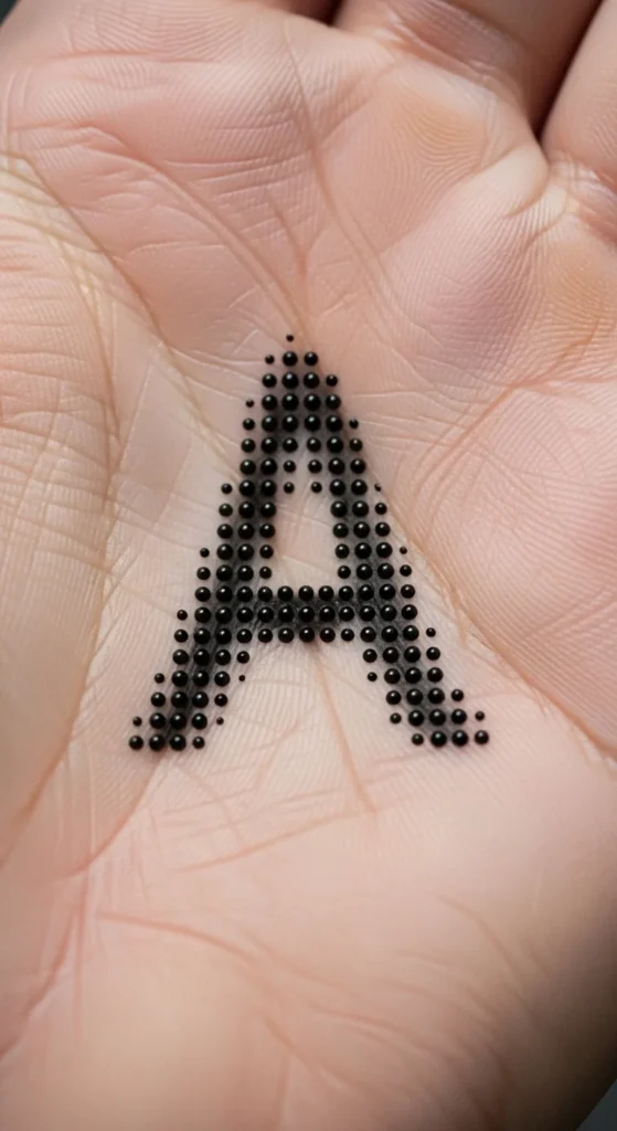
9. Fine-Line Initial
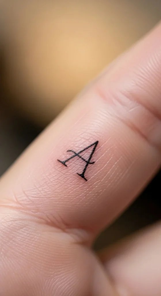
An initial feels personal without being loud. It’s a clean choice for family tributes or private meaning.
Pick a simple font. Avoid super thin cursive.
Place it near the finger base or near the wrist. Finger sides fade faster, so place it where it won’t rub constantly.
Ask for slightly thicker strokes than you think you want. A thin initial can blur into a smudge over time.
Budget tip: type your initial in a few fonts at home, print them small, and hold them against your hand in a mirror. Choose the one that still looks clear from a step back.
Keep it single-letter. Two letters can still work, but don’t go tiny.
Minimal, personal, and easy to wear.
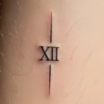
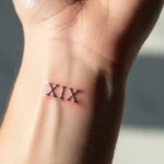
10. Tiny Date in Minimal Numbers

A date can mark something meaningful without needing a full quote.
Use clean, simple numbers. Avoid fancy scripts for dates because small loops blur.
Place it near the wrist or along the side of the hand.
Budget tip: write the date with a pen daily for a week. If you love seeing it, it’s a good sign.
Keep the date short. Use dots or dashes. Example format: 12•05•22. The dots break up the numbers and help readability.
Ask your artist for a size that stays readable in photos. Too small looks like ink specks.
Simple. Personal. Clean.
11. Small Semicolon
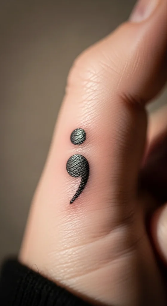
A semicolon is a clean symbol with deep meaning for many people.
Place it near the thumb or wrist. Keep it bold enough that the dot and comma stay clear.
Budget tip: this is a short session and usually affordable.
If you want it even cleaner, keep it upright and small. No extra decoration.
This tattoo works well alone or paired with a tiny heart or dot beside it.
It’s simple, meaningful, and easy to place discreetly.
12. Leaf Outline with One Vein
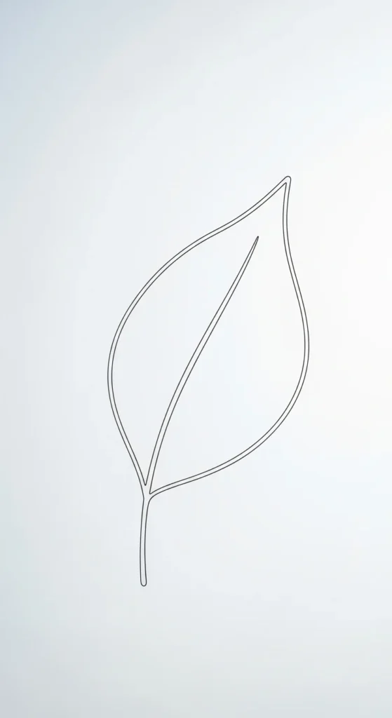
A leaf outline looks elegant and natural. It’s also easy to keep minimalist.
Use one mid-vein only. Skip extra veins if you want it to stay crisp.
Place it near the wrist or thumb base.
Budget test: draw a small leaf with one line down the center. If it looks too faint, scale up slightly.
Ask for a line weight that won’t vanish. Hands soften thin lines.
This design pairs well with other minimal ideas later, like a tiny dot cluster.
Soft, clean, and easy to wear.
13. Micro Flower Stem
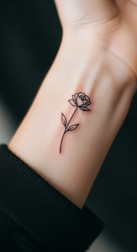
A single stem flower is minimalist, but it still looks pretty.
Keep it to one flower head and a thin stem. No shading.
Place it near the wrist so it’s easy to cover with a watch if needed.
Budget tip: start with just the stem and leaf. Add the flower later if you want to spread cost out.
Ask for simple petal shapes. Tiny petals blur when they’re too detailed.
This tattoo looks delicate and clean, and it’s easy to fit into your style.
14. Lone Star with Two Dots
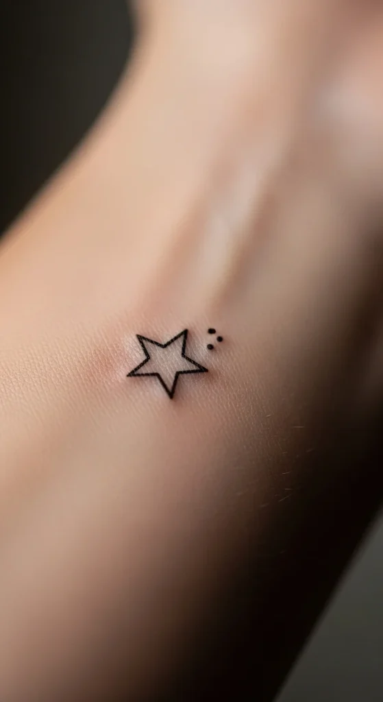
A single star looks clean. Adding two dots makes it feel designed, not random.
Place it near the thumb base or on the back of the hand.
Ask for a slightly bold star outline or a small filled star.
Budget tip: use three tiny sticker dots to test placement and spacing.
This design stays readable even as it softens, because the shapes are simple.
If you like minimalist tattoos that still feel a little special, this is a great option.
15. Micro Constellation Connector
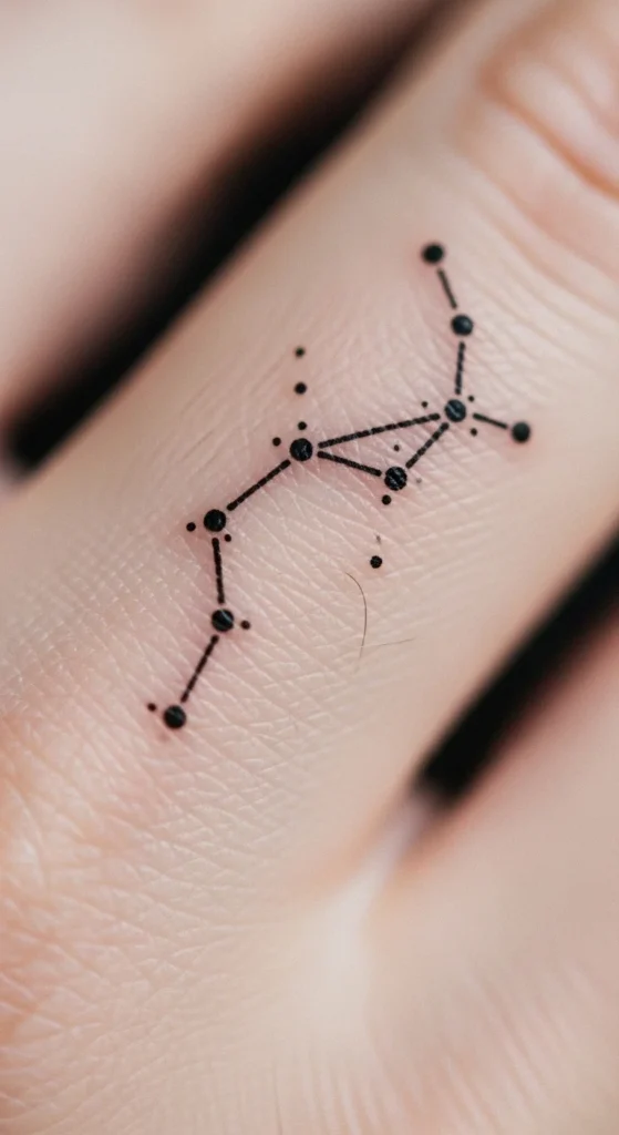
A small constellation made of dots and a few connecting lines looks tidy and elegant.
Keep it small. Two or three lines max.
Place it along a finger or near the wrist.
Ask for dots that aren’t too tiny. Pinpoint dots fade faster.
Budget tip: map your constellation with pen first. Try different spacing until it feels balanced.
This works especially well if you choose a constellation you personally like, but you don’t have to tell anyone which one it is.
Clean, personal, and photo-friendly.
16. Simple Feather Silhouette
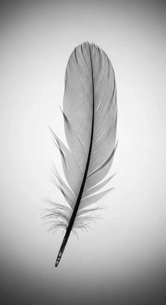
A feather in minimalist form looks light and elegant.
Use a clean outline with just a few barbs. Too many little strokes blur.
Place it along the side of the hand or near the wrist.
Budget tip: choose a short feather. Long feathers require more time and cost.
Ask for a slightly thicker outline on the shaft. That’s where fading shows first.
This tattoo reads well and stays calm in style.
17. One-Line Eye Motif
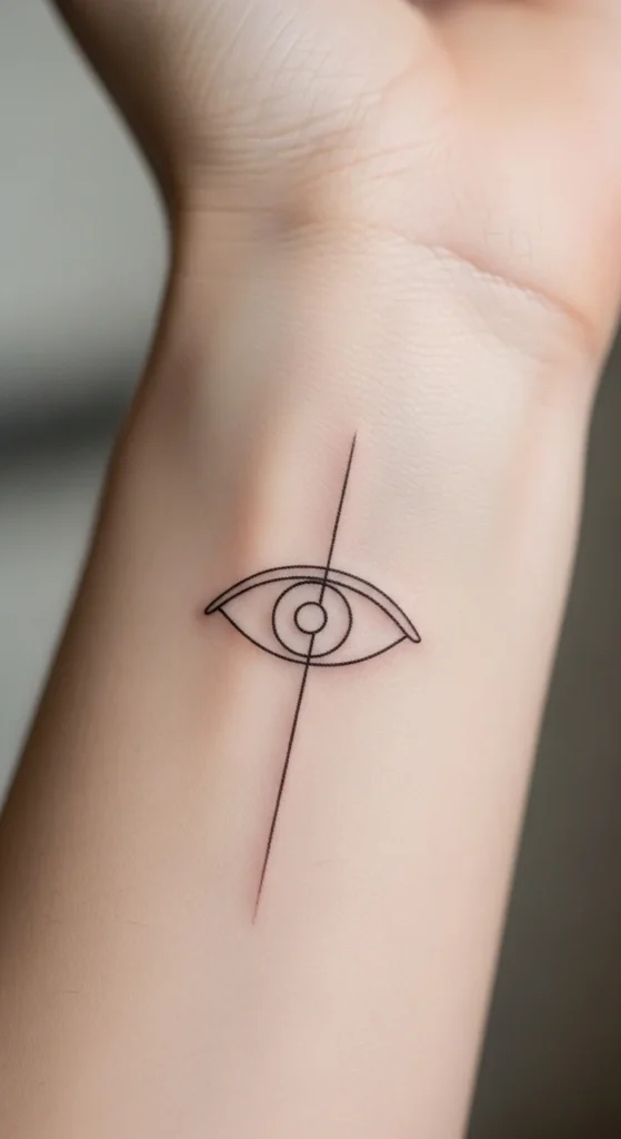
A single-line eye looks artistic but clean. It gives a “watchful” vibe without heavy detail.
Keep it minimal. One lid line and one iris loop.
Place it near the thumb base or close to the wrist.
Budget tip: sketch it on paper first, then transfer with tracing paper to check size.
Ask for smooth curves. With minimalist tattoos, clean curves matter.
This design looks modern and slightly mysterious while staying elegant.
18. Heart Outline with Open Center
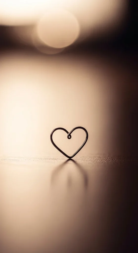
An outline heart with an open center stays light and clean.
Ask for a slightly thicker outline so it doesn’t vanish over time.
Place it near the thumb or on the back of the hand.
Budget test: draw it and leave the center blank. If it looks too faint, go bigger.
This heart looks mature and minimalist compared to filled hearts.
19. Small Crosshatch Shadow Patch
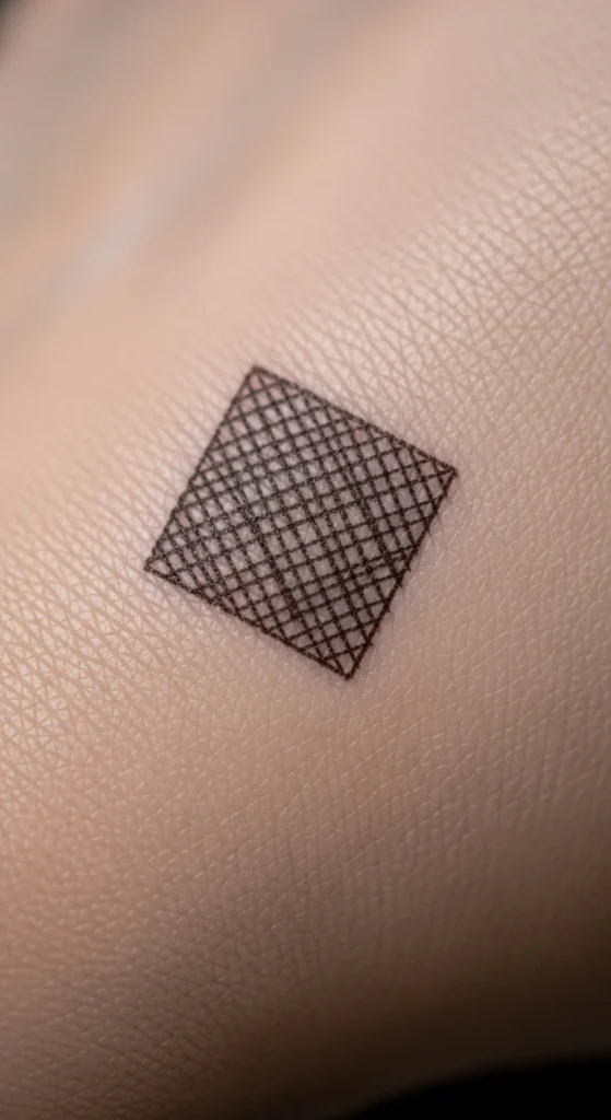
Crosshatch shading can add depth without heavy ink blocks.
Keep it tiny, like a small patch or a small shadow under a dot.
Place it near the wrist or thumb base.
Budget tip: ask for a small “texture sample” rather than a full design.
This is for people who want something different but still minimalist.
It looks like sketch art on skin.
20. Minimal Branch Line
A thin branch line with one or two leaves looks clean and calm.
Keep it short. Avoid lots of twigs.
Place it near the wrist so it has space.
Budget tip: start with a single branch curve. Add leaves later.
Ask for simple leaf shapes with open space between them.
This keeps it elegant and easy to read.
21. Dot Matrix Letter
A letter made of dots feels modern and techy.
Spacing is key. Even dots look clean.
Place it near the wrist or thumb base.
Budget test: place dots with a marker first. If it looks messy, space them wider.
Ask the artist for dots big enough to last.
This is a cool way to personalize without using full script.
22. “Holding a Star” Gesture Illusion

This style lines up a tiny star so it looks like you’re holding it when you pinch your fingers.
It’s minimal but interactive. Great for photos.
Placement matters. Work with the artist to test your hand pose before tattooing.
Budget tip: mark the star spot with a pen, take photos while posing, then adjust placement.
Keep the star simple. A small filled star or outline star works best.
This is playful while staying clean.
23. Ultra-Simple Infinity Loop
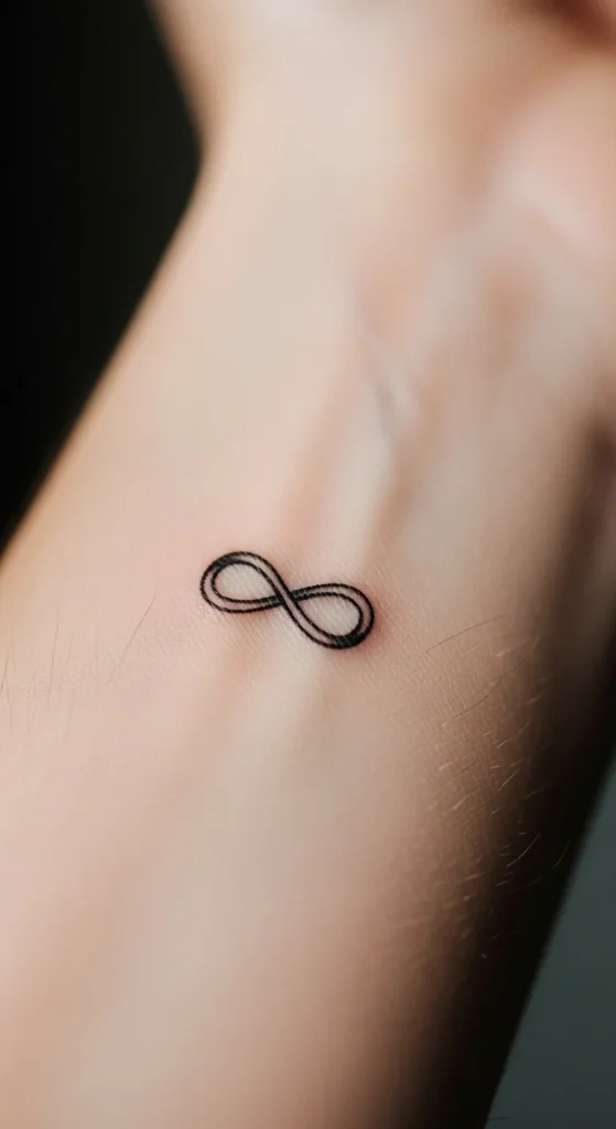
A plain infinity loop looks elegant in small size.
Place it near the wrist or thumb base.
Ask for consistent line weight so the loop doesn’t look uneven.
Budget tip: draw it at home in three sizes and choose the one that still reads in a photo.
Skip initials inside the loop if you want it extra clean. Or keep initials tiny and simple if you want personalization.
Minimal. Classic. Easy.
24. One-Word Fragment in Simple Font
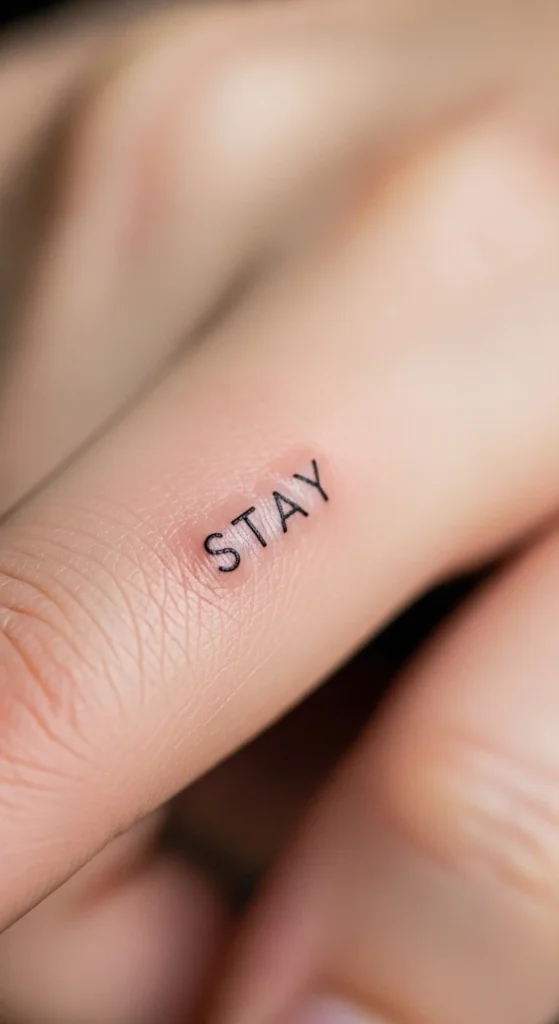
A single short word can feel powerful without looking heavy.
Pick a plain font. Avoid thin cursive.
Place it near the wrist or finger base so it’s discreet.
Budget tip: print the word in different fonts and tape it to your hand for a day.
Keep it under four letters if possible. Short words stay readable.
This tattoo looks clean, personal, and easy to wear daily.
Conclusion
Minimalist hand tattoos look best when the design stays readable from a step back and the line weight isn’t too thin. Test your idea with marker first. Choose spots that don’t rub constantly. Start small and add later if you want more. With clean shapes, smart spacing, and gentle aftercare, your hand tattoo can stay elegant and easy to wear for years.